 Menu
Menu
I'm having a very peculiar problem that I've been trying to solve for the last 2 days to no avail. The page I'm building has the following structure:
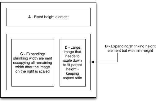
I can easily achieve the A-B layout with the overall parent having display: flex; flex-direction: column; align-items: stretch and setting A to be flex: 0 0 auto and B to be flex: 1 1 0; min-height: 100px;
However I'm having real trouble layout out C and D inside B. I feel like the flex/row is the right approach for B, but I just can't get the specifics. So I'm trying:
.B {
    display: flex;
    flex-direction: row;
    align-items: stretch;
    justify-content: space-between;
}

.C {
    flex: 1 1 0;
}

.D {
    object-fit: scale-down;
}
But clearly this is not sufficient. The image either doesn't scale down at all, scales down but distorted or leaves a lot of space around if I set it to also have flex: 1 1 0 with min width.
Any ideas how I can achieve what I need here?
UPDATE: I tried putting jsfiddle together here - https://jsfiddle.net/2gsrzwwq/3/ - but for some reason it wouldn't even honour height:100% on the parent. As far as the image fitting goes, I need the image to scale down to the height of the D div and then have the D block decrease in width to just contain the scaled down image - and for C block to occupy the remaining width.
 293
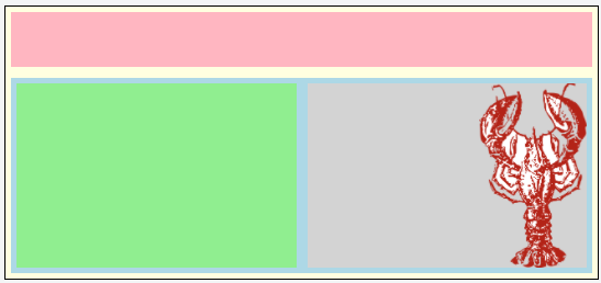
293
After a lot more struggle and another sleepless night, I came up with something sort-of working. The sacrifice I had to make is not adjusting the width of the image container and always settling on it being half the width of the screen (note that in the real app, there are no background colours, so it won't look as strange, rather there will be some extra white space). I'll have to discuss this with the client, but I think I'll be able to convince them. Here's what I came up with:
https://jsfiddle.net/2gsrzwwq/6/
HTML:
<div class="page">
  <div class="A">
  </div>

  <div class="B">
    <div class="C">
    </div>
    <div class="D">
      <img src="http://res.freestockphotos.biz/pictures/10/10677-illustration-of-a-red-lobster-pv.png"/>
    </div>
  </div>
</div>
CSS:
div {
  box-sizing: border-box;
}

.page {
  width: 100%;
  height: 250px;
  border: solid 1px black;
  margin: 5px;
  background-color: lightYellow;
  display: flex;
  flex-direction: column;
  align-items: stretch;
  justify-content: flex-start;
}

.A {
  background-color: lightPink;
  margin: 5px;
  flex: 0 0 50px;
}

.B {
  background-color: lightBlue;
  margin: 5px;
  flex: 1 1 0;
  min-height: 80px;
  display: flex;
  flex-direction: row;
  align-items: stretch;
  justify-content: space-between
}

.C {
  background-color: lightGreen;
  margin: 5px;
  flex: 1 1 0;
  min-width: 100px;
}

.D {
  background-color: lightGrey;
  margin: 5px;
  flex: 1 1 0;
  min-height: 50px;
  display: flex;
  justify-content: flex-end;
}

.D img {
  flex: 1 1 0;
  max-height: 100%;
  max-width: 200px;
  object-fit: scale-down;
  object-position: top right;
}
161
If you love us? You can donate to us via Paypal or buy me a coffee so we can maintain and grow! Thank you!
Donate Us With
