 Menu
Menu
I guess, it is not allowed to put a material grid in a material grid (nesting grids)?
Can someone please confirm my assumption?
(I am using Angular Material 6.)
<mat-grid-list cols="6" gutterSize="32px">
    <mat-grid-tile [colspan]="3">
        left
        <mat-grid-list cols="3" gutterSize="8px">
            <mat-grid-tile>1</mat-grid-tile>

            <mat-grid-tile [colspan]="2">2</mat-grid-tile>

            <mat-grid-tile [colspan]="3">3</mat-grid-tile>
        </mat-grid-list>
    </mat-grid-tile>

    <mat-grid-tile [colspan]="3">
        right
        <mat-grid-list cols="3" gutterSize="8px">
            <mat-grid-tile>4</mat-grid-tile>

            <mat-grid-tile [colspan]="2">5</mat-grid-tile>

            <mat-grid-tile [colspan]="3">6</mat-grid-tile>
        </mat-grid-list>
    </mat-grid-tile>
</mat-grid-list>
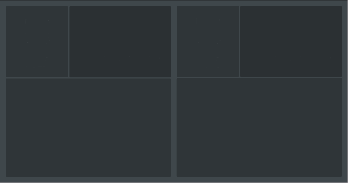
The result should be look like this (two different gutter sizes):
Why do I want this? The design I have to implement has DIFFERENT GUTTER SIZES between the columns :-/ I thought a grid in a grid would be a clever solution, but it doesn't work.
UPDATE: The solution suggested here does not work, as this is only possible in the older AngularJS Material.
 593
593
After trying everything I could think of, I came to the conclusion, that material grid in material grid is not possible and probably conceptually not meant to work (understandably).
I decided to solve my problem by using a CSS grid (https://www.w3schools.com/css/css_grid.asp). This works (so far):
<mat-grid-list cols="2" rowHeight="fit" gutterSize="32px">
<mat-grid-tile>
    <div class="css-grid">
        <div class="css-grid-tile top-left">
        </div>
        <div class="css-grid-tile top-right">
        </div>
        <div class="css-grid-tile bottom">
        </div>
    </div>
</mat-grid-tile>

<mat-grid-tile>
    <div class="css-grid">
        <div class="css-grid-tile top-left">
        </div>
        <div class="css-grid-tile top-right">
        </div>
        <div class="css-grid-tile bottom">
        </div>
    </div>
</mat-grid-tile>
.css-grid {
  display: grid;
  grid-gap: 8px;
  grid-template-columns: 33% 67%; // two columns
  grid-template-rows: 33% 67%; // two rows
  height: 100%;
  width: 100%;

  .css-grid-tile {
    &.top-left {
      grid-column: 1 / 2;
    }

    &.top-right {
      grid-column: 2 / 3;
    }

    &.bottom {
      grid-column: 1 / 3;
    }
  }
}
If you love us? You can donate to us via Paypal or buy me a coffee so we can maintain and grow! Thank you!
Donate Us With