 Menu
Menu
I am trying to style my preferences with a material theme and am almost there.
I imported the following:
compile 'com.android.support:preference-v7:25.1.0'
compile 'com.android.support:preference-v14:25.1.0'
Then in my main app theme set the preference theme:
<item name="preferenceTheme">@style/PreferenceThemeOverlay.v14.Material</item>
And my preference screen looks pretty good. My only problem is that the categories have zero space or visual separation, making all the preferences look very smashed together.
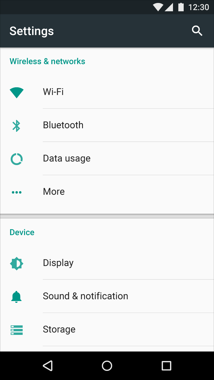
The material design docs show a divider with what looks like top and bottom shadows (IE above the device category):
A couple of questions:
Does android provide this? If so is there a newer appcompat theme? Or anything else I am doing wrong?
If android does not yet provide this divider in the material preference theme has anyone created it yet? I saw this, where he creates a new category with a custom layout, Divider between category in PreferenceFragment. But I am not entirely sure how to create the desired effect.
 203
203
The other answer was fine, edited it slightly here in case you simply did not understand the drawable.
xml/preferences.xml
<PreferenceCategory
    android:layout="@layout/divider"
    android:title="Category2">
    <Preference
        android:title="Test1"
        android:summary="Summary1"/>

    </PreferenceCategory>
layout/divider.xml
<LinearLayout xmlns:android="http://schemas.android.com/apk/res/android"
              android:layout_width="match_parent"
              android:layout_height="10dp"
              android:orientation="vertical">

    <View
        android:layout_width="match_parent"
        android:layout_height="5dp"
        android:background="@drawable/shadow"/>


</LinearLayout>
drawable/shadow.xml
<shape xmlns:android="http://schemas.android.com/apk/res/android">
    <gradient
        android:startColor="#1F000000"
        android:endColor="@android:color/transparent"
        android:angle="90" />
</shape>
If you look at the screenshot closely, you'd notice that the divider effect you want has a shadow on top and the bottom, but not in the middle. So, for the divider, the following XML should work :-
<LinearLayout xmlns:android="http://schemas.android.com/apk/res/android"
          android:layout_width="match_parent"
          android:layout_height="10dp"
          android:orientation="vertical">

<View
    android:layout_width="match_parent"
    android:layout_height="5dp"
    android:background="@drawable/shadow_bottom"/>

<View
    android:layout_width="match_parent"
    android:layout_height="5dp"
    android:background="@drawable/shadow_top"/>

</LinearLayout>
Now, for the PreferenceScreen, to show a divider, all you have to do is to include an empty PreferenceCategory with android:layout set as the above XML. Something like android:layout="@layout/divider_layout". By "empty" preference category, I mean that the preference category should not have Preference children.
So, your PreferenceScreen should look something like this :-
<?xml version="1.0" encoding="utf-8"?>
<PreferenceScreen xmlns:android="http://schemas.android.com/apk/res/android">
        <PreferenceCategory
            android:title="Category_First">

        <Preference
            android:title="prefA"/>

        </PreferenceCategory>

        <PreferenceCategory
            android:layout="@layout/divider_layout">
  </PreferenceCategory>

  <PreferenceCategory
            android:title="Category_Second">

        <Preference
            android:title="prefB"/>

  </PreferenceCategory>
</PreferenceScreen>
If you love us? You can donate to us via Paypal or buy me a coffee so we can maintain and grow! Thank you!
Donate Us With


