 Menu
Menu
(UPDATED with examples for Bootstrap v4, v3 and v3)
Examples of forms with validation classes for the past few major versions of Bootstrap.
Bootstrap v4
See the live version on codepen

<div class="container">
  <form>
    <div class="form-group row">
      <label for="inputEmail" class="col-sm-2 col-form-label text-success">Email</label>
      <div class="col-sm-7">
        <input type="email" class="form-control is-valid" id="inputEmail" placeholder="Email">
      </div>
    </div>

    <div class="form-group row">
      <label for="inputPassword" class="col-sm-2 col-form-label text-danger">Password</label>
      <div class="col-sm-7">
        <input type="password" class="form-control is-invalid" id="inputPassword" placeholder="Password">
      </div>
      <div class="col-sm-3">
        <small id="passwordHelp" class="text-danger">
          Must be 8-20 characters long.
        </small>
      </div>
    </div>
  </form>
</div>
Bootstrap v3
See the live version on codepen

<form role="form">
  <div class="form-group has-warning">
    <label class="control-label" for="inputWarning">Input with warning</label>
    <input type="text" class="form-control" id="inputWarning">
    <span class="help-block">Something may have gone wrong</span>
  </div>
  <div class="form-group has-error">
    <label class="control-label" for="inputError">Input with error</label>
    <input type="text" class="form-control" id="inputError">
    <span class="help-block">Please correct the error</span>
  </div>
  <div class="form-group has-info">
    <label class="control-label" for="inputError">Input with info</label>
    <input type="text" class="form-control" id="inputError">
    <span class="help-block">Username is taken</span>
  </div>
  <div class="form-group has-success">
    <label class="control-label" for="inputSuccess">Input with success</label>
    <input type="text" class="form-control" id="inputSuccess" />
    <span class="help-block">Woohoo!</span>
  </div>
</form>
Bootstrap v2
See the live version on jsfiddle

The .error, .success, .warning and .info classes are appended to the .control-group. This is standard Bootstrap markup and styling in v2. Just follow that and you're in good shape. Of course you can go beyond with your own styles to add a popup or "inline flash" if you prefer, but if you follow Bootstrap convention and hang those validation classes on the .control-group it will stay consistent and easy to manage (at least since you'll continue to have the benefit of Bootstrap docs and examples)
  <form class="form-horizontal">
    <div class="control-group warning">
      <label class="control-label" for="inputWarning">Input with warning</label>
      <div class="controls">
        <input type="text" id="inputWarning">
        <span class="help-inline">Something may have gone wrong</span>
      </div>
    </div>
    <div class="control-group error">
      <label class="control-label" for="inputError">Input with error</label>
      <div class="controls">
        <input type="text" id="inputError">
        <span class="help-inline">Please correct the error</span>
      </div>
    </div>
    <div class="control-group info">
      <label class="control-label" for="inputInfo">Input with info</label>
      <div class="controls">
        <input type="text" id="inputInfo">
        <span class="help-inline">Username is taken</span>
      </div>
    </div>
    <div class="control-group success">
      <label class="control-label" for="inputSuccess">Input with success</label>
      <div class="controls">
        <input type="text" id="inputSuccess">
        <span class="help-inline">Woohoo!</span>
      </div>
    </div>
  </form>
Bootstrap V3:
Official Doc Link 1
Official Doc Link 2
<div class="form-group has-success">
  <label class="control-label" for="inputSuccess">Input with success</label>
  <input type="text" class="form-control" id="inputSuccess" />
  <span class="help-block">Woohoo!</span>
</div>
<div class="form-group has-warning">
  <label class="control-label" for="inputWarning">Input with warning</label>
  <input type="text" class="form-control" id="inputWarning">
  <span class="help-block">Something may have gone wrong</span>
</div>
<div class="form-group has-error">
  <label class="control-label" for="inputError">Input with error</label>
  <input type="text" class="form-control" id="inputError">
  <span class="help-block">Please correct the error</span>
</div>
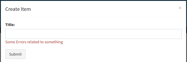
One can also use the following class while using bootstrap modal class (v 3.3.7) ... help-inline and help-block did not work in modal.
<span class="error text-danger">Some Errors related to something</span>
Output looks like something below:
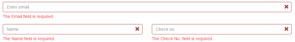
Bootstrap V3:
Once i was searching for laravel features then i got to know this amazing form validation. Later on, i amended glyphicon icon features. Now, it looks great.
<div class="col-md-12">
<div class="form-group has-error has-feedback">
    <input id="enter email" name="email" type="text" placeholder="Enter email" class="form-control ">
    <span class="glyphicon glyphicon-remove form-control-feedback"></span>
    <span class="help-block"><p>The Email field is required.</p></span>
</div>
</div>
<div class="clearfix"></div>

<div class="col-md-6">
<div class="form-group has-error has-feedback">
    <input id="account_holder_name" name="name" type="text" placeholder="Name" class="form-control ">
    <span class="glyphicon glyphicon-remove form-control-feedback"></span>
    <span class="help-block"><p>The Name field is required.</p></span>
</div>
</div>
<div class="col-md-6">
<div class="form-group has-error has-feedback">
 <input id="check_np" name="check_no" type="text" placeholder="Check no" class="form-control ">
 <span class="glyphicon glyphicon-remove form-control-feedback"></span>
<span class="help-block"><p>The Check No. field is required.</p></span>
</div>
</div>
This is what it looks like:
Once i completed it i thought i should implement it in Codeigniter as well. So here is the Codeigniter-3 validation with Bootstrap:
Controller
function addData()
{
$this->load->library('form_validation');
$this->form_validation->set_rules('email','Email','trim|required|valid_email|max_length[128]');
if($this->form_validation->run() == FALSE)
{
//validation fails. Load your view.
$this->loadViews('Load your view','pass your data to view if any');
}
else
{
 //validation pass. Your code here.
}
}
View
<div class="col-md-12">
<?php
 $email_error = (form_error('email') ? 'has-error has-feedback' : '');
 if(!empty($email_error)){
 $emailData = '<span class="help-block">'.form_error('email').'</span>';
 $emailClass = $email_error;
 $emailIcon = '<span class="glyphicon glyphicon-remove form-control-feedback"></span>';
}
else{
    $emailClass = $emailIcon = $emailData = '';
 }
 ?>
<div class="form-group <?= $emailClass ?>">
<input id="enter email" name="email" type="text" placeholder="Enter email" class="form-control ">
<?= $emailIcon ?>
<?= $emailData ?>
</div>
</div>
Output:

Generally showing the error near where the error occurs is best. i.e. if someone has an error with entering their email, you highlight the email input box.
This article has a couple good examples. http://uxdesign.smashingmagazine.com/2011/05/27/getting-started-with-defensive-web-design/
Also twitter bootstrap has some nice styling that helps with that (scroll down to the Validation states section) http://twitter.github.com/bootstrap/base-css.html#forms
Highlighting each input box is a bit more complicated, so the easy way would be to just put an bootstrap alert at the top with details of what the user did wrong. http://twitter.github.com/bootstrap/components.html#alerts
For Bootstrap v4 use:has-danger for form-group wrapper,form-control-danger for input to show icon (will display ✖ at the end of input),form-control-feedback to message wrapper
Example:
<link rel="stylesheet" href="https://maxcdn.bootstrapcdn.com/bootstrap/4.0.0-alpha.6/css/bootstrap.min.css" integrity="sha384-rwoIResjU2yc3z8GV/NPeZWAv56rSmLldC3R/AZzGRnGxQQKnKkoFVhFQhNUwEyJ" crossorigin="anonymous">


<div class="form-group has-danger">
  <input type="text" class="form-control form-control-danger">
  <div class="form-control-feedback">Not valid :(</div>
</div>If you love us? You can donate to us via Paypal or buy me a coffee so we can maintain and grow! Thank you!
Donate Us With