 Menu
Menu
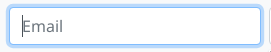
Answer: Use the CSS box-shadow Property By default, all the textual <input> elements, <textarea> , and <select> elements with the class . form-control highlighted in blue glow upon receiving the focus in Bootstrap.
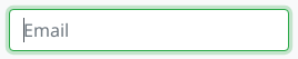
form-control:focus and copy the parameters that you want to modify into your css. In this case is border-color and box-shadow . Choose a color for the border-color . In this case I choose to pick up the same green the bootstrap uses for their .
You can achieve what you want by setting the autofocus attribute inside the input tag to autofocus. The keyboard input will be focused on the input field and it will glow. <input class="form-control" id="focusedInput" type="text" autofocus="autofocus" value="This is focused...">
In the end I changed the following css entry in bootstrap.css
textarea:focus,
input[type="text"]:focus,
input[type="password"]:focus,
input[type="datetime"]:focus,
input[type="datetime-local"]:focus,
input[type="date"]:focus,
input[type="month"]:focus,
input[type="time"]:focus,
input[type="week"]:focus,
input[type="number"]:focus,
input[type="email"]:focus,
input[type="url"]:focus,
input[type="search"]:focus,
input[type="tel"]:focus,
input[type="color"]:focus,
.uneditable-input:focus {
  border-color: rgba(126, 239, 104, 0.8);
  box-shadow: 0 1px 1px rgba(0, 0, 0, 0.075) inset, 0 0 8px rgba(126, 239, 104, 0.6);
  outline: 0 none;
}
You can use the .form-control selector to match all inputs. For example to change to red:
.form-control:focus {
  border-color: #FF0000;
  box-shadow: inset 0 1px 1px rgba(0, 0, 0, 0.075), 0 0 8px rgba(255, 0, 0, 0.6);
}
Put it in your custom css file and load it after bootstrap.css. It will apply to all inputs including textarea, select etc...
If you are using Bootstrap 3.x, you can now change the color with the new @input-border-focus variable.
See the commit for more info and warnings.
In _variables.scss update @input-border-focus.
To modify the size/other parts of this glow modify the mixins/_forms.scss
@mixin form-control-focus($color: $input-border-focus) {
  $color-rgba: rgba(red($color), green($color), blue($color), .6);
  &:focus {
    border-color: $color;
    outline: 0;
    @include box-shadow(inset 0 1px 1px rgba(0,0,0,.075), 0 0 4px $color-rgba);
  }
}
You can modify the .form-control:focus color without altering the bootstrap style in this way:
.form-control:focus {
        border-color: #28a745;
        box-shadow: 0 0 0 0.2rem rgba(40, 167, 69, 0.25);
    }
.form-control:focus and copy the parameters that you want to modify into your css. In this case is border-color and box-shadow.
border-color. In this case I choose to pick up the same green the bootstrap uses for their .btn-success class, by searching for that particular class in the bootstrap.css page mentioned in the step 1.
box-shadow parameter without altering the fourth RGBA parameter (0.25) that bootstrap has for transparency.For Bootstrap v4.0.0 beta release you will need the following added to a stylesheet that overrides Bootstrap (either add in after CDN/local link to bootstrap v4.0.0 beta or add !important to the stylings:
.form-control:focus {
  border-color: #6265e4 !important;
  box-shadow: 0 0 5px rgba(98, 101, 228, 1) !important;
}
Replace the border-color and the rgba on the box-shadow with which ever colour style you'd like*.
If you love us? You can donate to us via Paypal or buy me a coffee so we can maintain and grow! Thank you!
Donate Us With