 Menu
Menu
I'm looking for a way to make a monospaced text as wide as possible in its container witohut overflowing or breaking. I've already looked at CSS3 Make Text As Big As Possible To FIll Element Without Overflowing and tried to implement the suggested solution, but it doesn't appear to work in my case. If I set the font size to 3vw instead of 7vw as suggested in the answer to the linked question, it seems to be close, but when I change the length of the lines or width of the page, it's off again.
Here is my code:
https://jsfiddle.net/de7qbu19/ (the code in the fiddle is the same)
#song-container {
    text-align: center;
    margin: 20px;
}
#song {
    color: #000;
    font: normal 3vw Courier New,monospace,Courier;
    white-space: pre;
    word-break: break-all;
    text-align: left;
    display: inline-block;
}

#song > span { /* Chords*/
    color: #007fbf;
    cursor: pointer;
}
<link rel="stylesheet" href="https://maxcdn.bootstrapcdn.com/bootstrap/3.3.7/css/bootstrap.min.css" integrity="sha384-BVYiiSIFeK1dGmJRAkycuHAHRg32OmUcww7on3RYdg4Va+PmSTsz/K68vbdEjh4u" crossorigin="anonymous">
<script src="https://code.jquery.com/jquery-3.4.1.slim.min.js" integrity="sha384-J6qa4849blE2+poT4WnyKhv5vZF5SrPo0iEjwBvKU7imGFAV0wwj1yYfoRSJoZ+n" crossorigin="anonymous"></script>
<link rel="stylesheet" href="https://maxcdn.bootstrapcdn.com/bootstrap/3.3.7/css/bootstrap-theme.min.css" integrity="sha384-rHyoN1iRsVXV4nD0JutlnGaslCJuC7uwjduW9SVrLvRYooPp2bWYgmgJQIXwl/Sp" crossorigin="anonymous">
<script src="https://maxcdn.bootstrapcdn.com/bootstrap/3.3.7/js/bootstrap.min.js" integrity="sha384-Tc5IQib027qvyjSMfHjOMaLkfuWVxZxUPnCJA7l2mCWNIpG9mGCD8wGNIcPD7Txa" crossorigin="anonymous"></script>
<div class="container-fluid">
<div id="song-container">
<div class="panel panel-default">
<div class="panel-body">
<span id="song">
[Placeholder]
<span>Em</span> <span>G</span>
Placeholder Placeholder Placeholder Placeholder
<span>D</span> <span>C</span>
Placeholder Placeholder Placeholder Placeholder
</span>
</div>
</div>
</div>
</div>When I run the snippet it seems like it almost takes the entire width:
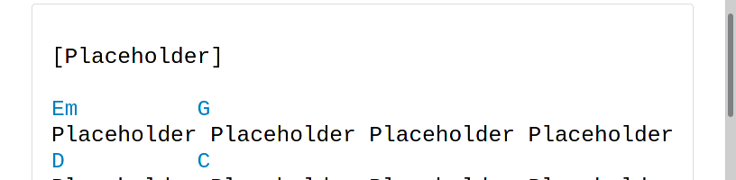 But when I then click the
 Full page option, it becomes clear that it doesn't and that it's not reliable, especially when I reduce the window size:
So setting the font size using the vw units doesn't appear to do the trick for me.
Any ideas how I could achieve this properly?
 736
736
If you're fine width a javascript solution, here's a simple one.
It consist in retrieving the width of div and font size, it calculates the width of a single character, and finally calculates the new maximum font size according to these informations.
You must also specify in the script the maximum number of characters you can have on the longest line of text:
Placeholder Placeholder Placeholder Placeholder
In this example above, there are 47 characters on the longest line of text;
var container = document.getElementById("container"),
  cs = getComputedStyle(container),
  containerPB = parseFloat(cs.paddingLeft) + parseFloat(cs.paddingRight) + parseFloat(cs.borderLeftWidth) + parseFloat(cs.borderRightWidth), //containerPadding + containerBorderWidth
  containerWidth = container.offsetWidth - containerPB,
  containerFontSize = parseFloat(cs.fontSize),
  containerFontFamily = cs.fontFamily,
  span = document.createElement("SPAN"),
  char = document.createTextNode("a"),
  charMax = 47, //max characters per line
  alpha = 1.00; //represent font scaling based on width
span.style.fontFamily = containerFontFamily;
span.appendChild(char);
span.style.visibility = "hidden";
document.body.appendChild(span);
//GETTING THE WIDTH OF A SINGLE CHAR
var charWidth = span.getBoundingClientRect().width;
document.body.removeChild(span);
container.style.fontSize =
  (containerWidth * containerFontSize * alpha) / (charWidth * charMax) + "px";
window.addEventListener("resize", function(e) {
  //update the width of container
  containerWidth = container.offsetWidth - containerPB;
  //update the font-size
  container.style.fontSize =
    (containerWidth * containerFontSize * alpha) / (charWidth * charMax) + "px";
});
* {
padding: 0;
margin: 0;
box-sizing: border-box;
}
#container {
border: 1px solid #ddd;
color: #000;
font-family: Courier New, monospace, Courier;
margin: 0 auto;
padding: 0.375rem;
width: 90%;
}
#container>span {
/* Chords*/
color: #007fbf;
cursor: pointer;
}<pre id="container">[Placeholder]
<span>Em</span> <span>G</span>
Placeholder Placeholder Placeholder Placeholder
<span>D</span> <span>C</span>
Placeholder Placeholder Placeholder Placeholder</pre>Let's first have a look at why the size of the text is the way it currently is. 3vw means 3% of the viewport width. Important to note is that this value is used for the height of the characters. We can calculate the width of the full text in a percentage of the viewport width. This only works for a mono font.
To start of we need the width/height ration of the font. The width of a mono-spaced character depends on the font. I will be working with Courier New for this example. I'm not sure where exactly to find this so I will be using a approximate of 99/188.

If the maximum amount of characters is:
11 * 4 (Placeholder) + 3 (spaces) = 47
Then the width of 47 characters is:
47 * 3vw * (99/188) = 74.25vw
So about 75% of the viewport width. This means when paddings, margins and borders take up more then 25% of the width (due to resizing the window) the contents of the text will no longer fit in its container.
So how do we make the content fit? We can use the CSS calc() function to subtract some a static value from a dynamic value. To do this we first have to know the width of the static values. In your example these are the static widths:
20px margin for #song-container
15px padding for .container-fluid
1px border for .panel
15px padding for .panel-body
Don't forget that all of these values are present on both sides, so they take up:
(20px + 15px + 1px + 15px) * 2 = 102px
We can't subtract this from the 3vw, because the 3vw is the height of one character whereas the 102px is the width of the static elements. So we now need to convert the 102px to the height of one character. This is done by spreading the width over all characters, then applying the ratio to convert from character width to height.
102px / 47 / (99/188) ≈ 4.121212121
Now we are comparing apples with apples and we can use calc(3vw - 102px / 47 / (99/188)) for the font size. You can now freely play around with the 3vw value. In the example I upped this value to 3.5vw.
Note that this isn't 100% accurate, I didn't account for character spacing and the font width/height ratio is based on a measurement, not a given.
#song-container {
    text-align: center;
    margin: 20px;
}
#song {
    color: #000;
    font-size: calc(3.5vw - 102px / 47 / (99/188));
    font-family: "Courier New",monospace,Courier;
    white-space: pre;
    word-break: break-all;
    text-align: left;
    display: inline-block;
}

#song > span { /* Chords*/
    color: #007fbf;
    cursor: pointer;
}
<link rel="stylesheet" href="https://maxcdn.bootstrapcdn.com/bootstrap/3.3.7/css/bootstrap.min.css" integrity="sha384-BVYiiSIFeK1dGmJRAkycuHAHRg32OmUcww7on3RYdg4Va+PmSTsz/K68vbdEjh4u" crossorigin="anonymous">
<script src="https://code.jquery.com/jquery-3.4.1.slim.min.js" integrity="sha384-J6qa4849blE2+poT4WnyKhv5vZF5SrPo0iEjwBvKU7imGFAV0wwj1yYfoRSJoZ+n" crossorigin="anonymous"></script>
<link rel="stylesheet" href="https://maxcdn.bootstrapcdn.com/bootstrap/3.3.7/css/bootstrap-theme.min.css" integrity="sha384-rHyoN1iRsVXV4nD0JutlnGaslCJuC7uwjduW9SVrLvRYooPp2bWYgmgJQIXwl/Sp" crossorigin="anonymous">
<script src="https://maxcdn.bootstrapcdn.com/bootstrap/3.3.7/js/bootstrap.min.js" integrity="sha384-Tc5IQib027qvyjSMfHjOMaLkfuWVxZxUPnCJA7l2mCWNIpG9mGCD8wGNIcPD7Txa" crossorigin="anonymous"></script>
<div class="container-fluid">
<div id="song-container">
<div class="panel panel-default">
<div class="panel-body">
<span id="song">
[Placeholder]
<span>Em</span> <span>G</span>
Placeholder Placeholder Placeholder Placeholder
<span>D</span> <span>C</span>
Placeholder Placeholder Placeholder Placeholder
</span>
</div>
</div>
</div>
</div>This works, but when the static widths, the maximum amount of characters or the font width/height ratio changes you have to recalculate the compensation value. For this reason a JavaScript library might be better suited. You can find a few of them described in the CSS-Trics post Fitting Text to a Container.
I would also suggest taking a look at the Font scaling based on width of container question, which has some other suggestions.
44
If you love us? You can donate to us via Paypal or buy me a coffee so we can maintain and grow! Thank you!
Donate Us With