 Menu
Menu
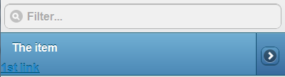
Based on the JQuery-Mobile example of the Split button list I am trying to generate a listview component in Android with two extra buttons to the right, one next to the other. The problem is that the code generates only one button and the second one is added as a link to the current item.
Here is my code:
<ul data-role="listview" data-filter="true" data-theme="b">
  <li>
    <a href="#" onclick="alert('the item!');">
      <h3>The item</h3>
    </a>
    <a href="#" onclick="alert('1st splitbutton!');">1st link</a>
    <a href="#" onclick="alert('2nd splitbutton!');">2nd link</a>
  </li>
</ul>
This is what it generates:
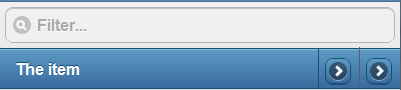
And something like this is what I am trying to produce:
Is there a way to achieve this? Thank you in advance.
 937
937
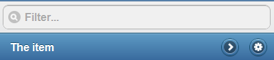
I was able at last to achieve something similar:
In case anyone is interested, here is the final code:
<ul data-role="listview" data-filter="true" data-theme="b" style="margin-bottom: 50px;">
  <li>
    <a href="#" onclick="alert('the item!');">
      <h3>The item</h3>
    </a>
    <a href="#" onclick="alert('1st splitbutton!');" class="split-button-custom" data-role="button" data-icon="gear" data-iconpos="notext">1st link</a>
    <a href="#" onclick="alert('2nd splitbutton!');" class="split-button-custom" data-role="button" data-icon="arrow-r" data-iconpos="notext">2nd link</a>
    <a href="#" style="display: none;">Dummy</a>
  </li>
</ul>
And the new defined classes:
.split-button-custom {
    float: right;
    margin-right: 10px;
    margin-top: -32px;
    border-bottom-left-radius: 1em 1em;
    border-bottom-right-radius: 1em 1em;
    border-top-left-radius: 1em 1em;
    border-top-right-radius: 1em 1em;
}

.split-button-custom span.ui-btn-inner {
    border-bottom-left-radius: 1em 1em;
    border-bottom-right-radius: 1em 1em;
    border-top-left-radius: 1em 1em;
    border-top-right-radius: 1em 1em;
    padding-right: 0px;
}

.split-button-custom span.ui-icon {
    margin-top: 0px;
    right: 0px;
    top: 0px;
    position: relative;
}
Inspired by Pablo's answer
<ul data-role="listview">
    <li>
        <a href="#">
            <img class="cover" src="images/cover.jpg"/>
            <h3>title</h3>
            <p>description</p>
        </a>
        <div class="split-custom-wrapper">
            <a href="#" data-role="button" class="split-custom-button" data-icon="gear" data-rel="dialog" data-theme="c" data-iconpos="notext"></a>
            <a href="#" data-role="button" class="split-custom-button" data-icon="delete" data-rel="dialog" data-theme="c" data-iconpos="notext"></a>
        </div>
    </li>
</ul>
by placing the links in a wrapper div there's no need for a 'dummy' anchor (and can take more than two anchors).
css styling gives the buttons the same height as the listitem, so the accessibility is the same as the standard split button
.split-custom-wrapper {
    /* position wrapper on the right of the listitem */
    position: absolute;
    right: 0;
    top: 0;
    height: 100%;
}

.split-custom-button {
    position: relative;
    float: right;   /* allow multiple links stacked on the right */
    height: 100%;
    margin:0;
    min-width:3em;
    /* remove boxshadow and border */
    border:none;
    moz-border-radius: 0;
    webkit-border-radius: 0;
    border-radius: 0;
    moz-box-shadow: none;
    webkit-box-shadow: none;
    box-shadow: none;
}

.split-custom-button span.ui-btn-inner {
    /* position icons in center of listitem*/
    position: relative;
    margin-top:50%;
    margin-left:50%;
    /* compensation for icon dimensions */
    top:11px;
    left:-12px;
    height:40%; /* stay within boundaries of list item */
}
If you love us? You can donate to us via Paypal or buy me a coffee so we can maintain and grow! Thank you!
Donate Us With

