 Menu
Menu
I am aware this has been answered previously however that was for the bottom of a div and I cannot work out how to do it for the left and right of a div.
I am trying to acheive the same effect as this:
BODY {
  background: url(http://farm6.staticflickr.com/5506/9699081016_ba090f1238_h.jpg) 0 -100px;
}
#wrapper {
  overflow: hidden;
  height: 116px;
}
#test {
  height: 100px;
  background-color: #ccc;
  position: relative;
}
#test:before {
  content: "";
  position: absolute;
  left: -6px;
  width: 50%;
  height: 16px;
  top: 100px;
  background-color: #ccc;
  -webkit-transform: skew(-40deg);
  -moz-transform: skew(-40deg);
  -o-transform: skew(-40deg);
  -ms-transform: skew(-40deg);
  transform: skew(-40deg);
}
#test:after {
  content: "";
  position: absolute;
  right: -6px;
  width: 50%;
  height: 16px;
  top: 100px;
  background-color: #ccc;
  -webkit-transform: skew(40deg);
  -moz-transform: skew(40deg);
  -o-transform: skew(40deg);
  -ms-transform: skew(40deg);
  transform: skew(40deg);
}
<div id="wrapper">
<div id="test"></div>
</div>But with the cut out on the left and another with the cut out on the right.
 577
577
This solution is adapted from this answer : Transparent arrow/triangle
The point is to use two skewed pseudo elements to make the transparent cut out arrow. Both pseudo elements are absolutely positioned and skewed.
In the following demo, the arrow is on the left. To make the same on on the right, you could duplicate the .arrow element and use scaleX(-1) + positioning on the second one. This will allow you to change both sides at the same time and have less CSS. Or you can make a new element based on the first one and change the positioning and skew properties.
DEMO
.wrap {
  position: relative;
  overflow: hidden;
  width: 70%;
  margin: 0 auto;
}
.wrap img {
  width: 100%;
  height: auto;
  display: block;
}
.arrow {
  position: absolute;
  left: 0; top:0;
  width: 3%;
  height:100%;
  background-color: rgba(255,255,255,.8);
}
.arrow:before, .arrow:after {
  content:'';
  position: absolute;
  left: 100%;
  width: 100%;
  height:50%;
  background-color: inherit;
}
.arrow:before {
  bottom: 50%;
  -ms-transform-origin: 0 100%;
  -webkit-transform-origin: 0 100%;
  transform-origin: 0 100%;
  -ms-transform: skewY(-45deg);
  -webkit-transform: skewY(-45deg);
  transform: skewY(-45deg);
}
.arrow:after {
  top: 50%;
  -ms-transform-origin: 0 0;
  -webkit-transform-origin: 0 0;
  transform-origin: 0 0;
  -ms-transform: skewY(45deg);
  -webkit-transform: skewY(45deg);
  transform: skewY(45deg);
}
<div class="wrap">
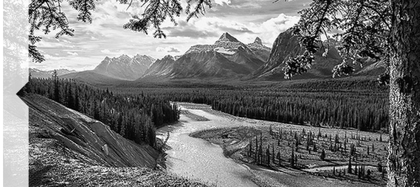
<img src="https://farm7.staticflickr.com/6217/6216951796_e50778255c.jpg" />
<div class="arrow"></div>
</div>For the same output, you can use an svg :
DEMO
.wrap {
  position: relative;
  overflow: hidden;
  width: 70%;
  margin: 0 auto;
}
.wrap img {
  width: 100%;
  height: auto;
  display: block;
}
.arrow{
  position:absolute;
  left:0; top:0;
  height:100%;
}
<div class="wrap">
<img src="https://farm7.staticflickr.com/6217/6216951796_e50778255c.jpg" />
<svg class="arrow" xmlns="http://www.w3.org/2000/svg" viewbox="0 0 10 100">
<path d="M-1 -1 H10 V45 L5 50 L10 55 V101 H-1z" fill="#fff" fill-opacity="0.8" stroke-width="0"/>
</svg>
</div>It can be made with a single element using inset box-shadow and pseudo-elements :before and :after
The elements are skewed by 45deg and -45deg to create the transparent gap. Inset box-shadow is used to increase the width of the arrow banner.
Fiddle (1 element)
body {
  font-size: 10px;
}
div {
  background: url('https://farm7.staticflickr.com/6217/6216951796_e50778255c.jpg');
  height: 33.3em;
  width: 50em;
  position: relative;
  overflow: hidden;
  box-shadow: inset 2em 0 0 0 rgba(255, 255, 255, 0.6);
}
div:before, div:after {
  content: "";
  position: absolute;
  left: 2em;
  background-color: rgba(255, 255, 255, 0.6);
  height: 25em;
  width: 2em;
  -webkit-transform-origin: 0% 0%;
  -moz-transform-origin: 0% 0%;
  -ms-transform-origin: 0% 0%;
  transform-origin: 0% 0%;
}
div:before {
  bottom: -8.35em;
  -webkit-transform: skewY(45deg);
  -moz-transform: skewY(45deg);
  -ms-transform: skewY(45deg);
  transform: skewY(45deg);
}
div:after {
  top: -8.35em;
  -webkit-transform: skewY(-45deg);
  -moz-transform: skewY(-45deg);
  -ms-transform: skewY(-45deg);
  transform: skewY(-45deg);
}<div></div>Bugs : Browser rendering of box-shadow isn't consistent when using veiwport units. On zooming-out to 33%, GC shows 1px gap b/w pseudo-element and box-shadow. This bug doesn't occur with px and em units on zooming.
A better approach than the one given above would be to use one element on top of img element. The rest properties (overflow: hidden;, box-shadow) too are used, but this doesn't have the gap between the arrow even on zooming.
Fiddle (2 elements)

Note :
em with a set font-size of 10px.
41
If you love us? You can donate to us via Paypal or buy me a coffee so we can maintain and grow! Thank you!
Donate Us With


