 Menu
Menu
So this question will probably get downvoted but I figure someone might be able to help.
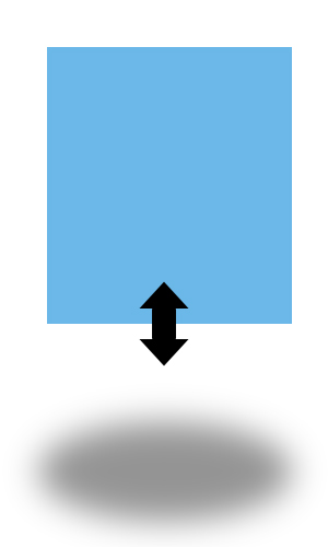
The effect I am looking for is the blue block hovering up and down like a balloon, and the shadow growing and shrinking beneath it, as the block goes up and down, on a loop.
Any ideas on how to program this, or is anyone aware of a tutorial/plugin that might accomplish?
 565
565
You can do it with jQuery or either with CSS3, your call, I'll show you both:
CSS3:
#box{
  position:absolute;
  top:100px;
  left:0;
  width:200px;
  height:200px;
  background:#6CB8E9;
     -moz-animation:jump 2s infinite ease-in-out;
  -webkit-animation:jump 2s infinite ease-in-out;
}

#shadow{
  position:absolute;
  top:290px;
  height:20px;
  border-radius:30px;
  left: -200px;
  background:transparent;
  width:200px;
  box-shadow:200px 0 10px 2px rgba(0,0,0,0.4);
  margin-left:0;
  opacity: 1;
     -moz-animation:shadowSize 2s infinite ease-in-out;
  -webkit-animation:shadowSize 2s infinite ease-in-out;
}

@-moz-keyframes jump {
    0%   { top:100px;}
    50%  { top:25px;}
    100% { top:100px;}
}
@-webkit-keyframes jump {
    0%   { top:100px;}
    50%  { top:25px;}
    100% { top:100px;}
}

@-moz-keyframes shadowSize {
    0%   { width:200px; margin-left:0px; opacity:1;   box-shadow:200px 0 10px rgba(0,0,0,0.7);}
    50%  { width:150px; margin-left:25px;opacity:0.3; box-shadow:200px 0 30px rgba(0,0,0,0.3);}
    100% { width:200px; margin-left:0px; opacity:1;   box-shadow:200px 0 10px rgba(0,0,0,0.7);}
}
@-webkit-keyframes shadowSize {
    0%   { width:200px; margin-left:0px; opacity:1;   box-shadow:200px 0 10px rgba(0,0,0,0.7);}
    50%  { width:150px; margin-left:25px;opacity:0.3; box-shadow:200px 0 30px rgba(0,0,0,0.3);}
    100% { width:200px; margin-left:0px; opacity:1;   box-shadow:200px 0 10px rgba(0,0,0,0.7);}
}
Now, with our dear jQ... just use a .png image for the shadow instead of my ugly box-shadow :)
var li = 1; // a LoopIterations variable

function loop(){

    li = ++li%2;  // reset evenly to '0' // results in 0, 1, 0, 1, 0, ....

  $('#shadow').animate({
      width:       !li ? 150:200 ,
      marginLeft:  !li ? 25:0 ,
      opacity:     !li ? 0.3:1
  }, 2000);

  $('#box').animate({
    top:        !li ? 25 : 100
  },2000, loop);   // THIS 'loop' callback will recall the loop() function creating ... a loop :D

}

loop(); // start loop
To explain:
On every odd iteration li will be set to 0, and on every other to 1 thanks to % (Modulo operator).0 in Javascript can be represented as false, great for the use of a ternary operator that will check for two Boolean values e.g:
[true or false statement] ? [do this if true] : [do that if false] ;
!li ? 150:200 means if !li (= 0 = is false) use 200 else use 150
Additionally:
<div id="box"></div>
<div id="shadow"></div>
and CSS:
#box{
  position:absolute;
  top:100px;
  width:200px;
  height:200px;
  background:#6CB8E9;
}

#shadow{
  position:absolute;
  top:310px;
  height:1px;
  background:rgba(0,0,0,0.26);
  width:200px;
  box-shadow:0 0 14px 2px #000;
  margin-left:0;
  opacity: 1;
}
If you love us? You can donate to us via Paypal or buy me a coffee so we can maintain and grow! Thank you!
Donate Us With

