 Menu
Menu
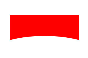
I'm trying to create an arch using just CSS. I've looked into various "inset border-radius" questions, but all of them show how to inset corners, not the middle section of an object.
I'm looking for a way to inverse the middle of an object to create an arch like a bridge.
Included is an example image to show the sort of thing I'm trying to achieve.
Edit:
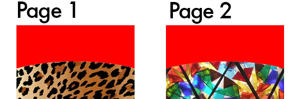
An important part of this arch is that it will be placed over other objects. Simply whiting it out isn't a solution, rather just a temporary hack. See image below for more on that.
 930
930
You could accomplish with radial gradients. I’ve put an example up on JSFiddle: http://jsfiddle.net/17ohey9h/
The basic idea is to have a big overlay (generated content clipped to the container with overflow: hidden) and then to give it a background of a radial gradient with a hard stop for the transition. We can do this by setting two stops at the same position, but with opposite translucencies:
radial-gradient(ellipse at center, rgba(255,0,0,0) 0%,rgba(255,0,0,0) 50%,rgba(255,0,0,1) 50%,rgba(255,0,0,1) 100%)
You can obviously play around with the colours and positionings, the general idea holds. I’ve also only provided the W3C syntax for this. You’ll need to add in the older versions dependent on how far back your required browser support goes.
184
Given the images you've posted, you might consider another approach to this, such as this: http://codepen.io/pageaffairs/pen/lpLHg
<!DOCTYPE html>
<html lang="en">
<head>
<meta charset="utf-8">
<style>

div {background: red; padding-top: 100px; width: 400px; text-align: center; overflow: hidden;}
img {border-radius: 200px/30px ; display: block; margin: 0 0 -30px -10px;}

</style>
</head>
<body>

<div>
    <img src="http://placeimg.com/420/420/any">
</div>

</body>
</html>
Another way to solve it, using box-shadow
.overlay::after {
    content: "";
    position: absolute;
    width: 100%;
    height: 50%;
    top: 30px;
    border-radius: 50%;
    box-shadow: 0px -100px 0px 72px red;
 }
fiddle
Reusing Robin fiddle :-)
31
Html :
<div class="wrapper">
   <div class="rectangle"></div>
   <div class="egg"></div>
</div>
CSS :
.wrapper {
  width:200px;
  height:100px;
  overflow:hidden;
  position:relative;
}
.rectangle{
  width:200px;
  height:100px;
  background-color:red;
}
.egg {
  width:200px;
  height:100px;
  border-radius:50%;
  background-color:#fff;
  position:absolute;
  top:56px;
}
and the fiddle : http://jsfiddle.net/h1gjefk7/
30
If you love us? You can donate to us via Paypal or buy me a coffee so we can maintain and grow! Thank you!
Donate Us With