 Menu
Menu
I've recently started doing some stuff in WPF and I came up with an idea to integrate maps into my application. I tried some stuff with Google Maps, but the capabilities aren't that great, so after a while I gave up on Google Maps in WPF.
A little while later I bumped into Bing Maps. This looked way more promising than Google Maps to use with WPF. I've started playing around with Bing's Maps and the capabilities are great!
However, when I tried to put a pushpin on the map it wasn't immediately clear to me how to add a infobox to the pushpin, when hovering over it. I have found some examples how to do so, but it required procedural code linked to the xaml. I was actually looking for a method without using procedural code.
Is it possible to add a infobox to a pushpin with just xaml? Or does anyone have a good alternative method on how to do so?
There is a tooltip property available though, but I wasn't actually looking for that. I was actually looking for Google Maps' pushpin kind of style (if it is available).
 741
741
Assuming I understand correctly what you want, I believe the short answer is: Sorry, but it's not possible to add a Google-Maps-style info box to a pushpin with just XAML. However, I'll try to help if I can.
Disclaimer: I've been playing with the Bing Maps control for Silverlight, so hopefully this will be applicable to the WPF version of the control as well.
I imagine that you don't want to use the built-in ToolTip either because you want it to look different (i.e. not just a yellow box with text) or because you want it to not disappear when the user moves the mouse away.
If you just want it to look different, I can offer the following. When I specified a template for my Pushpins, I went ahead and used a re-templated ToolTip and allowed the user to click the pushpin to get more information.
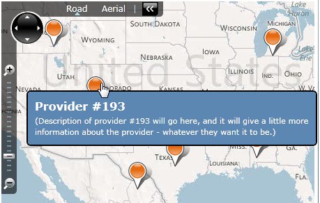
Here's the ToolTip template, defined as a StaticResource, which of course could contain anything you want:
<Style x:Key="MyToolTipStyle" TargetType="ToolTip">
    <Setter Property="Template">
        <Setter.Value>
            <ControlTemplate>
                <Border CornerRadius="5" BorderBrush="Black" BorderThickness="2" Background="#5c87b2">
                    <ContentPresenter Margin="5">
                        <ContentPresenter.Content>
                            <StackPanel Margin="5" MaxWidth="400">
                                <TextBlock Text="{Binding Name}" FontWeight="Bold" FontSize="16" Foreground="White" TextWrapping="Wrap"/>
                                <TextBlock Text="{Binding Description}" Foreground="White" TextWrapping="Wrap"/>
                            </StackPanel>
                        </ContentPresenter.Content>
                    </ContentPresenter>
                </Border>
            </ControlTemplate>
        </Setter.Value>
    </Setter>
</Style>
And here's where I used it:
<maps:Map>
    <maps:MapItemsControl ItemsSource="{Binding SearchResultsManager.Items}">
        <maps:MapItemsControl.ItemTemplate>
            <DataTemplate>
                <maps:Pushpin Location="{Binding Location}" Cursor="Hand" MouseLeftButtonUp="Pushpin_MouseLeftButtonUp">
                    <ToolTipService.ToolTip>
                        <ToolTip Style="{StaticResource MyToolTipStyle}" />
                    </ToolTipService.ToolTip>
                </maps:Pushpin>
            </DataTemplate>
        </maps:MapItemsControl.ItemTemplate>
    </maps:MapItemsControl>
</maps:Map>
Then I'd handle when the user clicked on the pushpin to take them to a details area.
private void Pushpin_MouseLeftButtonUp(object sender, MouseButtonEventArgs e)
{
    // Get a reference to the object that was clicked.
    var clickedSearchResult = (sender as FrameworkElement).DataContext as SearchResultViewModel;

    // Do something with it.
}
However, I imagine you want to keep the ToolTip from disappearing, so that the user can click on controls inside it. Unfortunately, I'm not sure there's a simple way to do that. You might have to define your own custom control, which of course would require some C#/VB code.
Perhaps this new control could derive from Pushpin, and it could show the info box content on mouse-over and/or click. You could use the VisualStateManager to keep most of the code in XAML. The C#/VB would just have to provide a dependency property for the content and some overrides to transition between the visual states at the correct times.
I hope that's at least a little bit helpful!
188
If you love us? You can donate to us via Paypal or buy me a coffee so we can maintain and grow! Thank you!
Donate Us With

