 Menu
Menu
I want to create two widgets. Both displaying a 2 column grid with buttons that can be selected/unselected. One should have radio logic (single selection) where as the other should have checkbox logic (multiple selection).
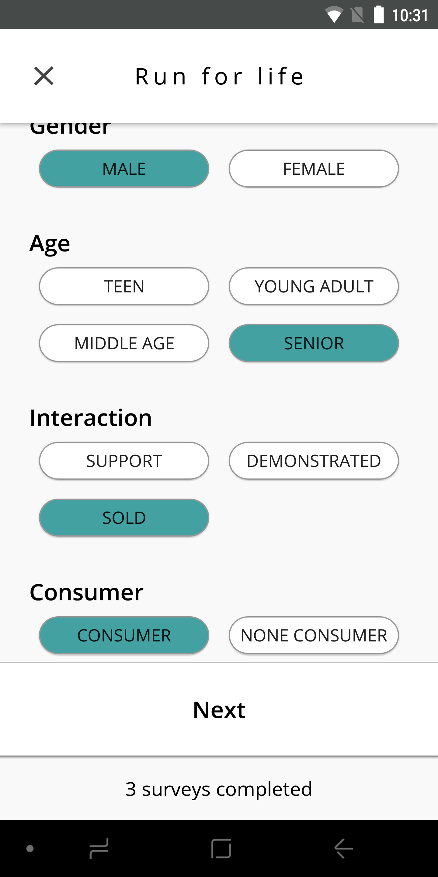
This is my android implementation I'm trying to recreate in Flutter:
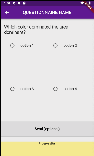
I tried using a GridView with RadioListTiles, thinking I could replace the RadioButton icon with my own widget while retaining the logic. I can't see any way to do this. I also realized GridView in Flutter does not auto wrap it's children, resulting in each radio tile only taking up the first 10% of the entire cell.
This is where I'm at the moment:
class RadioSelect extends StatefulWidget {
    final QuestionData question;

    RadioSelect({this.question});

    @override
    RadioSelectState createState() => RadioSelectState(question);
}

class RadioSelectState extends State<RadioSelect> {
  RadioSelectState(this._question);

  final QuestionData _question;
  final SliverGridDelegate delegate =
    SliverGridDelegateWithFixedCrossAxisCount(crossAxisCount: 2);
  int _selectedIndex;

  @override
  Widget build(BuildContext context) {
    return GridView.builder(
      gridDelegate: delegate,
      padding: EdgeInsets.all(0),
      itemCount: _question.selectOptions.length,
      itemBuilder: (context, index) {
        return RadioListTile(
          groupValue: _selectedIndex,
          title: Text(_question.selectOptions[index]),
          value: index,
          onChanged: (newIndex) {
           setState(() {
              _selectedIndex = newIndex;
            });
          },
        );
      },
    );
  }
}
Resulting in:
I want to follow the most "Fluttery" way possible. What do you reckon is my best cause of action?
 712
712
This is what worked for Me.
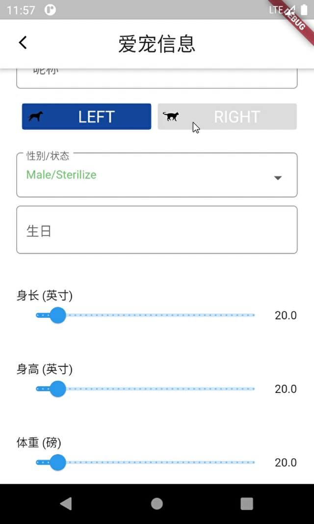
to mimic radio button behavior I used "ChoiceChip". You can see in the code bellow the parent widget is a "row", but i think "wrap" as a parent widget may serve best this use case.
The proprety shape of the "ChoiceChip" can help to shape it as you need.
 Row(
                        mainAxisAlignment: MainAxisAlignment.spaceBetween,
                        crossAxisAlignment: CrossAxisAlignment.start,
                        children: [
                          Expanded(
                              child: ChoiceChip(
                                  avatar: image.asset(
                                      "assets/left.png",
                                      matchTextDirection: false,
                                      width: 20.0),
                                  label: Text('LEFT',
                                      textAlign: TextAlign.center,
                                      style: TextStyle(
                                          color: Colors.white, fontSize: 20)),
                                  labelPadding:
                                      EdgeInsets.symmetric(horizontal: 50),
                                  selected: choice== 'left',
                                  onSelected: (bool selected) {
                                    setState(() {
                                      choice= selected ? 'left' : null;
                                    });
                                  },
                                  selectedColor: Color(0xFF0D47A1),
                                  shape: ContinuousRectangleBorder(
                                      borderRadius:
                                          BorderRadius.circular(5.0)))),
                          Expanded(
                              child: ChoiceChip(
                                  avatar: image.asset(
                                      "assets/right.png",
                                      matchTextDirection: false,
                                      width: 20.0),
                                  label: Text('RIGHT',
                                      textAlign: TextAlign.center,
                                      style: TextStyle(
                                          color: Colors.white, fontSize: 20)),
                                  labelPadding:
                                      EdgeInsets.symmetric(horizontal: 50),
                                  selected: choice== 'right',
                                  onSelected: (bool selected) {
                                    setState(() {
                                      choice= selected ? 'right' : null;
                                    });
                                  },
                                  selectedColor: Color(0xFF0D47A1),
                                  shape: ContinuousRectangleBorder(
                                      borderRadius:
                                          BorderRadius.circular(5.0))))
                        ]),
The Result Looks like this
171
If you love us? You can donate to us via Paypal or buy me a coffee so we can maintain and grow! Thank you!
Donate Us With
