 Menu
Menu
I was a huge 960 grid system user, and I thought I would try out Twitter Bootstrap, but maybe it is a stupid question and you can laugh and down vote me but the fact is I don't understand the span and row.
So my problem is, when I create a container, and create spans inside of it, it does not fit next to each other correctly:
Like in 960gs if i write the following
<div class="container_12">
  <div class="grid_4"></div>
  <div class="grid_4"></div>
  <div class="grid_4"></div>
</div>
I get a perfect 3 column next to each other.
But I cannot achieve this with Twitter Bootstrap, no matter what I do, I always end up with disproportionate columns, so the columns do not fill the container as it supposed to, like with 960gs. If I place 3 columns, then the margin to the right is not correct, or it will not fit correctly in the container.
Boostrap example:
<div class="container">
    <div class="row">
        <div class="span4">
            <h2>Column one</h2>
            <p>
                Donec id elit non mi porta gravida at eget metus. Fusce dapibus, tellus ac cursus commodo, tortor mauris condimentum nibh, ut fermentum massa justo sit amet risus. Etiam porta sem malesuada magna mollis euismod. Donec sed odio dui.
            </p>
        </div>
    </div>
</div>
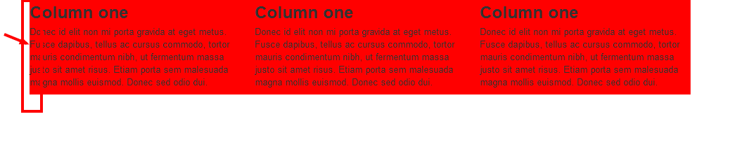
So in the example above, I end up with disproportionate columns, there is no margin in the first column to the left. If I do this in 960gs with the grid classes it is perfect.
What is different about Twitter Bootstrap when compared to 960gs that is causing my issue?
 398
398
Twitter Bootstrap is a front end framework to develop web apps and sites fast. In modern web development, there are several components which are required in almost all web projects. Bootstrap provides you with all those basic modules - Grid, Typography, Tables, Forms, Buttons, and Responsiveness.
At Twitter, Bootstrap has quickly become one of our many go-to front-end tools when starting new applications and sites.
The reason:
when screen width is <=940px, the -20px from row and the 20px margin from span4 cancel each other out, that's why the first span4 has no left margin.
The 'twitter bootstrap' solution:
Add bootstrap-responsive.css and when the screen goes under 980px and beyond 768px:
container become 724px, row 744px and span4 228px, keeping a left margin on first span4.
143
If you love us? You can donate to us via Paypal or buy me a coffee so we can maintain and grow! Thank you!
Donate Us With

