 Menu
Menu
Using a responsive fluid grid and images are 800px x 500px
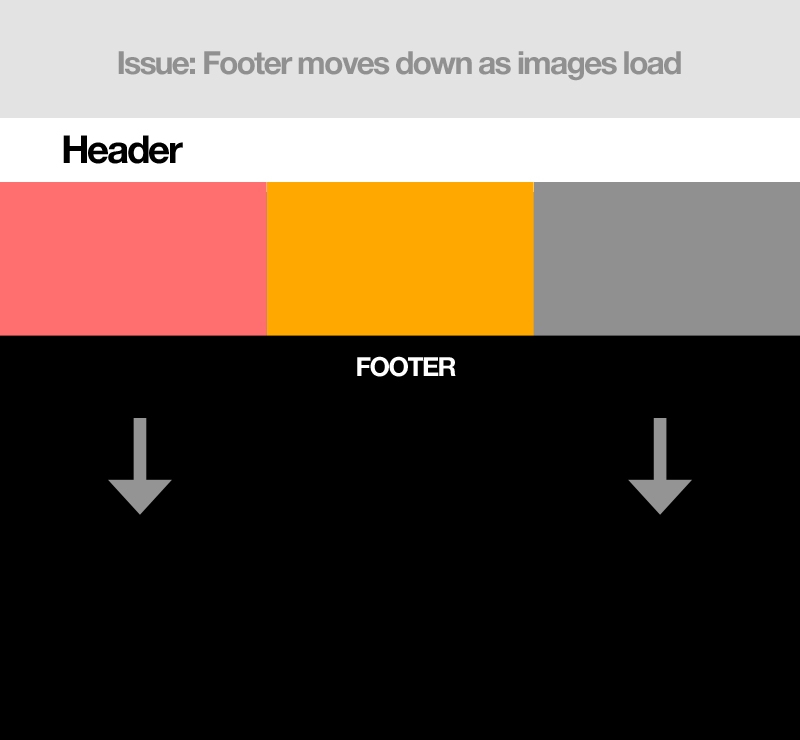
Problem: When images load, the footer as it the top and is pushed down while the images are loading in.
Setup: Using a div for the images and div for the footer.
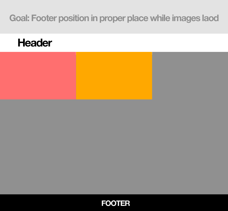
Goal: To have the footer always remain in the correct position, not trying to put it in an absolute spot, just looking to have the images spacing accounted for.
Ideas: Perhaps use a transparent png at 800x500 so it loads first before the images.
Concerns: Creating a div placeholder at 800x500 might not work as these images are responsive in a fluid grid so they'll never actually be at that size unless the viewer has a huge monitor..
Final result when images loaded:

Current issue:
Goal for images to load:
 287
287
When I know the aspect ratio for something is going to stay the same no matter what the width of the elements/screen is, I do something like this:
.image-holder {
    display: inline-block;
    width: 33.333%;
    position: relative;
}
.image-holder:before {
    content:"";
    display: block;
    padding-top: 62.5%;
}
.image-holder img {
    position: absolute;
    top: 0;
    left: 0;
    width: 100%;
    height: 100%;
}
Here's a full demo: http://jsfiddle.net/serv0m8o/1/
I wrap each image in a div with a class of image-holder (which is styled to give you the 3 per row pattern that you illustrated) and make sure it is position: relative;
I then style the :before pseudo-element of that div to be the proper height of the aspect ratio that is needed. Padding in CSS is an intrinsic property, which means it is based on the width of the element, allowing you to assign a percentage which reflects the ratio. You specified 800x500 images, so (500/800*100) = 62.5% as my padding-top
Then, you can absolutely position your image to fill the full width and height of the container (which is why we set it to be position: relative;)
Doing this means that the div element is the size that the image will be, whether the image is loaded into it or not (the image itself has no bearing on the container size, since it is absolutely positioned)
199
If you love us? You can donate to us via Paypal or buy me a coffee so we can maintain and grow! Thank you!
Donate Us With