 Menu
Menu
Given a basic four-column layout with a simple continuous paragraph of text, along with just one image spanning three columns, top-right aligned, how can we span our image over the final three columns so that our text flows automatically around the image?
.quatroColumns{} /* css multi column 4 columns */ .imageSpanning2Columns{} /* align to top-right */ .imageSpanning3Columns{} /* align to top-right */ .imageDescription{} /* description box over image */ http://jsfiddle.net/Vbr9d/205/ (a pain to find where the image should go: not simple & not elegant start!)
http://jsfiddle.net/Vbr9d/206/ (looks ugly, but HTML starts elegantly seperating image & text pragraph!)
*Forget older browser versions except major current ones: Firefox, Internet Explorer, Chrome, Safari. Any ideas, directions or experiments are welcome. Alternative JavaScript implementations for splitting the paragraph text into different divs automatically are welcome too.
 329
329
The value of column-span can either be all or none . Set an element with column-span: all to make it span the columns. The value none for the property is the kill switch for a spanning element. You might use this when working with media queries to tell the spanning element to stop spanning.
The basic idea of multicol, is that you can take a chunk of content and flow it into multiple columns, as in a newspaper. You do this by using one of two properties. The column-count property specifies the number of columns that you would like the content to break into.
With CSS3, you can split the text content of an element in multiple columns.
This is a cleaned up solution that should work in all major browsers. It relays on an absolute positioned image instead of using column-span since Firefox not yet supports that.
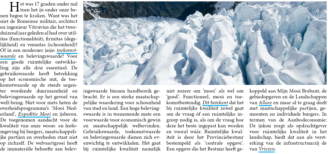
/* Just to make it look a little nicer */ body { font-size: 16px; line-height: 1.4; color: #333; padding: 1em; } article { /* We're giving our article a max-width. This isn't needed if a parent already does this.*/ max-width: 860px; /* Create a 4 column layout */ -webkit-column-count: 4; -moz-column-count: 4; column-count: 4; /* Give each column a little added spacing */ -webkit-column-gap: 20px; -moz-column-gap: 20px; column-gap: 20px; /* To be able to absolute position the image we need to give the parent a position */ position: relative; /* This pulls up the first column of text to align with the image */ padding-top: 225px; } article img { /* Absolute position our image */ position: absolute; /* Place it in the top right cornet */ top: 0; right: 0; /* Give it a height of 200px, this can of course be change if needed. If you update the height here make sure you also change the padding-top of the article and the negative margin later down. */ height: 200px; /* We only want the image to spread 3 columns in width, that's 75% of the entire width. We also use 10px (half of the column-gap). */ width: calc(75% - 10px); } /* Give the first paragraph a negative margin to pull it back up. (right now we're only using one parapgrah but if you'd want more in the future lets be specific here) */ article p:first-of-type { margin-top: -225px; } /* Some media queries to make it look nice on all resolutions */ @media screen and (max-width: 800px) { article { padding-top: 0; -webkit-column-count: 2; -moz-column-count: 2; column-count: 2; } article p:first-of-type { margin-top: 0; } article img { position: static; margin: 0 0 30px; width: 100%; height: auto; } } @media screen and (max-width: 600px) { article { -webkit-column-count: 1; -moz-column-count: 1; column-count: 1; } }<article> <img src="http://www.robfraser-photographer.co.uk/wp-content/uploads/2012/07/SHOT-9.jpg" /> <p>Het was 17 graden onder nul toen het ijs onder onze benen begon te kraken. Consectetuer adipiscing elit, sed diam nonummy nibh euismod tincidunt ut laoreet dolore magna aliquam erat volutpat. Ut wisi enim ad minim veniam. Paragraph Duis autem vel eum iriure dolor in hendrerit in vulputate velit esse molestie consequat, vel illum dolore eu feugiat nulla facilisis at vero eros et accumsan et iusto odio dignissim qui blandit praesent luptatum zzril delenit augue duis dolore te feugait nulla facilisi.Nam liber tempor cum soluta. nobis eleifend option congue nihil imperdiet doming id quod mazim placerat facer possim assum. Dolor sit amet, consectetuer adipiscing elit, sed diam nonummy nibh euismod tincidunt ut laoreet dolore magna aliquam erat volutpat. Ut wisi enim ad minim veniam.Paragraph Duis autem vel eum iriure dolor in hendrerit in vulputate velit esse molestie consequat, vel illum dolore eu feugiat nulla facilisis at vero eros et accumsan et iusto odio dignissim qui blandit praesent luptatum zzril delenit augue duis dolore te feugait nulla facilisi.Nam liber tempor cum soluta nobis eleifend option congue nihil imperdiet doming id quod mazim placerat facer possim assum. Consectetuer adipiscing elit, sed diam nonummy nibh euismod tincidunt ut laoreet dolore magna aliquam erat volutpat. Ut wisi enim ad minim veniam.Paragraph Duis autem vel eum iriure dolor in hendrerit in vulputate velit esse molestie consequat, vel illum dolore eu feugiat nulla facilisis at vero eros et accumsan et iusto odio dignissim qui blandit praesent luptatum zzril delenit augue duis dolore te feugait nulla facilisi.Nam liber tempor cum soluta nobis eleifend option congue nihil imperdiet doming id quod mazim placerat facer possim ass.</p> </article>For a scss version of this look at the this codepen
This answer originally contained a solution using column-span (sadly not yet supported by Firefox). For reference I've added this solution as a separate answer to this question.
167
If you love us? You can donate to us via Paypal or buy me a coffee so we can maintain and grow! Thank you!
Donate Us With

