 Menu
Menu
I am trying to create a flexbox-based grid, with the content being 2/3 width and the side bar the remaining 1/3.
I have used percentages for the width in each col, which unfortunately are giving me errors in the navigation and header.
Why is this? And how can I make this without using percentages, to avoid the errors?
CodePen demo
@import url(https://fonts.googleapis.com/css?family=Open+Sans:400,300,600,700);
*,
*:before,
*:after {
  box-sizing: border-box;
}

html body {
  margin: 0;
  padding: 0;
  font-family: 'Open Sans', sans-serif;
}

h1,
h2,
h3,
h4,
h5,
p,
a,
li,
ul {
  margin: 0;
  padding: 0;
}


/* centres content of website in a width of 950px */

.container {
  width: 80%;
  margin: 0 auto;
}


/* Header styling */

header {
  background: #66b3ff;
  /*   padding: 10px; */
}


/* Logo */

#logo h1 {
  font-weight: 300;
  margin-top: 30px;
}

#logo h1 span {
  font-weight: 600;
}


/* end of Logo */


/* Nav */

nav ul {
  margin: 0;
  padding: 0;
  display: flex;
  margin-top: 50px;
}

li {
  flex: 1;
  list-style: none;
}

a {
  text-decoration: none;
}


/* End of header styling */


/* Columns */

.col1,
.col2,
.col3,
.col4,
.col5,
.col6,
.col7,
.col8,
.col9,
.col10,
.col11,
.col12 {
  margin: 0 5px 0 5px;
}

.row {
  display: flex;
  flex-direction: row;
  flex-wrap: nowrap;
}

.col1 {
  width: 8%;
}

.col2 {
  width: 16%;
}

.col3 {
  width: 25%;
}

.col4 {
  width: 33%;
}

.col5 {
  width: 41%;
}

.col6 {
  width: 50%;
}

.col7 {
  width: 58%;
}

.col8 {
  width: 66%;
}

.col9 {
  width: 75%;
}

.col10 {
  width: 83%;
}

.col11 {
  width: 91%;
}

.col12 {
  width: 100%;
}
<header>
<div class="container">
<div class="row">
<!-- row -->
<!-- header -->
<div id="logo" class="col col6">
<h1>Bespoke<span>Design</span>Agency</h1>
</div>
<nav class="col col6">
<ul>
<!-- Navigation -->
<li><a href="">HOME</a>
</li>
<li><a href="">ABOUT</a>
</li>
<li><a href="">GALLERY</a>
</li>
<li><a href="">CONTACT</a>
</li>
</ul>
</nav>
<!-- end of Navigation -->
</div>
</div>
<!-- End of container -->
</header>
<!-- end of header -->
<!-- end of row -->
<div class="container mainContentContainer">
<!-- Website CONTENT -->
<div class="row">
<!-- row -->
<!-- Main content -->
<div class="col col8" id="maincontent">
<h1>Main Website content here</h1>
<p>Authentic truffaut put a bird on it tacos crucifix. Kale chips craft beer austin, organic small batch salvia squid. Readymade health goth put a bird on it, yr semiotics shabby chic williamsburg selfies man braid godard. DIY blog lomo selvage. Pabst
echo park tacos, kinfolk chicharrones thundercats farm-to-table offal twee keffiyeh affogato irony helvetica banjo. Bicycle rights XOXO irony mumblecore tofu, keffiyeh kitsch retro plaid seitan street art. Chartreuse ennui helvetica 90's you probably
haven't heard of them godard, DIY keffiyeh listicle 3 wolf moon mustache.</p>
</div>
<!-- end of main content -->
<!-- sidebar content -->
<div id="sidebar" class="col col4">
<h1>side bar here</h1>
</div>
<!-- end of sidebar -->
</div>
<!-- end of row -->
<div class="row">
<footer class="col col12">
<h1>footer content</h1>
</footer>
</div>
</div> 244
244
The flex-basis property If flex-basis is set to auto then to work out the initial size of the item the browser first checks if the main size of the item has an absolute size set. This would be the case if you had given your item a width of 200 pixels. In that case 200px would be the flex-basis for this item.
Flex-basis overrules any specified CSS width value, so if you set flex-basis to 0, it doesn't fall back to the CSS "width" value. However, the only way it'll actually be 0px wide is if there's absolutely no content or padding inside it (which would be uncommon in real-world use).
in the case of a flexbox, if you set flex:1; to childs, it will spray them evenly.
2 childs = 50% average including margin , bordeers ... 3 childs = 33% average ...
if you have 2 childs, and want 33% / 66% set : flex:1; to one and flex:2; to the other .or flex:33.33 and flex:66.66 if this seems clearer to you :)
examples:
.flex {
  display:flex;
}
div div {
  flex:1;
  padding:0.5em;
  border:solid;
  margin:5px;
}
.f2 {
  flex:2;
}
<div class="flex">
<div></div>
<div></div>
</div>
<div class="flex">
<div></div>
<div></div>
<div></div>
</div>
<div class="flex">
<div></div>
<div></div>
<div></div>
<div></div>
</div>
<div class="flex">
<div></div>
<div class="f2"></div>
</div>
<div class="flex">
<div></div>
<div class="f2"></div>
<div></div>
</div>Consider using the flex-grow property for sizing flex items. This property tells flex items what amount of free space in the container they should absorb.
Here are some examples of how flex-grow distributes space in a row:
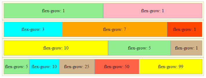
.container:nth-child(1) > .box { flex-grow: 1;  background-color: lightgreen; }
.container:nth-child(1) > .box:last-child { background-color: lightpink; }
.container:nth-child(2) > .box:nth-child(1) { flex-grow: 3; background-color: aqua; }
.container:nth-child(2) > .box:nth-child(2) { flex-grow: 7; background-color: orange; }
.container:nth-child(2) > .box:nth-child(3) { flex-grow: 1;  background-color: orangered;}
.container:nth-child(3) > .box:nth-child(1) { flex-grow: 10; background-color: yellow; }
.container:nth-child(3) > .box:nth-child(2) { flex-grow: 5; background-color: lightgreen; }
.container:nth-child(3) > .box:nth-child(3) { flex-grow: 1; background-color: tan; }
.container:nth-child(4) > .box:nth-child(1) { flex-grow: 5; bacground-color: pink; }
.container:nth-child(4) > .box:nth-child(2) { flex-grow: 10; background-color: aqua; }
.container:nth-child(4) > .box:nth-child(3) { flex-grow: 25; background-color: tan; }
.container:nth-child(4) > .box:nth-child(4) { flex-grow: 50; background-color: tomato; }
.container:nth-child(4) > .box:nth-child(5) { flex-grow: 99; background-color: yellow; }


body {
    display: flex;
    flex-direction: column;
    align-items: center;
}

.container {
    display: flex;
    width: 95%;
    padding: 5px;
    border: 1px solid #ccc;
    background-color: lightyellow;
}

.box {
    height: 50px;
    background-color: lightgreen;
    border: 1px solid #aaa;
    display: flex;
    justify-content: center;
    align-items: center;
}
<div class="container">
<div class="box"><span>flex-grow: 1</span></div>
<div class="box"><span>flex-grow: 1</span></div>
</div>
<div class="container">
<div class="box"><span>flex-grow: 3</span></div>
<div class="box"><span>flex-grow: 7</span></div>
<div class="box"><span>flex-grow: 1</span></div>
</div>
<div class="container">
<div class="box"><span>flex-grow: 10</span></div>
<div class="box"><span>flex-grow: 5</span></div>
<div class="box"><span>flex-grow: 1</span></div>
</div>
<div class="container">
<div class="box"><span>flex-grow: 5</span></div>
<div class="box"><span>flex-grow: 10</span></div>
<div class="box"><span>flex-grow: 25</span></div>
<div class="box"><span>flex-grow: 50</span></div>
<div class="box"><span>flex-grow: 99</span></div>
</div>Note that the flexbox spec recommends using flex-grow as part of the flex shorthand property.
Authors are encouraged to control flexibility using the
flexshorthand rather than with its longhand properties directly, as the shorthand correctly resets any unspecified components to accommodate common uses.
For a detailed description of how flex-grow works, see this post:
When working with the flex property refer to the spec for a summary of common values.
flex
153
If you love us? You can donate to us via Paypal or buy me a coffee so we can maintain and grow! Thank you!
Donate Us With