 Menu
Menu
So I have 3 boxes that need to have a particular height and width and have set them within bootstrap as child elements. Looks good in full view as:
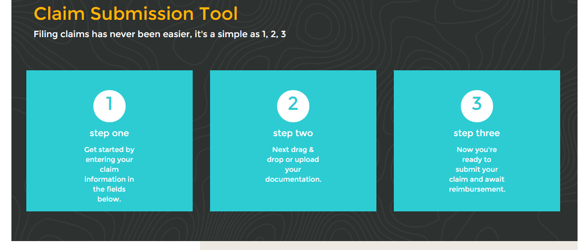
However, when the window resizes, the boxes shift to the left rather than float in the middle of that background graphic. Additionally, the header text (in yellow) loses its upper padding as:

Figured the "responsiveness" was taking over but cannot pinpoint it and am hoping some of you can help.
My HTML for these are:
<div class="container">
    <div class="claimHead col-md-12">
        <div class="submitHeader" style="margin-top: 60px; margin-bottom: 60px; margin-left: 30px;">
            <h1 style="font-size: 36px;">Claim Submission Tool</h1>
            <p style="font-size: 18px;">Filing claims has never been easier, it's a simple as 1, 2, 3</p>
        </div>
        <div id="stepsContainer">
            <div class="col-md-4 stepsBox">
                <div class="claimSteps" id="stepOne">
                    <p class="claimStepNumber">1</p>
                    <p class="claimStepTitle">step one</p>
                    <p class="claimStepText">Get started by entering your claim information in the fields below.</p>
                </div>
            </div>
            <div class="col-md-4 stepsBox">
                <div class="claimSteps" id="stepTwo">
                    <p class="claimStepNumber">2</p>
                    <p class="claimStepTitle">step two</p>
                    <p class="claimStepText">Next drag & drop or upload your documentation.</p>
                </div>
            </div>
            <div class="col-md-4 stepsBox">
                <div class="claimSteps" id="stepThree">
                    <p class="claimStepNumber">3</p>
                    <p class="claimStepTitle">step three</p>
                    <p class="claimStepText">Now you're ready to submit your claim and await reimbursement.</p>
                </div>
            </div>
        </div>
    </div>
</div>
And my css is:
#stepsContainer {
    text-align: center;
}

.stepsBox {
    padding-bottom: 60px;
}

.claimSteps {
    padding-top: 40px;
    width: 335px;
    height: 285px;
    background-color: #2dccd3;
    color: #ffffff;
    text-align: center;
}

.claimStepNumber {
    font-size: 38px;
    background-color: #ffffff;
    color: #2dccd3;
    width: 65px;
    height: 65px;
    border-radius: 50%;
    margin-left: 135px;
}

.claimStepTitle {
    color: #ffffff;
    font-size: 18px;
}

.claimStepText {
    text-align: center;
    margin-left: 33.3%;
    width: 33.3%;
}
Any ideas on what I can do here and where to check? Am also using Bootstrap 3 on top of this css, but I do not see where it is causing the boxes to shift left justified.
Thanks much.
 618
618
Our default .container class is a responsive, fixed-width container, meaning its max-width changes at each breakpoint.
Q 1 – Which of the following is correct about Bootstrap Grid System? A – Predefined grid classes like . row and . col-xs-4 are available for quickly making grid layouts.
The .container class provides a responsive fixed width container. The .container-fluid class provides a full width container, spanning the entire width of the viewport.
The Bootstrap documentation recommends using what they call a responsive column reset. By adding a clearing div between rows, it'll guarantee that each new row will begin flush against the left edge.
Columns are floated to the left by default and because you're using a fixed height/width inside of the columns (.claimSteps), they have no choice but to align left once the medium column collapses since they cannot occupy 100% of the smaller viewport.
The heading alignment has to due primarily to your HTML structure.
Note that one area you should consider changing is the width of the box you're creating. It's too wide and starts to break/overflow because it's fixed. If you can reduce it, you should (my examples reflect this but can easily be changed back to your default width.)
The fixed size of the box also comes into play at around 400px. In the second example I made the box flexible so it works properly across all viewports. See examples 1 and 2 on viewports under 400px.
Here are a few examples that may help.
Example 1: Standard Setup
.submitHeader {
  margin: 60px 0;
}
.submitHeader h1 {
  font-size: 36px;
}
.submitHeader p {
  font-size: 18px;
}
.claimSteps {
  width: 285px;
  height: 285px;
  background-color: #2dccd3;
  color: #ffffff;
  text-align: center;
  position: relative;
  margin: 0 auto;
  display: table;
}
.claimStepNumber {
  margin-top: 40px;
  font-size: 38px;
  background-color: #ffffff;
  color: #2dccd3;
  width: 55px;
  height: 55px;
  border-radius: 50%;
  position: absolute;
  display: table-cell;
  left: 50%;
  -webkit-transform: translate(-50%);
  -ms-transform: translate(-50%);
  transform: translate(-50%);
}
.claimStepTitle {
  color: #ffffff;
  font-size: 18px;
  margin-top: 110px;
}
.claimStepText {
  text-align: center;
  margin-left: 33.3%;
  width: 33.3%;
}
@media (min-width: 1200px) {
  .submitHeader {
    margin: 60px 40px;
  }
}
@media (max-width: 991px) {
  .claimSteps {
    margin: 30px auto;
  }
  .submitHeader {
    margin-top: 60px;
    margin-bottom: 0;
    text-align: center;
  }
}
<link href="https://maxcdn.bootstrapcdn.com/bootstrap/3.3.5/css/bootstrap.min.css" rel="stylesheet" />
<div class="container">
<div class="submitHeader">
<h1>Claim Submission Tool</h1>
<p>Filing claims has never been easier, it's a simple as 1, 2, 3</p>
</div>
<div class="row">
<div class="col-md-4">
<div class="claimSteps" id="stepOne">
<p class="claimStepNumber">1</p>
<p class="claimStepTitle">step one</p>
<p class="claimStepText">Get started by entering your claim information in the fields below.</p>
</div>
</div>
<div class="col-md-4">
<div class="claimSteps" id="stepTwo">
<p class="claimStepNumber">2</p>
<p class="claimStepTitle">step two</p>
<p class="claimStepText">Next drag and drop or upload your documentation.</p>
</div>
</div>
<div class="col-md-4">
<div class="claimSteps" id="stepThree">
<p class="claimStepNumber">3</p>
<p class="claimStepTitle">step three</p>
<p class="claimStepText">Now you're ready to submit your claim and await reimbursement.</p>
</div>
</div>
</div>
</div>Example 2: Mobile First Setup
.submitHeader {
  margin: 60px 0;
}
.submitHeader h1 {
  font-size: 36px;
}
.submitHeader p {
  font-size: 18px;
}
.claimSteps {
  width: 285px;
  height: 285px;
  background-color: #2dccd3;
  color: #ffffff;
  text-align: center;
  position: relative;
  margin: 0 auto;
  display: table;
}
.claimStepNumber {
  margin-top: 40px;
  font-size: 38px;
  background-color: #ffffff;
  color: #2dccd3;
  width: 55px;
  height: 55px;
  border-radius: 50%;
  position: absolute;
  display: table-cell;
  left: 50%;
  -webkit-transform: translate(-50%);
  -ms-transform: translate(-50%);
  transform: translate(-50%);
}
.claimStepTitle {
  color: #ffffff;
  font-size: 18px;
  margin-top: 110px;
}
.claimStepText {
  text-align: center;
  margin-left: 33.3%;
  width: 33.3%;
}
@media (min-width: 1200px) {
  .submitHeader {
    margin: 60px 40px;
  }
}
@media (max-width: 991px) {
  .claimSteps {
    margin: 30px auto;
  }
  .submitHeader {
    margin-top: 60px;
    margin-bottom: 0;
    text-align: center;
  }
}
@media (max-width: 400px) {
  /*Color For Demo Only*/
  body {
    background: red;
  }
  .claimSteps {
    width: 100%;
    height: 100%;
    padding-bottom: 40px;
  }
}
/*Color For Demo Only*/

@media (max-width: 320px) {
  body {
    background: lightblue;
  }
}
<link href="https://maxcdn.bootstrapcdn.com/bootstrap/3.3.5/css/bootstrap.min.css" rel="stylesheet" />
<div class="container">
<div class="submitHeader">
<h1>Claim Submission Tool</h1>
<p>Filing claims has never been easier, it's a simple as 1, 2, 3</p>
</div>
<div class="row">
<div class="col-md-4">
<div class="claimSteps" id="stepOne">
<p class="claimStepNumber">1</p>
<p class="claimStepTitle">step one</p>
<p class="claimStepText">Get started by entering your claim information in the fields below.</p>
</div>
</div>
<div class="col-md-4">
<div class="claimSteps" id="stepTwo">
<p class="claimStepNumber">2</p>
<p class="claimStepTitle">step two</p>
<p class="claimStepText">Next drag and drop or upload your documentation.</p>
</div>
</div>
<div class="col-md-4">
<div class="claimSteps" id="stepThree">
<p class="claimStepNumber">3</p>
<p class="claimStepTitle">step three</p>
<p class="claimStepText">Now you're ready to submit your claim and await reimbursement.</p>
</div>
</div>
</div>
</div>Example 3: Text Alignment Example
.claimSteps {
  width: 285px;
  height: 285px;
  background-color: #2dccd3;
  color: #ffffff;
  margin-top: 30px;
  margin-bottom: 30px;
}
<link href="https://maxcdn.bootstrapcdn.com/bootstrap/3.3.5/css/bootstrap.min.css" rel="stylesheet" />
<div class="container">
<h1>Claim Submission Tool</h1>
<p>Filing claims has never been easier, it's a simple as 1, 2, 3</p>
<div class="row">
<div id="stepsContainer">
<div class="col-md-4">
<div class="claimSteps"></div>
</div>
<div class="col-md-4">
<div class="claimSteps"></div>
</div>
<div class="col-md-4">
<div class="claimSteps"></div>
</div>
</div>
</div>
</div>You should add class="row" before using the class="col-**-**" as common after class="container".
33
If you love us? You can donate to us via Paypal or buy me a coffee so we can maintain and grow! Thank you!
Donate Us With