 Menu
Menu
I followed ChrisF here and write a simple demo.
...open your project in Expression Blend, select the button and then right click and select "Edit Template > Edit a Copy..". This copies the existing template into one you can modify. It's easier if you create it in a resource dictionary.
And I can see the behind-the-screen template of the button as below screenshot (The ButtonChrome in Resource).
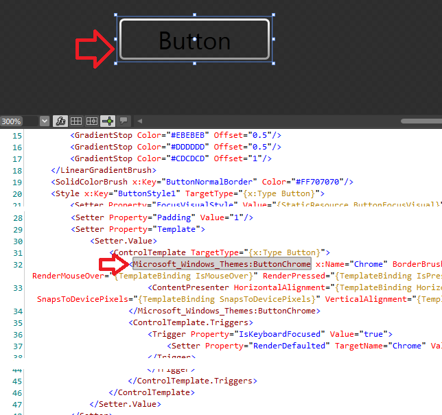
I want to remove the white-gradient border of the ButtonChrome AND keep everything else of the button's UI remain as-is. How can I do that?
ps. To make the problem simple I use the ButtonChrome as a normal control on my view. I browse the properties but still got NO idea where to remove the "white" border.
(The ButtonChrome in-use)
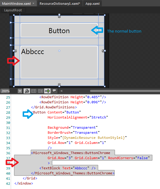
(The ButtonChrome in Resource)
 981
981
One of the great fetatures of WPF is the ability to leverage the behavior of a control while completely swapping the look of that control.You can just delete the chrome altogether and create a custom appearence that matches your requirement.
Sample
 <Style x:Key="NoChromeButton" TargetType="{x:Type Button}">
        <Setter Property="Background" Value="Transparent"/>
        <Setter Property="BorderThickness" Value="1"/>
        <Setter Property="Foreground" Value="{DynamicResource {x:Static SystemColors.ControlTextBrushKey}}"/>
        <Setter Property="HorizontalContentAlignment" Value="Center"/>
        <Setter Property="VerticalContentAlignment" Value="Center"/>
        <Setter Property="Padding" Value="1"/>
        <Setter Property="Template">
            <Setter.Value>
                <ControlTemplate TargetType="{x:Type Button}">
                    <Grid x:Name="Chrome" Background="{TemplateBinding Background}" SnapsToDevicePixels="true">
                        <ContentPresenter HorizontalAlignment="{TemplateBinding HorizontalContentAlignment}" Margin="{TemplateBinding Padding}" RecognizesAccessKey="True" SnapsToDevicePixels="{TemplateBinding SnapsToDevicePixels}" VerticalAlignment="{TemplateBinding VerticalContentAlignment}"/>
                    </Grid>
                    <ControlTemplate.Triggers>
                        <Trigger Property="IsEnabled" Value="false">
                            <Setter Property="Foreground" Value="#ADADAD"/>
                            <Setter Property="Opacity" TargetName="Chrome" Value="0.5"/>
                        </Trigger>
                    </ControlTemplate.Triggers>
                </ControlTemplate>
            </Setter.Value>
        </Setter>
    </Style>
Check this too http://www.designerwpf.com/2008/03/27/wpf-designers-guide-to-styles-and-templates/
This link seems to work now: http://www.designersilverlight.com/2008/03/27/wpf-designers-guide-to-styles-and-templates/
90
I don't think there's an easy way to get rid of that White Border. The actual routine being called is DrawInnerBorder and its called from within OnRender in ButtonChrome.
protected override void OnRender(DrawingContext drawingContext)
{
    Rect bounds = new Rect(0.0, 0.0, base.ActualWidth, base.ActualHeight);
    this.DrawBackground(drawingContext, ref bounds);
    this.DrawDropShadows(drawingContext, ref bounds);
    this.DrawBorder(drawingContext, ref bounds);

    // This one draws the white Rectangle
    this.DrawInnerBorder(drawingContext, ref bounds);
}

private void DrawInnerBorder(DrawingContext dc, ref Rect bounds)
{
    if ((base.IsEnabled || this.RoundCorners) && ((bounds.Width >= 4.0) && (bounds.Height >= 4.0)))
    {
        Pen innerBorderPen = this.InnerBorderPen;
        if (innerBorderPen != null)
        {
            dc.DrawRoundedRectangle(null, innerBorderPen, new Rect(bounds.Left + 1.5, bounds.Top + 1.5, bounds.Width - 3.0, bounds.Height - 3.0), 1.75, 1.75);
        }
    }
}
As we can see, there is no property to disable this.
You can verify it by setting IsEnabled="False" and RoundCorners="False" on the ButtonChrome or by setting Width or Height to something like 3.99 and the "White Border" goes away.
Update
To disable the inner border of ButtonChrome you could create your own ButtonChrome which adds this property. Unfortunately ButtonChrome is sealed so we can't inherit from it. I tried to copy the whole class and add the Property DisableInnerBorder and it seems to be working. You can use it like this
<local:MyButtonChrome ...
                      DisableInnerBorder="True">
Other than that it works just like the regular ButtonChrome and you can also add other Properties etc. that you might want. There might be drawbacks to this method that I haven't thought of, but for a small test it worked just fine.
Apperently 937 lines of code was too much to post on SO :) I uploaded MyButtonChrome.cs here: http://www.mediafire.com/?wnra4qj4qt07wn6
30
You should not try to customize ButtonChrome. *Chrome classes are theme-specific, i.e. they contain implementation of a specific windows theme and you cannot override it. Look at the declaration of the "Microsoft_Windows_Themes" namespace in your resource dictionary - it probably contains something like PresentationFramework.Aero...
What you should do in your custom templates is use usual Border instead of ButtonChrome and define triggers that will change its background, etc. when the button is pressed or hovered.
Here is an example:
<Style x:Key="BaseButtonStyle"
   TargetType="{x:Type ButtonBase}">
<Setter Property="FocusVisualStyle"
        Value="{StaticResource ButtonFocusVisual}" />
<Setter Property="Background"
        Value="{StaticResource ButtonNormalBackground}" />
<Setter Property="BorderBrush"
        Value="{StaticResource ButtonNormalBorder}" />
<Setter Property="BorderThickness"
        Value="1" />
<Setter Property="Foreground"
        Value="{StaticResource ButtonNormalForeground}" />
<Setter Property="HorizontalContentAlignment"
        Value="Center" />
<Setter Property="VerticalContentAlignment"
        Value="Center" />
<Setter Property="Padding"
        Value="5,2,5,2" />
<Setter Property="Template">
    <Setter.Value>
        <ControlTemplate TargetType="{x:Type ButtonBase}">
            <Border Name="Chrome"
                    Background="{TemplateBinding Background}"
                    BorderBrush="{TemplateBinding BorderBrush}"
                    BorderThickness="{TemplateBinding BorderThickness}"
                    SnapsToDevicePixels="true"
                    CornerRadius="2">
                <ContentPresenter Margin="{TemplateBinding Padding}"
                                  VerticalAlignment="{TemplateBinding VerticalContentAlignment}"
                                  HorizontalAlignment="{TemplateBinding HorizontalContentAlignment}"
                                  RecognizesAccessKey="True"
                                  SnapsToDevicePixels="{TemplateBinding SnapsToDevicePixels}" />
            </Border>
            <ControlTemplate.Triggers>
                <Trigger Property="IsMouseOver"
                         Value="True">
                    <Setter Property="Background"
                            Value="{StaticResource ButtonHoverBackground}" />
                    <Setter Property="Foreground"
                            Value="{StaticResource ButtonHoverForeground}" />
                </Trigger>

                <Trigger Property="IsPressed"
                         Value="True">
                    <Setter Property="Background"
                            Value="{StaticResource ButtonPressedBackground}" />
                    <Setter Property="Foreground"
                            Value="{StaticResource ButtonPressedForeground}" />
                </Trigger>
                <Trigger Property="ToggleButton.IsChecked"
                         Value="True">
                    <Setter Property="Background"
                            Value="{StaticResource ButtonHoverBackground}" />
                    <Setter Property="Foreground"
                            Value="{StaticResource ButtonNormalForeground}" />
                </Trigger>
                <Trigger Property="IsEnabled"
                         Value="false">
                    <Setter Property="Foreground"
                            Value="#ADADAD" />
                </Trigger>
            </ControlTemplate.Triggers>
        </ControlTemplate>
    </Setter.Value>
</Setter>
I realize this is an old thread, but I found it when I was trying to do the same thing and didn't find any great solutions. I thought I'd post what I came up with in case it helps anybody else.
What I wanted was flat buttons that used the normal chrome when moused over. The best way I could find to do this was to cheat and use two ContentPresenters inside a Grid with two rows. One content presenter is inside the normal ButtonChrome and one is inside a Border. Only one grid row is shown at a time and the setter in the IsMouseOver trigger determines which one is shown.
<Window.Resources>
    <Style x:Key="ButtonFocusVisual">
        <Setter Property="Control.Template">
            <Setter.Value>
                <ControlTemplate>
                    <Rectangle StrokeDashArray="1 2" StrokeThickness="1" Stroke="{DynamicResource {x:Static SystemColors.ControlTextBrushKey}}" SnapsToDevicePixels="true" Margin="2"/>
                </ControlTemplate>
            </Setter.Value>
        </Setter>
    </Style>
    <LinearGradientBrush x:Key="ButtonNormalBackground" EndPoint="0,1" StartPoint="0,0">
        <GradientStop Color="#F3F3F3" Offset="0"/>
        <GradientStop Color="#EBEBEB" Offset="0.5"/>
        <GradientStop Color="#DDDDDD" Offset="0.5"/>
        <GradientStop Color="#CDCDCD" Offset="1"/>
    </LinearGradientBrush>
    <SolidColorBrush x:Key="ButtonNormalBorder" Color="Transparent"/>
    <Style x:Key="ActionButtonStyle" TargetType="{x:Type Button}">
        <Setter Property="FocusVisualStyle" Value="{StaticResource ButtonFocusVisual}"/>
        <Setter Property="Background" Value="{x:Null}"/>
        <Setter Property="BorderBrush" Value="{x:Null}"/>
        <Setter Property="BorderThickness" Value="0"/>
        <Setter Property="Foreground" Value="{DynamicResource {x:Static SystemColors.ControlTextBrushKey}}"/>
        <Setter Property="HorizontalContentAlignment" Value="Center"/>
        <Setter Property="VerticalContentAlignment" Value="Center"/>
        <Setter Property="Padding" Value="1"/>
        <Setter Property="Template">
            <Setter.Value>
                <ControlTemplate TargetType="{x:Type Button}">
                    <Grid>
                        <Grid.RowDefinitions>
                            <RowDefinition  x:Name="ContentWithChrome" Height="0"></RowDefinition>
                            <RowDefinition  x:Name="ContentWithBorder" Height="Auto"></RowDefinition>
                        </Grid.RowDefinitions>
                        <Themes:ButtonChrome Grid.Row="0" x:Name="Chrome" BorderBrush="{TemplateBinding BorderBrush}" Background="{TemplateBinding Background}" RenderMouseOver="{TemplateBinding IsMouseOver}" RenderPressed="{TemplateBinding IsPressed}" RenderDefaulted="{TemplateBinding IsDefaulted}" SnapsToDevicePixels="true">
                            <ContentPresenter HorizontalAlignment="{TemplateBinding HorizontalContentAlignment}" Margin="{TemplateBinding Padding}" RecognizesAccessKey="True" SnapsToDevicePixels="{TemplateBinding SnapsToDevicePixels}" VerticalAlignment="{TemplateBinding VerticalContentAlignment}"/>
                        </Themes:ButtonChrome>
                        <Border Grid.Row="1" Margin="0,2,0,2">
                            <ContentPresenter HorizontalAlignment="{TemplateBinding HorizontalContentAlignment}" Margin="{TemplateBinding Padding}" RecognizesAccessKey="True" SnapsToDevicePixels="{TemplateBinding SnapsToDevicePixels}" VerticalAlignment="{TemplateBinding VerticalContentAlignment}"/>
                        </Border>
                    </Grid>
                    <ControlTemplate.Triggers>
                        <Trigger Property="IsMouseOver" Value="True">
                            <Setter Property="Height" TargetName="ContentWithChrome" Value="Auto" />
                            <Setter Property="Height" TargetName="ContentWithBorder" Value="0" />
                        </Trigger>
                        <Trigger Property="IsKeyboardFocused" Value="true">
                            <Setter Property="RenderDefaulted" TargetName="Chrome" Value="true"/>
                        </Trigger>
                        <Trigger Property="ToggleButton.IsChecked" Value="true">
                            <Setter Property="RenderPressed" TargetName="Chrome" Value="true"/>
                        </Trigger>
                        <Trigger Property="IsEnabled" Value="false">
                            <Setter Property="Foreground" Value="#ADADAD"/>
                        </Trigger>
                    </ControlTemplate.Triggers>
                </ControlTemplate>
            </Setter.Value>
        </Setter>
    </Style>
</Window.Resources>
If you love us? You can donate to us via Paypal or buy me a coffee so we can maintain and grow! Thank you!
Donate Us With


