 Menu
Menu
I'm building a wizard-like ordering process where I have this menu:

The active page is colored green (in this case, Model).
How does one make this arrow using only CSS?:
At the moment i'm achieving my goal by using several divs and images:
<div class="menuItem">
<div></div> <!-- The left image -->
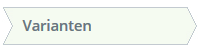
<div>Varianten</div>
<div></div> <!-- The right image -->
</div>
The left image: 
The right image:
I found a SO answer which does part of this: Arrow Box with CSS, however i'm having trouble with the indent at the left.
If you have a better idea about how to do this, please let me know!
 818
818
If the space between the arrows does not need to be transparent (it is solid color) you can use the :before and :after to create the edges (without new elements in DOM)
Basically, it creates rotated squares with the borders we want and places them accordingly
#flowBoxes {
    margin:auto;
    padding:20px;
    min-width:700px;

}
#flowBoxes div {
    display:inline-block;
    position:relative;
    height:25px;
    line-height:25px;
    padding:0 20px;
    border:1px solid #ccc;
    margin-right:2px;
    background-color:white;
}

#flowBoxes div.right:after{
    content:'';
    border-top:1px solid #ccc;
    border-right:1px solid #ccc;
    width:18px;
    height:18px;
    position:absolute;
    right:0;
    top:-1px;
    background-color:white;
    z-index:150;

    -webkit-transform: translate(10px,4px) rotate(45deg);
       -moz-transform: translate(10px,4px) rotate(45deg);
        -ms-transform: translate(10px,4px) rotate(45deg);
         -o-transform: translate(10px,4px) rotate(20deg);
            transform: translate(10px,4px) rotate(45deg);
}

#flowBoxes div.left:before{
    content:'';
    border-top:1px solid #ccc;
    border-right:1px solid #ccc;
    width:18px;
    height:18px;
    position:absolute;
    left:0;
    top:-1px;
    background-color:white;
    z-index:50;

    -webkit-transform: translate(-10px,4px) rotate(45deg);
       -moz-transform: translate(-10px,4px) rotate(45deg);
        -ms-transform: translate(-10px,4px) rotate(45deg);
         -o-transform: translate(-10px,4px) rotate(20deg);
            transform: translate(-10px,4px) rotate(45deg);
}
#flowBoxes .active{
    background-color:green;
    color:white;
}
#flowBoxes div.active:after{
    background-color:green;
}
<div id="flowBoxes">
<div class="right">Diersoort / I&R</div>
<div class="left right active">Model</div>
<div class="left right">Varianten</div>
<div class="left right">Bedrukkingen</div>
<div class="left">Bevestiging</div>
</div>Here is an alternate approach to the whole thing using CSS3 features. One advantage of using this method (and one of the main reasons for adding a separate answer) is that the space in between the arrows can be transparent.
Basically the implementation is as follows:
div for each step/item and it contains the text that needs to be displayed. Let us say the height of this div is x (50px in this example).:before and :after) are created with their width the same as the parent div and height as half (x/2) of the parent. The :before element has no border-bottom whereas the :after element has no border-top to avoid a line appearing in the middle of the shape (parallel to x-axis).skew transformed in opposite directions and are positioned in such a way that they are directly below each other and thus ends up forming the required shape.z-index to push them to be behind the parent div (and therefore its text).first-child and the last-child elements are modified slightly (left position, border of pseudo-elements, background and border of parent div) to achieve the straight sides.active class for active elements and hover effects also to the shapes like in the below sample. .steps {
height: 50px;
width: 150px;
text-align: center;
line-height: 50px;
position: relative;
margin: 10px 0px 10px 20px;
display: inline-block;
}
.steps:before,
.steps:after {
content: '';
position: absolute;
left: 0px;
width: 150px;
height: 25px;
z-index: -1;
}
.steps:before {
top: -2px;
border-top: 2px solid blue;
border-right: 2px solid blue;
border-left: 2px solid blue;
background: lightblue;
-moz-transform: skew(30deg);
-webkit-transform: skew(30deg);
transform: skew(30deg);
}
.steps:after {
bottom: -2px;
border-left: 2px solid blue;
border-right: 2px solid blue;
border-bottom: 2px solid blue;
background: lightblue;
-moz-transform: skew(-30deg);
-webkit-transform: skew(-30deg);
transform: skew(-30deg);
}
.steps:last-child {
background: lightblue;
border-right: 2px solid blue;
border-top: 2px solid blue;
border-bottom: 2px solid blue;
margin-left: 38px;
}
.steps:first-child {
background: lightblue;
border-left: 2px solid blue;
border-top: 2px solid blue;
border-bottom: 2px solid blue;
margin-right: 18px;
}
.steps:first-child:before,
.steps:first-child:after {
left: 18px;
}
.steps:last-child:before,
.steps:last-child:after {
left: -18px;
}
/* Hover Styles */
.steps:first-child:hover,
.steps:last-child:hover,
.steps:hover:before,
.steps:hover:after {
background: lightgreen;
}
.steps:first-child:hover {
border-left: 2px solid green;
}
.steps:last-child:hover {
border-right: 2px solid green;
}
.steps:hover:before {
border-top: 2px solid green;
border-right: 2px solid green;
border-left: 2px solid green;
}
.steps:hover:after {
border-left: 2px solid green;
border-right: 2px solid green;
border-bottom: 2px solid green;
}
.steps:first-child:hover,
.steps:last-child:hover {
border-top: 2px solid green;
border-bottom: 2px solid green;
}
/* Active Styles */
.active:first-child,
.active:last-child,
.active:before,
.active:after{
background: bisque;
}
.active:first-child{
border-left: 2px solid red;
}
.active:last-child{
border-right: 2px solid red;
}
.active:before{
border-top: 2px solid red;
border-right: 2px solid red;
border-left: 2px solid red;
}
.active:after{
border-left: 2px solid red;
border-right: 2px solid red;
border-bottom: 2px solid red;
}
.active:first-child, .active:last-child{
border-top: 2px solid red;
border-bottom: 2px solid red;
}
/* Just for creating a non solid color background */
body{
height: 200px;
background: -webkit-radial-gradient(center, ellipse, #400, #100);
background: -moz-radial-gradient(center, ellipse, #400, #100);
background: radial-gradient(center, ellipse, #400, #100);
}<div class='steps-container'>
<div class='steps'>1. Step 1</div>
<div class='steps active'>2. Step 2</div>
<div class='steps'>3. Step 3</div>
</div>Note: The
hoverin the above snippet doesn't work when hovering on the right tip of the first-child or the left tip of the last-child because of z-index issues. If you need seamlesshoverfunctionality then using aspaninside the.stepselement like in the below snippet would solve it. (Thanks to The Pragmatick for pointing this out).
.steps {
  height: 50px;
  width: 150px;
  text-align: center;
  line-height: 50px;
  position: relative;
  margin: 10px 0px 10px 20px;
  display: inline-block;
}
.steps span {
  position: relative;
  z-index: 2;
}
.steps:before,
.steps:after {
  content: '';
  position: absolute;
  left: 0px;
  width: 150px;
  height: 25px;
}
.steps:before {
  top: -2px;
  border-top: 2px solid blue;
  border-right: 2px solid blue;
  border-left: 2px solid blue;
  background: lightblue;
  -moz-transform: skew(30deg);
  -webkit-transform: skew(30deg);
  transform: skew(30deg);
}
.steps:after {
  bottom: -2px;
  border-left: 2px solid blue;
  border-right: 2px solid blue;
  border-bottom: 2px solid blue;
  background: lightblue;
  -moz-transform: skew(-30deg);
  -webkit-transform: skew(-30deg);
  transform: skew(-30deg);
}
.steps:first-child:before,
.steps:first-child:after {
  border-left: none;
}
.steps:last-child:before,
.steps:last-child:after {
  border-right: none;
}
.steps:last-child {
  background: lightblue;
  border-right: 2px solid blue;
  border-top: 2px solid blue;
  border-bottom: 2px solid blue;
  margin-left: 38px;
}
.steps:first-child {
  background: lightblue;
  border-left: 2px solid blue;
  border-top: 2px solid blue;
  border-bottom: 2px solid blue;
  margin-right: 18px;
}
.steps:first-child:before,
.steps:first-child:after {
  left: 18px;
}
.steps:last-child:before,
.steps:last-child:after {
  left: -18px;
}
/* Hover Styles */

.steps:first-child:hover,
.steps:last-child:hover,
.steps:hover:before,
.steps:hover:after {
  background: lightgreen;
}
.steps:first-child:hover {
  border-left: 2px solid green;
}
.steps:last-child:hover {
  border-right: 2px solid green;
}
.steps:hover:before {
  border-top: 2px solid green;
  border-right: 2px solid green;
  border-left: 2px solid green;
}
.steps:hover:after {
  border-left: 2px solid green;
  border-right: 2px solid green;
  border-bottom: 2px solid green;
}
.steps:first-child:hover,
.steps:last-child:hover {
  border-top: 2px solid green;
  border-bottom: 2px solid green;
}
.steps:first-child:hover:before,
.steps:first-child:hover:after {
  border-left: none;
}
.steps:last-child:hover:before,
.steps:last-child:hover:after {
  border-right: none;
}
/* Active Styles */

.active:first-child,
.active:last-child,
.active:before,
.active:after {
  background: bisque;
}
.active:first-child {
  border-left: 2px solid red;
}
.active:last-child {
  border-right: 2px solid red;
}
.active:before {
  border-top: 2px solid red;
  border-right: 2px solid red;
  border-left: 2px solid red;
}
.active:after {
  border-left: 2px solid red;
  border-right: 2px solid red;
  border-bottom: 2px solid red;
}
.active:first-child,
.active:last-child {
  border-top: 2px solid red;
  border-bottom: 2px solid red;
}
/* Just for creating a non solid color background */

body {
  height: 200px;
  background: -webkit-radial-gradient(center, ellipse, #400, #100);
  background: -moz-radial-gradient(center, ellipse, #400, #100);
  background: radial-gradient(center, ellipse, #400, #100);
}
<div class='steps-container'>
<div class='steps'>
<span>1. Step 1</span>
</div>
<div class='steps active'>
<span>2. Step 2</span>
</div>
<div class='steps'>
<span>3. Step 3</span>
</div>
</div>Screenshot: (with the hover on second item)

Responsive Implementation with Transparent Background:
For a responsive version of the progress tracker bar with semi-transparent boxes, visit this pen. The width of each step/item is assigned in such a way that their sum is always 100% of the available width and each itemis always of the same size as the others.
JavaScript is used for the following features: (All these features are value-add and can be removed depending on the needs. Note that when the JS is removed, the corresponding CSS properties should be put into the CSS file.)

32
If you love us? You can donate to us via Paypal or buy me a coffee so we can maintain and grow! Thank you!
Donate Us With


