 Menu
Menu
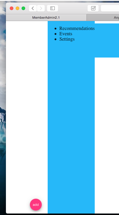
I have an angular4 app and am using the angular materials framework https://material.angular.io/components/sidenav/examples. I want to make the md-sidenav-container stretch the whole height of the div without covering up the header. I have attached the fullscreen directive, which causes the sidenav to fill the whole height of the screen thus covering up the header component. This is not what I want. The images show the sidenav stretch above the header, as well as another attempt where it stops at the header but does not stretch to the bottom. I want it to stretch all the way up to the header and all the way down to the bottom of the screen. How do I accomplish this? Thanks!
Html
<div class="bar">
  <md-sidenav-container class="example-sidenav-fab-container">
  <md-sidenav #sidenav mode="side" opened="true" align="end">
    <!--<button md-mini-fab class="example-fab" (click)="sidenav.toggle()">-->
      <!--<md-icon>add</md-icon>-->
    <!--</button>-->
    <div class="example-scrolling-content">
      <ul>
        <li>Recommendations</li>
        <li>Events</li>
        <li>Settings</li>
      </ul>
    </div>
  </md-sidenav>
  <button md-mini-fab class="example-fab" (click)="sidenav.toggle()">
    <md-icon>add</md-icon>
  </button>
</md-sidenav-container>
</div>
Css
md-sidenav-container
  :background-color white
  :float right
  :width 300px
  :height 400px

md-sidenav
  :background-color $light-blue


//.example-sidenav-fab-container
//  width: 300px
//  height: 400px
  //border: 1px solid rgba(0, 0, 0, 0.5)


.example-sidenav-fab-container md-sidenav
  max-width: 300px

.example-sidenav-fab-container md-sidenav
  display: flex
  overflow: visible

.example-scrolling-content
  overflow: auto


.example-fab
  position: absolute
  right: 20px
  bottom: 10px

.bar
  :height 100%
 856
856
I have found this workaround that works ok
HTML
<md-sidenav-container id="container" fullscreen >
CSS
#container {
 top: 64px !important;
}

@media(max-width: 599px) {
  #container {
    top: 56px !important;
  }
}
top has to have the same height of your toolbar. Remember that the standard Angular Material toolbar height becomes smaller when the width is less than 600px .
99
I struggled with the same problem. The solution of setting the top to 64px did not work for me.
I found two different solutions.
The first solution uses flexbox. Put the md-toolbar and md-sidenav-container inside of a div with height: 100% and uses display: flex with flex-direction: column.
Alternatively, and this solution may actually do the same thing, you can leave the md-toolbar and md-sidenav-container items at the root level, and then make the md-sidenav-container have a height: calc(100% - 64px) where the height of the toolbar is 64px.
37
If you love us? You can donate to us via Paypal or buy me a coffee so we can maintain and grow! Thank you!
Donate Us With


