 Menu
Menu
I really don't know how to put this in words.
When I have 2 divs in a row, each has different height, so the next row have unwanted space.
But stack correctly in small screen.
 <div class="row">
    <div class="col-lg-6 col-md-6 col-sm-12"> div 1 </div>
    <div class="col-lg-6 col-md-6 col-sm-12"> div 2 </div>
  </div>
  <div class="row">
    <div class="col-lg-6 col-md-6 col-sm-12"> div 3 </div>
    <div class="col-lg-6 col-md-6 col-sm-12"> div 4 </div>
  </div>
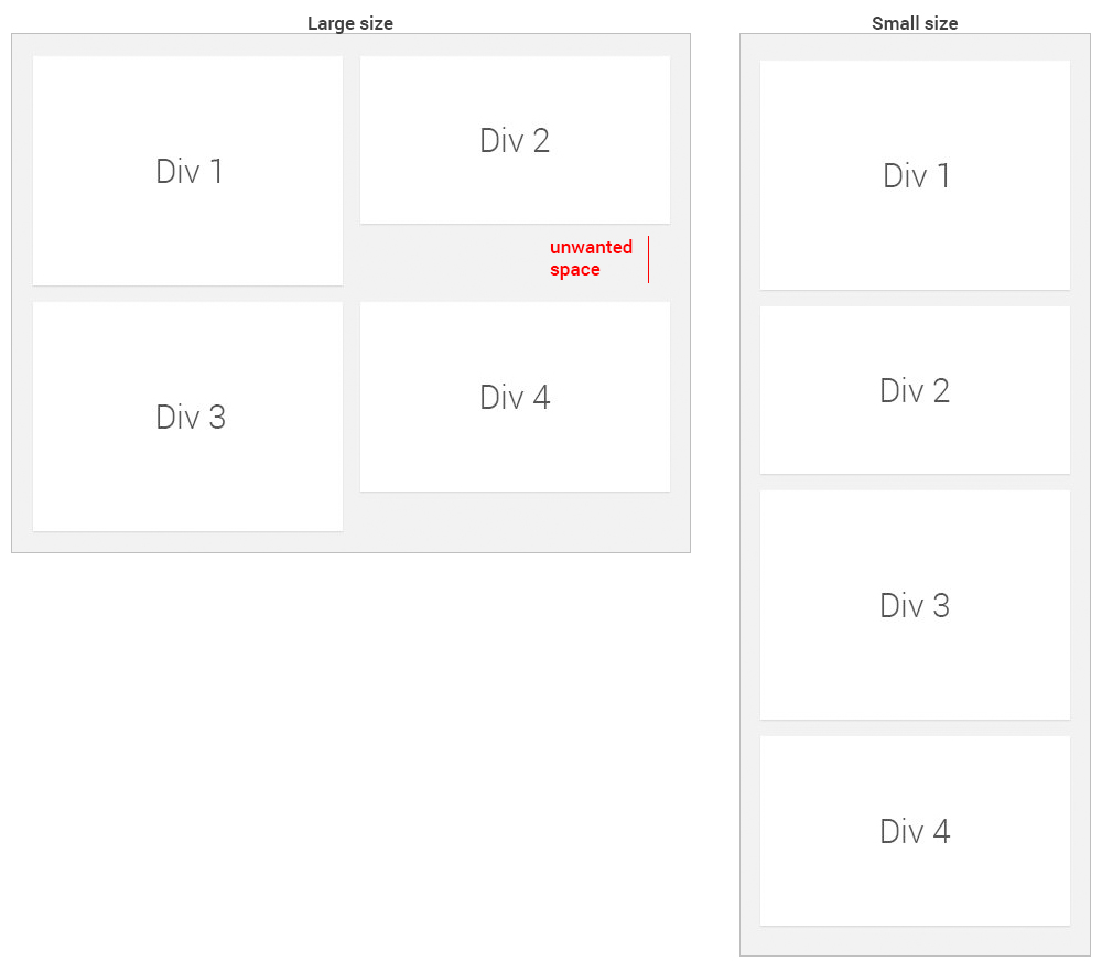
But when I remove the rows and put all divs on the left inside 1 div, and all on the right inside 1 div, there is no space.
But they stack in the wrong order on small screen.
  <div class="col-lg-6 col-md-6 col-sm-12">
    <div> div 1 </div>
    <div> div 3 </div>
  </div>
  <div class="col-lg-6 col-md-6 col-sm-12">
    <div> div 2 </div>
    <div> div 4 </div>
  </div>

Note that they are not just 4 divs, they are at least 8.
I hope this is clear. I appreciate any help.
 848
848
For a pure css solution, if you don't use the bootstrap styles, you can use display:flex:
.flex {
  display: flex;
  flex-direction: row;
  flex-wrap: wrap;
}
.flex-div {
  border: 1px solid #000000;
  width: 50%;
  box-sizing: border-box;
}
@media (max-width: 767px) {
  .flex {
    flex-direction: column;
  }
  .flex-div {
    width: 100%;
  }
}
<div class="flex">
<div class="flex-div"> div 1 <br> extra height</div>
<div class="flex-div"> div 2 </div>
<div class="flex-div"> div 3 </div>
<div class="flex-div"> div 4 </div>
</div>Use the full page link in the above snippet to see how the stacking changes between different screen sizes
Update
The closest I could get to what you is this:
Unfortunately it stacks the divs in columns from left first and is not supported in the older browsers:
.columns {
  -webkit-column-count: 2;
  -moz-column-count: 2;
  column-count: 2;
  -webkit-column-gap: 30px;
  -moz-column-gap: 30px;
  column-gap: 30px;
  padding: 1px;
}
.columns-div {
  border: 1px solid #000000;
}


@media (max-width: 767px) {
  .columns {
  -webkit-column-count: auto;
  -moz-column-count: auto;
  column-count: auto
  -webkit-column-gap: 0;
  -moz-column-gap: 0;
  column-gap: 0;
}
}
<div class="columns">
<div class="columns-div">div 1
<br>extra height</div>
<div class="columns-div">div 2</div>
<div class="columns-div">div 3</div>
<div class="columns-div">div 4</div>
</div>More information on columns
Columns support
57
If you love us? You can donate to us via Paypal or buy me a coffee so we can maintain and grow! Thank you!
Donate Us With