 Menu
Menu
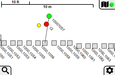
I'm working on a single-page web app, that will most typically be used on mobile devices. One of its features is a map mode, which temporarily takes over the entire browser window; a distance scale and some controls are attached to the four corners of the map. Here's a little screenshot of the map so you can tell what I'm talking about:
The map is implemented as a <div> with position: fixed and all four coordinates zero; I also temporarily set the <body> to overflow: hidden while the map is visible to handle the case of the underlying app display being scrolled away from the origin. That's sufficient to make the map work exactly how I want on desktop browsers. Mobile browsers also required that I give a meta viewport tag with something like "width=device-width,user-scalable=no" in order to make the visible area of the window exactly correspond with the viewport.
This all worked beautifully a few years back when I originally wrote this app, but somewhere along the line iOS Safari stopped honoring any of the meta viewport options involving scaling - apparently too many sites were misapplying the tag, resulting in text that was unreadably small, yet unzoomable. Currently, if you enable the map on this browser, you're likely to get a slightly zoomed-in view, that cuts off those buttons on the right and bottom - and you can't do anything about it, because all touches are interpreted as zoom/pan gestures for the map, rather than browser scrolling. The map isn't terribly useful without the features accessed through those buttons - and without the top-right button, you can't even close the map. The only way out is to reload the page, which may result in loss of unsaved data.
I'm definitely going to be adding the use of history.pushState/onpopstate so that the map overlay behaves like a separate page. You'd be able to get out of the map mode using the browser's Back button - but that doesn't address the rest of the loss of the functionality due to missing buttons.
I've considered using .requestFullscreen() to implement the map overlay, but it's not supported everywhere that the app would otherwise be usable. In particular, it apparently doesn't work at all on iPhones, and on iPads you get a status bar and a huge 'X' button overlaying your content - my distance scale would likely not be readable any more. It's not semantically what I really want, anyway - I need the full window, not the full screen.
How do I get a full-window display working on modern browsers? All the information I can find on the subject talks about using the meta viewport tag, but as I mentioned that no longer works.
 318
318
if your using position: fixed just use the standard CSS method that has been around for many years.
.divFixedClass{
    position: fixed;
    top:0;
    left:0;
    right:0;
    bottom:0;
}
This will just make the div auto-size to the full size of the viewport, and using possition fixed it's locked in place no matter how much they scroll, you could disable body scroll if you needed to with
html.noScroll, html.noScroll > body{
    overflow:none;
}
so if you just add the noScroll class to the html tag it will disable scrolling. then when you want to allow scrolling again you can.
197
Solution
Set the fullscreen div's height to window.innerHeight with JavaScript and then update it on window resizes.
Same problem here:
https://stackoverflow.com/a/37113430/8662476
More info:
25
You need to set the height of both body and html to 100%
   html, body {
       width: 100%;
       height: 100%;
       margin: 0;
    }
If you love us? You can donate to us via Paypal or buy me a coffee so we can maintain and grow! Thank you!
Donate Us With