 Menu
Menu
FIDDLE
<div id="DiamondCenter">
    <div id="triangle-topleft"></div>
</div>
#DiamondCenter {
    position:fixed;
    top:2%;
    left:48%;
    background: #24201a;
    height:40px;
    width:40px;
    -webkit-transform: rotate(45deg);
    -moz-transform: rotate(45deg);
    -ms-transform: rotate(45deg);
    -o-transform: rotate(45deg);
    transform: rotate(45deg);
    z-index:20 !important;
}
#triangle-topleft {
    width: 0;
    height: 0;
    border-top: 40px solid gray;
    border-right: 40px solid transparent;
}
 994
994
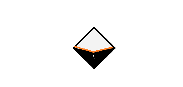
Using SVG:
While using SVG, you could make use of path and polyline elements to draw the required shape. As indicated by Paulie_D in comments, SVG is the better choice for such complex shapes instead of CSS (though this can be achieved with CSS also).
The approach is very simple and is as follows:
path element for the top polygon which is drawn by joining the points at coordinates (0,50), (50,0), (100,50) and (50,70).path element for the bottom polygon which is drawn by joining the points at (0,50), (50,70) and (100,50).polyline element for the orange border which is nothing but a line connecting (0,50), (50,70) and (100,50).svg {
height: 100px;
width: 100px;
}
path#top {
fill: gray;
}
path#bottom {
fill: black;
}
polyline#border {
stroke: orange;
stroke-width: 2;
fill: none;
}<svg viewBox="0 0 100 100">
<path id="top" d="M0,50 L50,0 100,50 50,70z" />
<path id="bottom" d="M0,50 L50,100 100,50 50,70z" />
<polyline id="border" points="0,50 50,70 100,50" />
</svg>Using CSS:
You can achieve the shape provided in question by using 2 pseudo-elements which are both rotated and skewed. The dimension of each pseudo-element is calculated using Pythagoras theorem.
The shape produced using this method is responsive and can adapt to changes in dimension. Hover the shape within the snippet to see how it adapts.
*,
*:after,
*:before {
  box-sizing: border-box;
}
#DiamondCenter {
  position: fixed;
  top: 2%;
  left: 48%;
  background: #24201a;
  height: 40px;
  width: 40px;
  transform: rotate(45deg);
  z-index: 20 !important;
  overflow: hidden;
}
#DiamondCenter:after {
  position: absolute;
  content: '';
  bottom: 0px;
  left: -1px; /* half the width of border-left */
  height: calc(100% / 1.414);
  width: calc(100% / 1.414);
  background: black;
  border-left: 2px solid orange;
  transform: rotate(40deg) skewX(-20deg);
  transform-origin: bottom left;
}
#DiamondCenter:before {
  position: absolute;
  content: '';
  top: -1px; /* half the width of border-top */
  right: 0px;
  height: calc(100% / 1.414);
  width: calc(100% / 1.414);
  background: black;
  border-top: 2px solid orange;
  transform: rotate(-40deg) skewY(-20deg);
  transform-origin: top right;
}

/* Just for demo */

#DiamondCenter{
  transition: all 1s;
}
#DiamondCenter:hover{
  top: 5%;
  height: 80px;
  width: 80px;
}
<script src="https://cdnjs.cloudflare.com/ajax/libs/prefixfree/1.0.7/prefixfree.min.js"></script>
<div id="DiamondCenter"></div>In the below snippet, I have set different background colors for the pseudo-elements to illustrate how the shape is achieved.
*,
*:after,
*:before {
  box-sizing: border-box;
}
#DiamondCenter {
  position: fixed;
  top: 2%;
  left: 48%;
  background: #24201a;
  height: 40px;
  width: 40px;
  transform: rotate(45deg);
  z-index: 20 !important;
  overflow: hidden;
}
#DiamondCenter:after {
  position: absolute;
  content: '';
  bottom: 0px;
  left: -1px;
  height: calc(100% / 1.414);
  width: calc(100% / 1.414);
  background: seagreen;
  border-left: 2px solid orange;
  transform: rotate(40deg) skewX(-20deg);
  transform-origin: bottom left;
}
#DiamondCenter:before {
  position: absolute;
  content: '';
  top: -1px;
  right: 0px;
  height: calc(100% / 1.414);
  width: calc(100% / 1.414);
  background: skyblue;
  border-top: 2px solid orange;
  transform: rotate(-40deg) skewY(-20deg);
  transform-origin: top right;
}

/* Just for demo */

#DiamondCenter{
  transition: all 1s;
}
#DiamondCenter:hover{
  top: 5%;
  height: 80px;
  width: 80px;
}
<script src="https://cdnjs.cloudflare.com/ajax/libs/prefixfree/1.0.7/prefixfree.min.js"></script>
<div id="DiamondCenter"></div>If you love us? You can donate to us via Paypal or buy me a coffee so we can maintain and grow! Thank you!
Donate Us With

