 Menu
Menu
What would be the best way to achieve a flip over effect using AngularJS animations?
I would like the flip over effect to occur on click. Every time it's clicked, it should flip over to the other side.
Ideally, I guess, I'm looking for a directive implementation that uses Angular animations.
 972
972
PLNKR - here is a seed of a configurable angular directive that provides 3d flipping functionality. I do not see any good reason why to use ngAnimate for it.
<flip flip-width="200px" flip-height="100px">
   <flip-panel>
     content-front
   </flip-panel>
   <flip-panel>
     content-back
   </flip-panel>
</flip>
directive all names should be configurable.flip-width and flip-height sets style of flip and both flip-panels.front and back are set.flip-panel is front and the second is back.transclusion content of the flip-panel may be arbitrary html.-webkit. (update to make it work in Firefox, just duplicate all pieces with -webkit with no prefix - you do not need -moz)PLNKR - here is an updated and extended version. It shows what I meant by making the directive configurable. In more details:
flipConfig via provider, that allows to set in app.config:
flip-show attribute that specifies which side to show.flip-show we can trigger the flip action from outside of the directive.(btw: it is just a seed and it may be improved in a lot of ways. E.g: specifying axis, specifying origin of the transform, specifying radius and margin of the panels, allowing flip on hover, defaults colors, margins and so on)
64
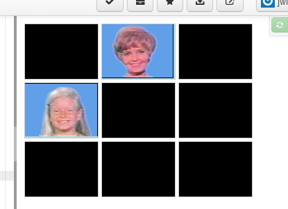
I had the same usecase just recently for an angular memory game.
My implementation is the same by the idea of the other answers. I also released the flipping code along with a DEMO.
Github: https://github.com/zwacky/angular-flippy
P.s.: Looks i'm late to the party ;)
34
You can use ng-click and ng-class to add a class when the flip container is clicked.
<div class="flip-container" ng-click="flip = !flip" ng-class="{'flip': flip}">
  <div class="flipper">
    <div class="front" style="background: lightblue;">
      front
    </div>
    <div class="back" style="background: lightgreen;">
      back
    </div>
  </div>
</div>
This is essentially the angular way of doing what Walsh suggested in his article:
Adding the flip class to the container element will flip the card using JavaScript -- no user hover required. A JavaScript comment like document.querySelector("#myCard").classList.toggle("flip") will do the flip!
The only change to David Walsh's css was removing the :hover selector - the html structure is unchanged. It works nicely in chrome and firefox.. but the flip isn't as pretty in IE.
Here is a working demo: http://plnkr.co/edit/0dn775vpuoOeh2PS1T6k?p=preview
Update
I created a simple directive to encapsulate this basic technique. It allows you to flip over a black card, to reveal a picture on the other side.
app.directive("flipReveal", function() {
  return {
    restrict: 'E',
    replace: true,
    templateUrl: 'template.html',
    scope: {
      url: '=',
      flip: '='
    }
  }
})
Here is a link to a new demo: http://plnkr.co/X4pSav
2
Disclaimer Based on @artur's answer https://stackoverflow.com/a/23139242/1319998 , but hopefully both simplified and made more flexible.
A custom directive is the way to go, one that can be used as:
<flip flip-side="{{side}}">
  <flip-front>
    Front side contents
  </flip-front>
  <flip-back>
    Rear contents
  </flip-back>
</flip>
I think it should have certain properties:
Programatically controlled by an attribute. In this case, a string that is equal to 'front' or 'back'
<flip flip-side="{{side}}">....</flip>
this would allow programmatic access via the surrounding scope.
Integrated with ngAnimate/$animate. Specifically, if ngAnimate is removed or disabled, the animation should not occur, but the reveal of the other side happen immediately. Using $animate.addClass/$animate.removeClass would achieve this, adding/removing a flip-visible class together with display:block and display:none styles to make sure the right side is visible/hidden when the animations are disabled.
flip > flip-front, flip > flip-back {
  display: none;
}
flip > .flip-visible {
  display: block;
}
Controlled by CSS, with defaults. So if you want to change the duration of the flip, it's a CSS, and not a Javascript, addition.
So it will have a style sheet to add styles required for the various stages of $animate.addClass / $animate.removeClass CSS animations explained at Year of Moo and $animate docs . The class will be flip-visible, so the extra classes will be .flip-visible-add, .flip-visible-add-active, .flip-visible-remove, and .flip-visible-remove-active classes.
The full set of styles can be seen at http://plnkr.co/edit/bbYbMhiURnm6FqC9patp?p=preview, but the main construction is of the form:
.flip-visible-add {
  // Initial setup: time and initial, pre-animation, transform
}
.flip-visible-add.flip-visible-add-active {
  // Target transform
}
Putting all this together, the directive is quite short:
app.directive("flip", function($animate) {
  return {
    restrict : "E",
    controller: function($scope, $element, $attrs) {
      var elements = {
        'front': $element.find('flip-front'),
        'back': $element.find('flip-back')
      };
      $attrs.$observe('flipSide', function(visibleSide) {
        visibleSide = visibleSide || 'front';
        var otherSide = visibleSide == 'front' ? 'back' : 'front';
        $animate.removeClass(elements[otherSide], 'flip-visible');
        $animate.addClass(elements[visibleSide], 'flip-visible');
      });
    }
  }
});
This can all be seen in an example, together with the stylesheets to make it all work, at http://plnkr.co/edit/bbYbMhiURnm6FqC9patp?p=preview
2
If you love us? You can donate to us via Paypal or buy me a coffee so we can maintain and grow! Thank you!
Donate Us With