 Menu
Menu
I'm developing an HTML page using Compass/SCSS and a vertical rhythm approach. I've set up a baseline and specified heights for paragraphs and headings in rem units. It works great and lays on a vertical rhythm grid nicely. However, I have a central image that takes 100% width of the column (I want it to be responsive and scale with the browser window).
The problem is that this image breaks vertical rhythm because it's height is calculated dynamically according to the browser width and image aspect ratio and is not respecting the baseline.
How do I handle this situation in order to have a perfect vertical rhythm?
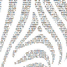
Here's the screenshot to demonstrate the idea:

As you can see the text below the image breaks out of the VR grid.
I've tried to use Respond.js jQuery plugin, but looks like it's outdated and is not working correctly.
 855
855
I have made a plugin for this case. Please check it out.
Now available in npm, run npm install jquery-rhythmplease to install.
Please feel free to leave any kind of feedback.
The plugin does not change the aspect ratio of the image.
$(function() {
  $('.rhythm-please').on('load', function() {
    $(this).rhythmPlease();
  });
});
img {
width: 100%;
height: auto;
}
body {
background: -webkit-linear-gradient(top, transparent, transparent 26px, rgba(0, 173, 240, 0.1) 27px, rgba(0, 173, 240, 0.1));
background: linear-gradient(to bottom, transparent, transparent 26px, rgba(0, 173, 240, 0.1) 27px, rgba(0, 173, 240, 0.1));
background-size: 100% 28px;
}
.text {
font-size: 16px;
line-height: 28px;
margin-bottom: 28px;
}<link href="https://maxcdn.bootstrapcdn.com/bootstrap/3.3.5/css/bootstrap.min.css" rel="stylesheet" />
<script src="https://ajax.googleapis.com/ajax/libs/jquery/2.1.1/jquery.min.js"></script>
<script src="https://rawgit.com/halfzebra/jquery-rhythmplease/master/src/jquery.rhythmPlease.js"></script>
<div class="container">
<div class="row">
<div class="col-xs-12">
<p class="text">Pellentesque habitant morbi tristique senectus et netus et malesuada fames ac turpis egestas.</p>
</div>
</div>
<div class="row">
<div class="col-xs-4">
<p class="text">Lorem ipsum dolor sit amet, consectetuer adipiscing elit.</p>
<img class="rhythm-please" src="http://placehold.it/350x230">
<p class="text">Pellentesque habitant morbi tristique senectus et netus et malesuada fames ac turpis egestas.</p>
</div>
<div class="col-xs-4">
<p class="text">Pellentesque habitant morbi tristique senectus et netus et malesuada fames ac turpis egestas. Vestibulum tortor quam, feugiat vitae, ultricies eget, tempor sit amet, ante. Donec eu libero sit amet quam egestas semper. Aenean ultricies mi vitae est.
Mauris placerat eleifend leo.</p>
</div>
<div class="col-xs-4">
<img class="rhythm-please" src="http://placehold.it/500x690">
<p class="text">Lorem ipsum dolor sit amet, consectetuer adipiscing elit.</p>
</div>
</div>
<div class="row">
<div class="col-xs-12"><span class="text">Lorem Ipsum is simply dummy text of the printing and typesetting industry. Lorem Ipsum has been the industry's standard dummy text ever since the 1500s, when an unknown printer took a galley of type and scrambled it to make a type specimen book.</span>
</div>
</div>
</div>Me and my colleague have created a library that solves this problem almost ideally with minimal image distortions.
Feel free to look into it, test it and use in your projects: https://github.com/betsol/baseline-element
Here's the conceptual solution I've came up with in the end:
$(function () {

  var baseline = 24;

  var $image = $('#sample-image');
  var imageAspectRatio = ($image.width() / $image.height());

  wrapImage($image);

  window.addEventListener('resize', resizeImage);
  resizeImage();

  function wrapImage ($image) {
    var $wrap = $('<div class="image-wrap">')
      .css('overflow', 'hidden')
    ;
    $image
      .css('width', 'auto')
      .css('display', 'block')
    ;
    $image.after($wrap);
    $wrap.append($image);
  }

  function resizeImage () {
    var newHeight = ($image.parent().width() / imageAspectRatio);
    var leftover = (newHeight % baseline);
    $image.css('height', newHeight + (baseline - leftover));
  }

});
It dynamically creates a container around image, set's image width to auto and uses resize event to manually calculate the image height with respect to baseline. That way image will be slightly cut by the right border, but it should work.
And here's the result:

45
If you love us? You can donate to us via Paypal or buy me a coffee so we can maintain and grow! Thank you!
Donate Us With