 Menu
Menu
What sizes would be the best to use for images: background.png, [email protected] and [email protected] if we want to use this image for example to cover the full width and half height of the screen on all resolutions for iPhone portrait app?
This is what we have now:
Device Points Log. Res. Sc. Real Res. PPI Ratio Size iPhone 12 Pro Max, 13 Pro Max 926x428 2778x1284 3x 2778x1284 458 19.5:9 6.7" iPhone 12, 12 Pro, 13, 13 Pro 844x390 2532x1170 3x 2532x1170 460 19.5:9 6.1" iPhone 12 mini, 13 mini 812x375 2436x1125 3x 2340x1080 476 19.5:9 5.4" iPhone XS Max, 11 Pro Max 896x414 2688x1242 3x 2688x1242 458 19.5:9 6.5" iPhone XR, 11 896x414 1792x828 2x 1792x828 326 19.5:9 6.1" iPhone X, XS, 11 Pro 812x375 2436x1125 3x 2436x1125 458 19.5:9 5.8" iPhone 6+, 6S+, 7+, 8+ 736x414 2208x1242 3x 1920x1080 401 16:9 5.5" iPhone 6, 6S, 7, 8, SE2 667x375 1334x750 2x 1334x750 326 16:9 4.7" iPhone 5, 5S, 5C, SE1 568x320 1136x640 2x 1136x640 326 16:9 4.0" iPhone 4, 4S 480x320 960x640 2x 960x640 326 3:2 3.5" iPhone 3GS 480x320 480x320 1x 480x320 163 3:2 3.5" 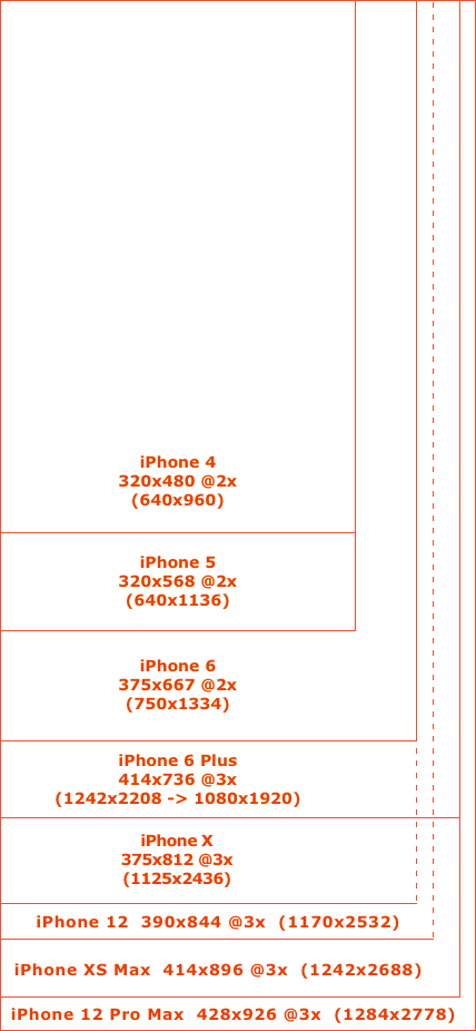
Some people say that for edge to edge image (like a banner on the bottom from left to right edge of the screen) for iPhone 6 Plus they would prepare [email protected] with width 1242 and for iPhone 6 [email protected] with width 750 to match the iPhone 6 screen size however I do not think that this is a good idea because 1242 / 3 = 414 and 750 / 2 = 375 so naming them as @2x and @3x does not have sense. And then what width should have back.png - 375 or 414?
Graphics names are using @2x and @3x suffixes so if for example [email protected] has 30x30 resolution then logically thinking [email protected] should have 20x20 resolution and image.png should be 10x10. This means that if we want to have sharp full width image for each screen then we probably should create [email protected] with width 4143=1242px, [email protected] with width 4142=828px and back.png with width 414px. This however means that on every iPhone except for iPhone 6 Plus you will need to setup your uiimages to use for example aspect fit content mode and they will be scalled down so this again is not a perferct solution and probably would really slow down the application if we use a lot of scalling on older devices.
So what do you think would be the best solution to solve this problem?
 383
383
Adjust the magnification: Double-tap the screen with three fingers (without lifting your fingers after the second tap), then drag up or down. Or triple-tap with three fingers, then drag the Zoom Level slider. Move the Zoom lens: (Window Zoom) Drag the handle at the bottom of the Zoom lens.
Your iPhone uses a ratio of 3:4 by default, which means that if you wanted to print a 3 x 4 photo or a 6 x 8 photo, you could do it without any cropping at all.
Step one: When you find your image, don't open it. Instead, right click on the photo and select “Properties.” Step two: Once you're in “Properties,” click on the “Details” tab. Step three: Scroll until you see the resolution or dpi of your picture.
You don't have to have each image in all scales if it won't be used. Make only the sizes you need and name them according to their width. For portrait full-device-width images, you need 320px wide at 1x and 2x, 375px wide at 2x and 414px wide at 3x.
4" devices used "-568h" suffix for naming their launch images, so I'd recommend a similar naming scheme:
Then figure out what image you need at runtime:
NSNumber *screenWidth = @([UIScreen mainScreen].bounds.size.width); NSString *imageName = [NSString stringWithFormat:@"name-%@w", screenWidth]; UIImage *image = [UIImage imageNamed:imageName]; This might break if other widths are added in future, but so far Apple has always required rebuilding the app to support new displays so I guess it's somewhat safe to assume they will continue doing that.
68
I personally will be doing :
ImageName@2x iPhone 4/4s
ImageName-568h@2x iPhone 5/5s
ImageName-667h@2x iPhone 6
ImageName-736h@3x iPhone 6Plus
The logic behind this is that it shows a difference between all devices, whereas width shares the same value on the iPhone 5s and iPhone 4s
Edit:
This is just the naming convention I am using for resources that are device dependant, such as a background image taking the whole screen, most of the time all you want is:
ImageName@2x iPhone 4/4s/5/5s/6
ImageName@3x iPhone 6Plus/Zoom mode
32
If you love us? You can donate to us via Paypal or buy me a coffee so we can maintain and grow! Thank you!
Donate Us With