 Menu
Menu
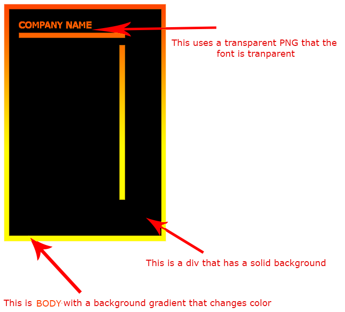
I'm looking to make a page that has a background gradient that changes color every few seconds and blends between transitions. Now I want to apply this effect on the to the upper elements that are blocked by a element that has a solid background.
To give you a better example what I mean I have attached a simple mockup and hopefully your understand what I'm attempting to do, I'm open to suggestions.
(source: bybe.net)
The problem is obviously the block that contains the black background which any PNG transparent used would see black not the gradient.
I'll include sample code so far:
<body><!-- A Jquery script will be used to add CSS background, Easy stuff -->
<div class="blackbox">
    <div class="logo"><img src="#" alt=""></div>
    <hr class="h-line">
    <div class="v-line"> </div>
</div>
So what I'm after is either:
 950
950
You could play a little with margins and box-shadow and keyframe animations.
Something in this direction for the shape (depends on what you want to do with which part - add content ... and in what way you want it to be responsive):
html:
<div class="wrapper">
    <div class="header"><img src="http://i.imgur.com/CUbOIxr.png" alt="Company name" /></div>
    <div class="content"></div>
</div>
CSS:
body {
    background:orange;
    width:100%;
    height:100%;
}
.wrapper {
    width:40%;
    height:90%;
    border:30px solid #000;
    border-right-width:100px;
    border-bottom-width:100px;
}
.header {
    width:100%;
    border-bottom:10px solid transparent;
    -webkit-box-shadow: 0 30px 0 #000;
    -moz-box-shadow: 0 30px 0 #000;
    box-shadow: 0 30px 0 #000;
}
.header img {
    width:100%;
}
.content {
    width:95%;
    height:400px;
    background-color:#000;
    margin-top:30px;
}
DEMO
This way no javascript is needed. And for the background you can use a linear gradient and do all animations with css transitions or keyframe animations. You also need to play with the lengths and adjust the borders and box-shadows to your needs, maybe add some @media queries for the responsiveness.
Hope this helps you a little in the right direction =)
I hoped the gradients changing was the smaller problem ;-) Silly me, sorry.
I will elaborate my CSS-only suggestion for the animation, but you can choose a javascript slider for the background animation, if you don't like CSS3 solutions - although this is the hot stuff now ;-)
Ok. So, I would add some more fixed positioned elements with gradient backgrounds (layer1 and layer2).
To have something in this direction in the html now:
<div class="layer layer1"></div>
<div class="layer layer2"></div>
<div class="wrapper">
    <div class="header">
        <img src="http://newtpond.com/test/company-name.png" alt="Company name" />
    </div>
    <div class="content"></div>
</div>
and add a keyframe animation on them in CSS (here it is just with the -webkit vendor prefix [probably cause I am a lazy bum], but I hope you can get the idea, and could add the others):
body {
    width:100%;
    height:100%;
    margin:0;
    padding:0;
}
/* for the animation */
 .layer {
    position:fixed;
    width:100%;
    height:100%;
}
@-webkit-keyframes GoLayer1 {
    0% {
        opacity:1;
    }
    50% {
        opacity:0;
    }
    100% {
        opacity:1;
    }
}
@-webkit-keyframes GoLayer2 {
    0% {
        opacity:0;
    }
    50% {
        opacity:1;
    }
    100% {
        opacity:0;
    }
}
.layer1 {
    background: -webkit-linear-gradient(bottom, rgb(43, 70, 94) 29%, rgb(194, 41, 41) 65%, rgb(155, 171, 38) 83%);
    -webkit-animation: GoLayer1 5s infinite;
}
.layer2 {
    background: -webkit-linear-gradient(bottom, rgb(225, 202, 230) 29%, rgb(39, 163, 194) 65%, rgb(36, 124, 171) 83%);
    -webkit-animation: GoLayer2 5s infinite;
}
/* the wrapper shape */
 .wrapper {
    z-index:999;
    opacity:1;
    position:relative;
    width:40%;
    height:90%;
    border:30px solid #000;
    border-right-width:100px;
    border-bottom-width:100px;
}
.header {
    width:100%;
    border-bottom:10px solid transparent;
    -webkit-box-shadow: 0 30px 0 #000;
    -moz-box-shadow: 0 30px 0 #000;
    box-shadow: 0 30px 0 #000;
}
.header img {
    width:100%;
}
.content {
    width:95%;
    height:400px;
    background-color:#000;
    margin-top:28px;
}
DEMO (tested in Chrome 26 - looked cool =)
This is now where I can point you according this CSS-only approach. There is still stuff to modify and consider browser compatibility. But it is certainly an alternative ... and a step in the direction where html5 and css3 is going (if you want to be hot and cool ;-), hehe, sorry, too much silliness.
Good luck!
So, I overcame my laziness a tiny bit and added some more vendor prefixes to the top example (and of course you can use any image as background):
And here I add another example, that is using a png image for the gradient, and is sliding up and down in the background (as another alternative):
88
There are many ways to do this, CSS3 and images are already suggested, so I'll suggest using a canvas.
The HTML canvas element has everything you need built in. It allows for gradient background fills, and with globalCompositeOperation, masking of shapes and text is possible, creating cut-outs in the background to make real changeable HTML elements truly transparent against a colored background. It also scales well, and can easily be made responsive.
The canvas element is supported in all major browsers except Internet Explorer 8 and below, which means browser support is better than many of the CSS3 methods previously mentioned, like keyframes and background-size.
Using a fallback, like say images that fade in and out if canvas is'nt available, should'nt be very hard to figure out, and in all other browsers except Internet Explorer below version 9, no images would be needed to create the gradient backgrounds and text masks in a canvas, which should make the loading of the page significantly faster.
To detect wether or not canvas is supported, you can use this convenient function :
function isCanvasSupported(){
  var elem = document.createElement('canvas');
  return !!(elem.getContext && elem.getContext('2d'));
}
used like so :
if ( isCanvasSupported() ) {
    // do canvas stuff
}else{
    // fall back to images
}
So, lets get to it! To create a "last resort" fallback and some elements we can "clone" into the canvas, we'll create the elements we need in the HTML to get a structure somewhat similar to what you've outlined in your question. This has the added advantage of being able to just change some of the CSS to also make changes in the canvas :
<div id="gradient">
    <div class="text">COMPANY NAME</div>
    <div class="h_bar"></div>
    <div class="v_bar"></div>
</div>
It's just a container with an element for text, and one for each of the bars.
Some styling is neccessary as well, I'll do it the easy way, with position absolute and some really fast positioning, as these elements won't be visible unless someone has disabled javascript anyway :
#gradient {position: absolute;
           background: #000;
           top: 5%; left: 5%; right: 5%; bottom: 5%;
          }
.text {position: absolute;
      top: 20px;
      left: 100px;
      width: 400px;
      color: #fff; font-size: 40px; font-weight: bold;
      font-family: arial, verdana, sans-serif;
      }
.h_bar {position: absolute;
        height: 20px;
        top: 100px; left: 60px; right: 60px;
        background: #fff;
       }
.v_bar {position: absolute;
        width: 20px;
        top: 140px; bottom: 30px; right: 60px;
        background: #fff;
       }
Without any javascript that would look exactly like THIS FIDDLE, and it should be somewhat responsive and adapt to the window size.
Now we need some javascript to turn those elements into something in a canvas. We'll create two canvas elements, one for the background, as I've decided to animate the background continously between random gradients, and one for the inner black box and the content (the text and the bars).
As the masking of the text and bars can be a little slow, we don't have to redraw everything, just the background canvas, as the foreground is pretty static. This also avoids a flickering issue in some browsers with high frame rates, and we're going to use requestAnimationFrame for the animation of the background canvas, so flickering in the text mask would be an issue if we did'nt use two canvas elements.
For browsers that does'nt support requestAnimationFrame we'll add this polyfill to make sure it works everywhere.
Time to write some javascript, this of course uses jQuery :
var gradSite = {
    init: function() {
        var self = this;
        self.create().setSizes().events();
        (function animationloop(){
            requestAnimationFrame(animationloop);
            self.draw().colors.generate();
        })();
    },
    create: function() { // creates the canvas elements
        this.canvas     = document.createElement('canvas');
        this.canvas2    = document.createElement('canvas');
        this.canvas.id  = 'canvas1';
        this.canvas2.id = 'canvas2';
        this.canvas.style.position = 'absolute';
        this.canvas2.style.position = 'absolute';
        $('#gradient').after(this.canvas, this.canvas2);
        return this;
    },
    events: function() { //event handlers
        $(window).on('resize', this.setSizes);
        $('#gradient').on('contentchange', this.draw2);
        return this;
    },
    setSizes: function() { // sets sizes on load and resize
        var self = gradSite,
            w    = $(window),
            m    = $('#gradient');

        self.canvas.height      = w.height();
        self.canvas.width       = w.width();
        self.canvas2.bg         = m.css('background-color');
        self.canvas2.height     = m.height();
        self.canvas2.width      = m.width();
        self.canvas2.style.top  = m.offset().top + 'px';
        self.canvas2.style.left = m.offset().left + 'px';
        self.draw2();
        return self;
    },
    colors: {
        colors: {
                0: [255,255,0],
                1: [255,170,0],
                2: [255,0,0]
        },
        map: {
                0: [0,0,1],
                1: [0,1,1],
                2: [0,1,1]
        },
        generate: function() { // generates the random colors
            var self = this;
            $.each(self.colors, function(i,color) {
                $.each(color, function(j, c) {
                    var r   = Math.random(),
                        r2  = Math.random(),
                        val = self.map[i][j] == 0 ? (c-(j+r)) : (c+(j+r2));

                    if (c > 255) self.map[i][j] = 0;
                    if (c < 0  ) self.map[i][j] = 1;

                    self.colors[i][j] = val;
                });
            });
        }
    },
    raf: (function() { // polyfill for requestAnimationFrame
        var lastTime = 0,
            vendors  = ['webkit', 'moz'];
        for(var x = 0; x < vendors.length && !window.requestAnimationFrame; ++x) {
            window.requestAnimationFrame = window[vendors[x]+'RequestAnimationFrame'];
            window.cancelAnimationFrame  = window[vendors[x]+'CancelAnimationFrame'] || window[vendors[x]+'CancelRequestAnimationFrame'];
        }

        if (!window.requestAnimationFrame)
            window.requestAnimationFrame = function(callback, element) {
                var currTime = new Date().getTime(),
                    timeToCall = Math.max(0, 16 - (currTime - lastTime)),
                    id = window.setTimeout(function() { callback(currTime + timeToCall); }, timeToCall);
                lastTime = currTime + timeToCall;
                return id;
            };

        if (!window.cancelAnimationFrame)
            window.cancelAnimationFrame = function(id) {
                clearTimeout(id);
            };
    }()),
    calculateColor: function(colors) { // returns a rgb color from the array
        return 'rgb(' + Math.round(colors[0]) + ',' + Math.round(colors[1]) + ',' + Math.round(colors[2]) + ')';
    },
    draw: function() { //draws the color background
        var self = this,
            c    = self.canvas || document.getElementById('canvas1'),
            ctx  = c.getContext('2d'),
            grad = ctx.createLinearGradient(0,0,0,self.canvas.height);

        c.width = c.width;
        grad.addColorStop(0, self.calculateColor(self.colors.colors[0]));
        grad.addColorStop(0.5, self.calculateColor(self.colors.colors[1]));
        grad.addColorStop(1, self.calculateColor(self.colors.colors[2]));
        ctx.fillStyle = grad;
        ctx.fillRect(0,0,self.canvas.width, self.canvas.height);
        return self;
    },
    draw2: function() { // draws the black square and content
        var self = this,
            c    = self.canvas2 || document.getElementById('canvas2'),
            ctx2 = c.getContext('2d'),
            txt  = $('.text', '#gradient').first(),
            hbar = $('.h_bar', '#gradient').first(),
            vbar = $('.v_bar', '#gradient').first();

        c.width = c.width;
        ctx2.globalCompositeOperation = 'xor';

        ctx2.font = txt.css('font');
        ctx2.fillStyle = c.bg || '#000';
        ctx2.fillText(txt.text(), txt.offset().left, txt.offset().top);

        ctx2.fillRect(hbar.position().left, hbar.position().top, hbar.width(),hbar.height());
        ctx2.fillRect(vbar.position().left, vbar.position().top, vbar.width(),vbar.height());
        ctx2.fillRect(0,0,c.width,c.height);
    }
}
The raf function would be the polyfill for requestAnimationFrame, and the two draw functions create the content in the canvas. It's really not that complicated.
We will call the above script inside a DOM ready handler, like so :
$(function() {
    gradSite.init(); // starts the canvas stuff
});
Adding all that up into a fiddle, and adding a few elements for demonstration purposes, it would look like THIS FIDDLE, and here's the finished ->
FULL SCREEN DEMO
4
If you love us? You can donate to us via Paypal or buy me a coffee so we can maintain and grow! Thank you!
Donate Us With