 Menu
Menu
Well, drawing a circle with pure CSS is easy.
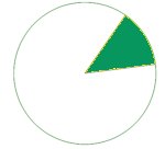
.circle { width: 100px; height: 100px; border-radius: 100px; border: 3px solid black; background-color: green; } How do I draw a sector? Given a degree X [0-360] I want to draw a X degrees sector. Can I do that with pure CSS?
For example:
Thanks + Example
Thank you Jonathan, I used the first method. If it helps someone here's an example of a JQuery function that gets percentage and draw a sector. The sector is behind the percentage circle and this example shows how to achieve an arc around a circle from a start degree.
$(function drawSector() { var activeBorder = $("#activeBorder"); var prec = activeBorder.children().children().text(); if (prec > 100) prec = 100; var deg = prec * 3.6; if (deg <= 180) { activeBorder.css('background-image', 'linear-gradient(' + (90 + deg) + 'deg, transparent 50%, #A2ECFB 50%),linear-gradient(90deg, #A2ECFB 50%, transparent 50%)'); } else { activeBorder.css('background-image', 'linear-gradient(' + (deg - 90) + 'deg, transparent 50%, #39B4CC 50%),linear-gradient(90deg, #A2ECFB 50%, transparent 50%)'); } var startDeg = $("#startDeg").attr("class"); activeBorder.css('transform', 'rotate(' + startDeg + 'deg)'); $("#circle").css('transform', 'rotate(' + (-startDeg) + 'deg)'); });.container { width: 110px; height: 110px; margin: 100px auto; } .prec { top: 30px; position: relative; font-size: 30px; } .prec:after { content: '%'; } .circle { position: relative; top: 5px; left: 5px; text-align: center; width: 100px; height: 100px; border-radius: 100%; background-color: #E6F4F7; } .active-border { position: relative; text-align: center; width: 110px; height: 110px; border-radius: 100%; background-color: #39B4CC; background-image: linear-gradient(91deg, transparent 50%, #A2ECFB 50%), linear-gradient(90deg, #A2ECFB 50%, transparent 50%); }<script src="https://ajax.googleapis.com/ajax/libs/jquery/1.10.1/jquery.min.js"></script> <div class="container"> <div id="activeBorder" class="active-border"> <div id="circle" class="circle"> <span class="prec">66</span> <span id="startDeg" class="90"></span> </div> </div> </div>JSFiddle demo
$(function drawSector() { // Get degrees ... // Draw a sector if (deg <= 180) { activeBorder.css('background-image', 'linear-gradient(' + (90+deg) + 'deg, transparent 50%, #A2ECFB 50%), linear-gradient(90deg, #A2ECFB 50%, transparent 50%)'); } else { activeBorder.css('background-image', 'linear-gradient(' + (deg-90) + 'deg, transparent 50%, #39B4CC 50%), linear-gradient(90deg, #A2ECFB 50%, transparent 50%)'); } // Rotate to meet the start degree activeBorder.css('transform','rotate(' + startDeg + 'deg)'); });  606
606
Creating an empty circle with CSS To create an empty circle first of all add an empty <div> element. Use CSS border-radius: 50% to make the div element circular. Additionally set the height, width and border of <div> element.
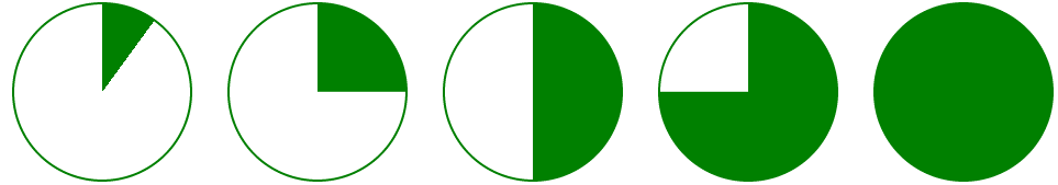
Rather than trying to draw the green portion, you could draw the white portions instead:
pie { border-radius: 50%; background-color: green; } .ten { background-image: /* 10% = 126deg = 90 + ( 360 * .1 ) */ linear-gradient(126deg, transparent 50%, white 50%), linear-gradient(90deg, white 50%, transparent 50%); } pie { width: 5em; height: 5em; display: block; border-radius: 50%; background-color: green; border: 2px solid green; float: left; margin: 1em; } .ten { background-image: linear-gradient(126deg, transparent 50%, white 50%), linear-gradient(90deg, white 50%, transparent 50%); } .twentyfive { background-image: linear-gradient(180deg, transparent 50%, white 50%), linear-gradient(90deg, white 50%, transparent 50%); } .fifty { background-image: linear-gradient(90deg, white 50%, transparent 50%); } /* Slices greater than 50% require first gradient to be transparent -> green */ .seventyfive { background-image: linear-gradient(180deg, transparent 50%, green 50%), linear-gradient(90deg, white 50%, transparent 50%); } .onehundred { background-image: none; }<pie class="ten"></pie> <pie class="twentyfive"></pie> <pie class="fifty"></pie> <pie class="seventyfive"></pie> <pie class="onehundred"></pie>Demo: http://jsfiddle.net/jonathansampson/7PtEm/
If it's an option, you can accomplish a similar effect using SVG <circle> and <path> elements. Consider the following:
<svg> <circle cx="115" cy="115" r="110"></circle> <path d="M115,115 L115,5 A110,110 1 0,1 190,35 z"></path> </svg> The above is fairly straight forward. We have an element containing a circle and a path. The circle's center is at 115x115 (making the SVG element 230x230). The circle has a radius of 110, making it a total of 220 wide (leaving a border of 10).
We then add a <path> element, which is the most complicated portion of this example. This element has one attribute which determines where, and how the path is drawn. It starts with the following value:
M115,115 This instructs the path to start in the center of the aforementioned circle. Next, we draw a line from this location to the next location:
L115,5 This draws a vertical line from the center of the circle up to the top of the element (well, five pixels from the top). It is at this point things get a little more complicated but still very much intelligible.
We now draw an arc from our present location (115,5):
A110,110 1 0,1 190,35 z This creates our arc and gives it a radius matching that of our circle (110). The two values represent the x-radius and y-radius, and both are equal since we're dealing with a circle. The next set of important numbers are the last, 190,35. This tells the arc where to complete.
As for the rest of the information (1 0,1 and z) these control the curvature, direction, and terminal of the arc itself. You can learn more about them by consulting any online SVG path reference.
To accomplish a "slice" of a different size, merely change the 190,35 to reflect a larger or smaller set of coordinates. You may find that you'll need to create a second, arc if you want to span more than 180 degrees.
If you want to determine the x and y coordinates from an angle, you can use the following equations:
x = cx + r * cos(a) y = cy + r * sin(a) With the above example, a degree of 76 would be:
x = 115 + 110 * cos(76) y = 115 + 110 * sin(76) Which gives us 205.676,177.272.
With some ease, you can create the following:
circle { fill: #f1f1f1; stroke: green; stroke-width: 5; } path { fill: green; } svg.pie { width: 230px; height: 230px; }<svg class="pie"> <circle cx="115" cy="115" r="110"></circle> <path d="M115,115 L115,5 A110,110 1 0,1 190,35 z"></path> </svg> <svg class="pie"> <circle cx="115" cy="115" r="110"></circle> <path d="M115,115 L115,5 A110,110 1 0,1 225,115 z"></path> </svg> <svg class="pie"> <circle cx="115" cy="115" r="110"></circle> <path d="M115,115 L115,5 A110,110 1 0,1 115,225 A110,110 1 0,1 35,190 z"></path> </svg>Demo: http://jsfiddle.net/jonathansampson/tYaVW/

58
That is very well possible using overflow and transform properties without any need to do complex calculations.
For angles less than 180deg
Add an element with aspect ratio 2:1 and overflow: hidden;
Add a pseudo-element with with top border radii same as the height of the element and bottom radii as 0.
Put transform-origin: 50% 100%; This transforms the pseudo-element from its middle bottom.
Transform: rotate(); the pseudo element by supplement of the required angle,
i.e., transform: rotate(180 - rqrd. angle);
See how it works :

EG :
A 40deg sector using this method : Fiddle
div { ... overflow: hidden; ... } div:before { ... border-radius: 100px 100px 0 0; transform-origin: 50% 100%; transform: rotate(140deg); ... } div { height: 100px; width: 200px; overflow: hidden; position: relative; } div:before { height: inherit; width: inherit; position: absolute; content: ""; border-radius: 100px 100px 0 0; background-color: crimson; -webkit-transform-origin: 50% 100%; -moz-transform-origin: 50% 100%; -ms-transform-origin: 50% 100%; transform-origin: 50% 100%; -webkit-transform: rotate(140deg); -moz-transform: rotate(140deg); -ms-transform: rotate(140deg); transform: rotate(140deg); }<div></div>You can also put image inside sector!
This can be done using skew transforms on parent and -ve skew on pseudoelement :
Fiddle
div { ... overflow: hidden; transform-origin: 0% 100%; transform: skew(-50deg); /*Complement of rqrd angle*/ ... } div:before { ... transform-origin: 0% 100%; transform: skew(50deg); ... } See how this works :

div { height: 200px; width: 200px; overflow: hidden; -webkit-transform-origin: 0% 100%; -moz-transform-origin: 0% 100%; -ms-transform-origin: 0% 100%; transform-origin: 0% 100%; -webkit-transform: skew(-50deg); -moz-transform: skew(-50deg); -ms-transform: skew(-50deg); transform: skew(-50deg); /*Complement of rqrd angle or (90 - angle)*/ position: relative; } div:before { height: inherit; width: inherit; position: absolute; content: ""; border-radius: 0 200px 0 0; background: url('http://www.placekitten.com/g/300/200/'); -webkit-transform-origin: 0% 100%; -moz-transform-origin: 0% 100%; -ms-transform-origin: 0% 100%; transform-origin: 0% 100%; -webkit-transform: skew(50deg); -moz-transform: skew(50deg); -ms-transform: skew(50deg); transform: skew(50deg); }<div></div>Acknowledgements : I don't want to be a self stealer, I used the ideas which I had previously used here and here.
34
If you love us? You can donate to us via Paypal or buy me a coffee so we can maintain and grow! Thank you!
Donate Us With


