 Menu
Menu
HTML:
<?xml version="1.0" encoding="utf-8"?>
<html>
  <head>
    <title>Circle</title>
    <link rel="stylesheet" href="stylesheet.css" type="text/css" />
  </head>
  <body>
    <div class="circle"><p class="innerCircle"></p></div>
  </body>
</html>
CSS:
.circle {
    width: 450px;
    height: 450px;

    border-top: 30px solid #416fa6;
    border-right: 30px solid #718242;
    border-bottom: 30px solid #63ae98;
    border-left: 30px solid #b45447;
    -webkit-border-radius: 300px;
       -moz-border-radius: 300px;
            border-radius: 300px;
}
.innerCircle {
    width: 0px;
    height: 0px;
    border-top: 210px solid #416FA6;
    border-left: 210px solid #B45447;
    border-right: 210px solid #718242;
    border-bottom: 210px solid #FFA500;
    -webkit-border-radius: 100%;
       -moz-border-radius: 100%;
            border-radius: 100%;
    margin-left: 15px;
    margin-right:0px;
    margin-top: 15px;
    margin-bottom:0px;
    /* border-radius: 50%;
    background-color: green; */
}
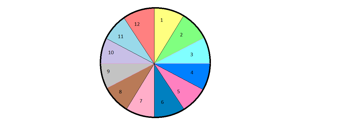
I want to divide a circle into 12 parts by using lines for innerCircle following below figure. I tried few but not fully. So Please give some idea.
Thanks in advance.
 889
889
This can be done using CSS transforms
1) For 12 equal slices, each slice angle will be 30 degrees.
2) We need to rotate each slice according to the angle between vertical axis and start of the slice. So the first slice will be rotated by 0deg and the last by 330deg
3) Additionally we need to skew each slice by minus (90deg - slice angle)
In this case, it is -(90deg - 30deg) = skewY(-60deg)
4) Regarding the text:
a) We need to unskew slice contents with skewY(60deg)
b) In order to center the text in the slice we need to rotate it by half the slice angle, hence: rotate(15deg)
.circle {
  position: relative;
  border: 1px solid black;
  padding: 0;
  margin: 1em auto;
  width: 20em;
  height: 20em;
  border-radius: 50%;
  list-style: none;
  overflow: hidden;
}
li {
  overflow: hidden;
  position: absolute;
  top: 0;
  right: 0;
  width: 50%;
  height: 50%;
  transform-origin: 0% 100%;
}
.text {
  position: absolute;
  left: -100%;
  width: 200%;
  height: 200%;
  text-align: center;
  transform: skewY(60deg) rotate(15deg);
  padding-top: 20px;
}
li:first-child {
  transform: rotate(0deg) skewY(-60deg);
}
li:nth-child(2) {
  transform: rotate(30deg) skewY(-60deg);
}
li:nth-child(3) {
  transform: rotate(60deg) skewY(-60deg);
}
li:nth-child(4) {
  transform: rotate(90deg) skewY(-60deg);
}
li:nth-child(5) {
  transform: rotate(120deg) skewY(-60deg);
}
li:nth-child(6) {
  transform: rotate(150deg) skewY(-60deg);
}
li:nth-child(7) {
  transform: rotate(180deg) skewY(-60deg);
}
li:nth-child(8) {
  transform: rotate(210deg) skewY(-60deg);
}
li:nth-child(9) {
  transform: rotate(240deg) skewY(-60deg);
}
li:nth-child(10) {
  transform: rotate(270deg) skewY(-60deg);
}
li:nth-child(11) {
  transform: rotate(300deg) skewY(-60deg);
}
li:nth-child(12) {
  transform: rotate(330deg) skewY(-60deg);
}
li:first-child .text {
  background: green;
}
li:nth-child(2) .text {
  background: tomato;
}
li:nth-child(3) .text {
  background: aqua;
}
li:nth-child(4) .text {
  background: yellow;
}
li:nth-child(5) .text {
  background: orange;
}
li:nth-child(6) .text {
  background: purple;
}
li:nth-child(7) .text {
  background: cyan;
}
li:nth-child(8) .text {
  background: brown;
}
li:nth-child(9) .text {
  background: gray;
}
li:nth-child(10) .text {
  background: pink;
}
li:nth-child(11) .text {
  background: maroon;
}
li:nth-child(12) .text {
  background: gold;
}
<ul class="circle">
<li>
<div class="text">1</div>
</li>
<li>
<div class="text">2</div>
</li>
<li>
<div class="text">3</div>
</li>
<li>
<div class="text">4</div>
</li>
<li>
<div class="text">5</div>
</li>
<li>
<div class="text">6</div>
</li>
<li>
<div class="text">7</div>
</li>
<li>
<div class="text">8</div>
</li>
<li>
<div class="text">9</div>
</li>
<li>
<div class="text">10</div>
</li>
<li>
<div class="text">11</div>
</li>
<li>
<div class="text">12</div>
</li>
<ul>NB: IE9 and Safari/iOS require -ms and -webkit vendor prefixes respectively. (caniuse)
61
You could use borders for this (I've made 8 sectors in this since my maths isn't great). But you should be able to get the general idea here:
.circ {
  height: 300px;
  width: 300px;
  background: rgba(0, 0, 0, 0.2);
  border-radius: 50%;
  position: relative;
  overflow: hidden;
}
.sect {
  height: 0px;
  width: 0px;
  position: absolute;
  top: 0;
  right: 0;
  border-right: 150px solid red;
  border-top: 150px solid transparent;
  transform-origin: bottom left;
}
.sect:nth-child(2) {
  transform: rotate(45deg);
  border-right: 150px solid blue;
}
.sect:nth-child(3) {
  transform: rotate(90deg);
  border-right: 150px solid green;
}
.sect:nth-child(4) {
  transform: rotate(135deg);
  border-right: 150px solid red;
}
.sect:nth-child(5) {
  transform: rotate(180deg);
  border-right: 150px solid blue;
}
.sect:nth-child(6) {
  transform: rotate(225deg);
  border-right: 150px solid green;
}
.sect:nth-child(7) {
  transform: rotate(270deg);
  border-right: 150px solid blue;
}
.sect:nth-child(8) {
  transform: rotate(315deg);
  border-right: 150px solid green;
}
<div class="circ">
<div class="sect"></div>
<div class="sect"></div>
<div class="sect"></div>
<div class="sect"></div>
<div class="sect"></div>
<div class="sect"></div>
<div class="sect"></div>
<div class="sect"></div>
</div>If you love us? You can donate to us via Paypal or buy me a coffee so we can maintain and grow! Thank you!
Donate Us With