 Menu
Menu
In Android, by default a progress bar will be displayed as a spinning wheel but If we want it to be displayed as a horizontal bar then we need to use style attribute as horizontal. It mainly use the “android. widget. ProgressBar” class.
Customizing a ProgressBar requires defining the attribute or properties for the background and progress of your progress bar.
Create an XML file named customprogressbar.xml in your res->drawable folder:
custom_progressbar.xml
<layer-list xmlns:android="http://schemas.android.com/apk/res/android">

    <!-- Define the background properties like color etc -->
    <item android:id="@android:id/background">
    <shape>
        <gradient
                android:startColor="#000001"
                android:centerColor="#0b131e"
                android:centerY="1.0"
                android:endColor="#0d1522"
                android:angle="270"
        />
    </shape>
   </item>

  <!-- Define the progress properties like start color, end color etc -->
  <item android:id="@android:id/progress">
    <clip>
        <shape>
            <gradient
                android:startColor="#007A00"
                android:centerColor="#007A00"
                android:centerY="1.0"
                android:endColor="#06101d"
                android:angle="270"
            />
        </shape>
    </clip>
    </item>
</layer-list>
Now you need to set the progressDrawable property in customprogressbar.xml (drawable)
You can do this in the XML file or in the Activity (at run time).
Do the following in your XML:
<ProgressBar
    android:id="@+id/progressBar1"
    style="?android:attr/progressBarStyleHorizontal"
    android:progressDrawable="@drawable/custom_progressbar"
    android:layout_width="wrap_content"
    android:layout_height="wrap_content" />
At run time do the following
// Get the Drawable custom_progressbar
    Drawable draw=res.getDrawable(R.drawable.custom_progressbar);
// set the drawable as progress drawable
    progressBar.setProgressDrawable(draw);
Edit: corrected xml layout
In case of complex ProgressBar like this,
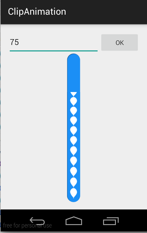
use ClipDrawable.
NOTE : I've not used
ProgressBarhere in this example. I've achieved this using ClipDrawable by clipping image withAnimation.
A Drawable that clips another Drawable based on this Drawable's current level value. You can control how much the child Drawable gets clipped in width and height based on the level, as well as a gravity to control where it is placed in its overall container. Most often used to implement things like progress bars, by increasing the drawable's level with setLevel().
NOTE : The drawable is clipped completely and not visible when the level is 0 and fully revealed when the level is 10,000.
I've used this two images to make this CustomProgressBar.
scall.png

ballon_progress.png

MainActivity.java
public class MainActivity extends ActionBarActivity {

private EditText etPercent;
private ClipDrawable mImageDrawable;

// a field in your class
private int mLevel = 0;
private int fromLevel = 0;
private int toLevel = 0;

public static final int MAX_LEVEL = 10000;
public static final int LEVEL_DIFF = 100;
public static final int DELAY = 30;

private Handler mUpHandler = new Handler();
private Runnable animateUpImage = new Runnable() {

    @Override
    public void run() {
        doTheUpAnimation(fromLevel, toLevel);
    }
};

private Handler mDownHandler = new Handler();
private Runnable animateDownImage = new Runnable() {

    @Override
    public void run() {
        doTheDownAnimation(fromLevel, toLevel);
    }
};

@Override
protected void onCreate(Bundle savedInstanceState) {
    super.onCreate(savedInstanceState);
    setContentView(R.layout.activity_main);

    etPercent = (EditText) findViewById(R.id.etPercent);

    ImageView img = (ImageView) findViewById(R.id.imageView1);
    mImageDrawable = (ClipDrawable) img.getDrawable();
    mImageDrawable.setLevel(0);
}

private void doTheUpAnimation(int fromLevel, int toLevel) {
    mLevel += LEVEL_DIFF;
    mImageDrawable.setLevel(mLevel);
    if (mLevel <= toLevel) {
        mUpHandler.postDelayed(animateUpImage, DELAY);
    } else {
        mUpHandler.removeCallbacks(animateUpImage);
        MainActivity.this.fromLevel = toLevel;
    }
}

private void doTheDownAnimation(int fromLevel, int toLevel) {
    mLevel -= LEVEL_DIFF;
    mImageDrawable.setLevel(mLevel);
    if (mLevel >= toLevel) {
        mDownHandler.postDelayed(animateDownImage, DELAY);
    } else {
        mDownHandler.removeCallbacks(animateDownImage);
        MainActivity.this.fromLevel = toLevel;
    }
}

public void onClickOk(View v) {
    int temp_level = ((Integer.parseInt(etPercent.getText().toString())) * MAX_LEVEL) / 100;

    if (toLevel == temp_level || temp_level > MAX_LEVEL) {
        return;
    }
    toLevel = (temp_level <= MAX_LEVEL) ? temp_level : toLevel;
    if (toLevel > fromLevel) {
        // cancel previous process first
        mDownHandler.removeCallbacks(animateDownImage);
        MainActivity.this.fromLevel = toLevel;

        mUpHandler.post(animateUpImage);
    } else {
        // cancel previous process first
        mUpHandler.removeCallbacks(animateUpImage);
        MainActivity.this.fromLevel = toLevel;

        mDownHandler.post(animateDownImage);
    }
}
}
activity_main.xml
<LinearLayout xmlns:android="http://schemas.android.com/apk/res/android"
xmlns:tools="http://schemas.android.com/tools"
android:layout_width="match_parent"
android:layout_height="match_parent"
android:paddingLeft="16dp"
android:paddingRight="16dp"
android:paddingTop="16dp"
android:paddingBottom="16dp"
android:orientation="vertical"
tools:context=".MainActivity">

<LinearLayout
    android:layout_width="match_parent"
    android:layout_height="wrap_content"
    android:orientation="horizontal">

    <EditText
        android:id="@+id/etPercent"
        android:layout_width="0dp"
        android:layout_height="wrap_content"
        android:layout_weight="1"
        android:inputType="number"
        android:maxLength="3" />

    <Button
        android:layout_width="wrap_content"
        android:layout_height="wrap_content"
        android:text="Ok"
        android:onClick="onClickOk" />

</LinearLayout>

<FrameLayout
    android:layout_width="wrap_content"
    android:layout_height="wrap_content"
    android:layout_gravity="center">

    <ImageView
        android:id="@+id/imageView2"
        android:layout_width="match_parent"
        android:layout_height="match_parent"
        android:src="@drawable/scall" />

    <ImageView
        android:id="@+id/imageView1"
        android:layout_width="wrap_content"
        android:layout_height="wrap_content"
        android:src="@drawable/clip_source" />

</FrameLayout>
clip_source.xml
<?xml version="1.0" encoding="utf-8"?>
<clip xmlns:android="http://schemas.android.com/apk/res/android"
    android:clipOrientation="vertical"
    android:drawable="@drawable/ballon_progress"
    android:gravity="bottom" />
In case of complex HorizontalProgressBar just change cliporientation in clip_source.xml like this,
android:clipOrientation="horizontal"
You can download complete demo from here.
in your xml
<ProgressBar
        android:id="@+id/progressBar1"
        android:layout_width="fill_parent"
        android:layout_height="wrap_content"
        style="@style/CustomProgressBar"
        android:layout_margin="5dip" />
And in res/values/styles.xml:
<resources>
        <style name="CustomProgressBar" parent="android:Widget.ProgressBar.Horizontal">
          <item name="android:indeterminateOnly">false</item>
          <item name="android:progressDrawable">@drawable/custom_progress_bar_horizontal</item>
          <item name="android:minHeight">10dip</item>
          <item name="android:maxHeight">20dip</item>
        </style>
    <style name="AppTheme" parent="android:Theme.Light" />
</resources>
And custom_progress_bar_horizontal is a xml stored in drawable folder which defines your custom progress bar. For more detail see this blog.
I hope this will help you.
Customizing the color of progressbar namely in case of spinner type needs an xml file and initiating codes in their respective java files.
Create an xml file and name it as progressbar.xml
<?xml version="1.0" encoding="utf-8"?>
<LinearLayout xmlns:android="http://schemas.android.com/apk/res/android"
    xmlns:tools="http://schemas.android.com/tools"
    android:layout_width="wrap_content"
    android:layout_height="wrap_content"
    android:gravity="center"
    tools:context=".Radio_Activity" >

    <LinearLayout
        android:id="@+id/progressbar"
        android:layout_width="wrap_content"
        android:layout_height="wrap_content" >

        <ProgressBar
            android:id="@+id/spinner"
            android:layout_width="wrap_content"
            android:layout_height="wrap_content" >
        </ProgressBar>
    </LinearLayout>

</LinearLayout>
Use the following code to get the spinner in various expected color.Here we use the hexcode to display spinner in blue color.
Progressbar spinner = (ProgressBar) progrees.findViewById(R.id.spinner);
spinner.getIndeterminateDrawable().setColorFilter(Color.parseColor("#80DAEB"),
                android.graphics.PorterDuff.Mode.MULTIPLY);
There are two types of progress bars called determinate progress bar (fixed duration) and indeterminate progress bar (unknown duration).
Drawables for both of types of progress bar can be customized by defining drawable as xml resource. You can find more information about progress bar styles and customization at http://www.zoftino.com/android-progressbar-and-custom-progressbar-examples.
Customizing fixed or horizontal progress bar :
Below xml is a drawable resource for horizontal progress bar customization.
 <?xml version="1.0" encoding="utf-8"?>
<layer-list xmlns:android="http://schemas.android.com/apk/res/android">
    <item android:id="@android:id/background"
        android:gravity="center_vertical|fill_horizontal">
        <shape android:shape="rectangle"
            android:tint="?attr/colorControlNormal">
            <corners android:radius="8dp"/>
            <size android:height="20dp" />
            <solid android:color="#90caf9" />
        </shape>
    </item>
    <item android:id="@android:id/progress"
        android:gravity="center_vertical|fill_horizontal">
        <scale android:scaleWidth="100%">
            <shape android:shape="rectangle"
                android:tint="?attr/colorControlActivated">
                <corners android:radius="8dp"/>
                <size android:height="20dp" />
                <solid android:color="#b9f6ca" />
            </shape>
        </scale>
    </item>
</layer-list>
Customizing indeterminate progress bar
Below xml is a drawable resource for circular progress bar customization.
<?xml version="1.0" encoding="utf-8"?>
<layer-list xmlns:android="http://schemas.android.com/apk/res/android">
    <item android:id="@android:id/progress"
        android:top="16dp"
        android:bottom="16dp">
                <rotate
                    android:fromDegrees="45"
                    android:pivotX="50%"
                    android:pivotY="50%"
                    android:toDegrees="315">
                    <shape android:shape="rectangle">
                        <size
                            android:width="80dp"
                            android:height="80dp" />
                        <stroke
                            android:width="6dp"
                            android:color="#b71c1c" />
                    </shape>
                </rotate>
    </item>
</layer-list>
Creating Custom ProgressBar like hotstar.
activity_main.xml
<ProgressBar
    style="?android:attr/progressBarStyleLarge"
    android:layout_width="wrap_content"
    android:layout_height="wrap_content"
    android:layout_centerVertical="true"
    android:layout_centerHorizontal="true"
    android:id="@+id/player_progressbar"
    android:indeterminateDrawable="@drawable/custom_progress_bar"
    />
custom_progress_bar.xml
<?xml version="1.0" encoding="utf-8"?>
    <rotate  xmlns:android="http://schemas.android.com/apk/res/android"
    android:duration="2000"
    android:fromDegrees="0"
    android:pivotX="50%"
    android:pivotY="50%"
    android:toDegrees="1080" >

    <shape
        android:innerRadius="35dp"
        android:shape="ring"
        android:thickness="3dp"
        android:useLevel="false" >
       <size
           android:height="80dp"
           android:width="80dp" />

       <gradient
            android:centerColor="#80b7b4b2"
            android:centerY="0.5"
            android:endColor="#f4eef0"
            android:startColor="#00938c87"
            android:type="sweep"
            android:useLevel="false" />
    </shape>

</rotate>
For using custom drawable:
<?xml version="1.0" encoding="utf-8"?>
<rotate xmlns:android="http://schemas.android.com/apk/res/android"
android:fromDegrees="0"
android:toDegrees="360"
android:drawable="@drawable/my_drawable"
android:pivotX="50%"
android:pivotY="50%" />
(add under res/drawable progress.xml). my_drawable may be xml, png
Then in your layout use
<ProgressBar
        android:id="@+id/progressBar"
        android:indeterminateDrawable="@drawable/progress_circle"
...
/>
If you love us? You can donate to us via Paypal or buy me a coffee so we can maintain and grow! Thank you!
Donate Us With