 Menu
Menu
I've been trying to make a DIV with uneven rounded sides like this:
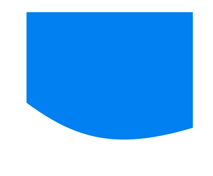
I've checked some solutions and the closest I can get to it is by using border-radius. I've used:
border-bottom-left-radius: 80%50px;
border-bottom-right-radius: 30%30px;
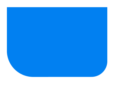
And this is what I've got:
How can this be done?
 518
518
border-radius is the fundamental CSS property to create rounded corners.
You can consider clip-path
.box {
  height: 200px;
  width: 200px;
  background: blue;
  clip-path: circle(75% at 65% 10%);
}
<div class="box">
</div>Or use radial-gradient
.box {
height: 200px;
width: 200px;
background: radial-gradient(circle at 65% 10%, blue 75%,#0000 75.5%);
}<div class="box">
</div>Or use a pseudo element with border-radius and rely on overflow
.box {
height: 200px;
width: 200px;
position: relative;
overflow: hidden;
}
.box:before {
content: "";
position: absolute;
inset: 0 -10% 10%;
background: blue;
border-radius: 0 0 50% 100%;
}<div class="box">
</div>And let's don't forget the SVG solution (as a regular element or background)
svg {
display:inline-block;
}
.box {
display:inline-block;
height:200px;
width:200px;
background:url("data:image/svg+xml;utf8,<svg xmlns='http://www.w3.org/2000/svg' viewBox='0 0 64 64' width='200' height='200' fill='blue'> <path d='M0 0 L0 28 C10 46 30 60 64 48 L64 0 Z' /></svg>")0 0/100% 100% no-repeat;
}<svg
xmlns='http://www.w3.org/2000/svg'
viewBox='0 0 64 64'
width='200' height='200'
fill='blue'>
<path d='M0 0 L0 28 C10 46 30 60 64 48 L64 0 Z' />
</svg>
<div class="box">

</div>Here is a good online tool to easily adjust the SVG http://jxnblk.com/paths/?d=M0 0 L0 28 C10 46 30 60 64 48 L64 0 Z
You can also consider mask-image:
.box {
  height: 200px;
  width: 200px;
  background:blue;
  -webkit-mask-image: radial-gradient(circle at 65% 10%, #fff 75%,#0000 75.5%);
          mask-image: radial-gradient(circle at 65% 10%, #fff 75%,#0000 75.5%);

}
<div class="box">
</div>Here is another syntax for the radial-gradient solution without the use of at which is not supported in Safari
.box {
  height: 200px;
  width: 200px;
  background:
    radial-gradient(blue 60.5%,#0000 61%) 35% 100%/200% 200% no-repeat;
}
<div class="box">
</div>If you love us? You can donate to us via Paypal or buy me a coffee so we can maintain and grow! Thank you!
Donate Us With

