 Menu
Menu
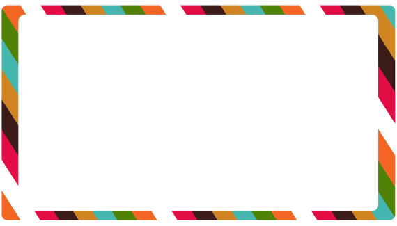
I want to create Round Edges Rectangle With Gradient Color Stripes Border.
I want to use the img tag or div tag to include the image and the Gradient Striped Border.
This is how it needs to look like:
I try to search around and i found that (SCSS) example: https://jsfiddle.net/rami7250/yujsz7wf/
and i got this SCSS code:
.module {
  background: white;
  border: 1px solid #ccc;
  margin: 3%;
  > h2 {
    padding: 1rem;
    margin: 0 0 0.5rem 0;
  }
  > p {
    padding: 0 1rem;
  }
  /*animation: widen 10s linear alternate infinite;*/
}

.stripe-1 {
  color: white;
  background: repeating-linear-gradient(
    45deg,
    #606dbc,
    #606dbc 10px,
    #465298 10px,
    #465298 20px
  );
}
As you can see, that feature effect only background and not border.
How do I make that Rectangle to display Gradient Color Stripes in his Border Via CSS/SCSS?
 710
710
One option would be to use a linear-gradient in the required pattern as background-image and put the required content on top of this background. This approach would work as long as the content, be it image or any text or whatever doesn't require to be transparent. The output is also responsive as can be seen by hovering on the element.
With just the strips: (a white layer is placed on top of the gradient to show only the strips)
div {
  height: 250px;
  width: 400px;
  background: linear-gradient(white, white),
              linear-gradient(60deg, orange 0%, orange 3.5%, white 3.5%, white 7%, hotpink 7%, hotpink 10.5%, black 10.5%, black 14%, brown 14%, brown 17.5%, aqua 17.5%, aqua 21%, green 21%, green 25%, orange 25%, orange 28.5%, white 28.5%, white 32%, hotpink 32%, hotpink 35.5%, black 35.5%, black 39%, brown 39%, brown 42.5%, aqua 42.5%, aqua 46%, green 46%, green 50%, orange 50%, orange 53.5%, white 53.5%, white 57%, hotpink 57%, hotpink 60.5%, black 60.5%, black 64%, brown 64%, brown 67.5%, aqua 67.5%, aqua 71%, green 71%, green 75%, orange 75%, orange 78.5%, white 78.5%, white 82%, hotpink 82%, hotpink 85.5%, black 85.5%, black 89%, brown 89%, brown 92.5%, aqua 92.5%, aqua 96%, green 96%, green 100%);
  padding: 10px 20px;
  border-radius: 20px;
  background-origin: content-box, padding-box;
  background-clip: content-box, padding-box;
}

/* just for demo */

div {
  transition: all 1s;
}
div:hover {
  height: 300px;
  width: 500px;
}<div></div>With image inside the div:
div {
  height: 250px;
  width: 400px;
  background: linear-gradient(white, white), linear-gradient(60deg, orange 0%, orange 3.5%, white 3.5%, white 7%, hotpink 7%, hotpink 10.5%, black 10.5%, black 14%, brown 14%, brown 17.5%, aqua 17.5%, aqua 21%, green 21%, green 25%, orange 25%, orange 28.5%, white 28.5%, white 32%, hotpink 32%, hotpink 35.5%, black 35.5%, black 39%, brown 39%, brown 42.5%, aqua 42.5%, aqua 46%, green 46%, green 50%, orange 50%, orange 53.5%, white 53.5%, white 57%, hotpink 57%, hotpink 60.5%, black 60.5%, black 64%, brown 64%, brown 67.5%, aqua 67.5%, aqua 71%, green 71%, green 75%, orange 75%, orange 78.5%, white 78.5%, white 82%, hotpink 82%, hotpink 85.5%, black 85.5%, black 89%, brown 89%, brown 92.5%, aqua 92.5%, aqua 96%, green 96%, green 100%);
  padding: 10px 20px;
  border-radius: 20px;
  background-origin: content-box, padding-box;
  background-clip: content-box, padding-box;
}
img {
  height: 250px;
  width: 400px;
}
/* just for demo */

div, img {
  transition: all 1s;
}
div:hover, div:hover img {
  height: 300px;
  width: 500px;
}
<div>
<img src='http://lorempixel.com/400/250/nature/1' />
</div>With repeating linear gradient: (thanks to vals for creating the demo)
div {
  height: 250px;
  width: 400px;
  background: linear-gradient(white,white), repeating-linear-gradient(60deg, orange 0%, orange 3.5%, white 3.5%, white 7%, hotpink 7%, hotpink 10.5%, black 10.5%, black 14%, brown 14%, brown 17.5%, aqua 17.5%, aqua 21%, green 21%, green 25%);
  background-attachment: padding-box, border-box;
  padding: 10px 20px;
  border-radius: 20px;
  background-origin: content-box, padding-box;
  background-clip: content-box, padding-box;
}

/* just for demo */

div {
  transition: all 1s;
}
div:hover {
  height: 300px;
  width: 500px;
}
<div>
</div>Note: The jagged edges are something that are tough to avoid when using angled gradients. They can be reduced by adjusting the color stop points.
145
There is no need for this to be so convoluted, it takes two lines of CSS:
.module {
    border: 20px solid;
    border-image: repeating-linear-gradient(45deg,#606dbc,#606dbc 10px,#465298 10px,#465298 20px) 20;
}
A fork of your Fiddle: https://jsfiddle.net/5k70jt5f/1/
37
If you love us? You can donate to us via Paypal or buy me a coffee so we can maintain and grow! Thank you!
Donate Us With