 Menu
Menu
I have already created the modal in css, but when I try changing the transition so that it pops more like a modal instead of fading in, it doesn't work. I've tried changing the duration and the transition type but it doesn't seem to apply. Am I using the wrong transition?
See fiddle: https://jsfiddle.net/mtbh24uL/
.popup {
  margin: 70px auto;
  padding: 20px;
  background: #fff;
  border-radius: 5px;
  width: 30%;
  position: relative;
  transition: all 5s ease-in-out;
}
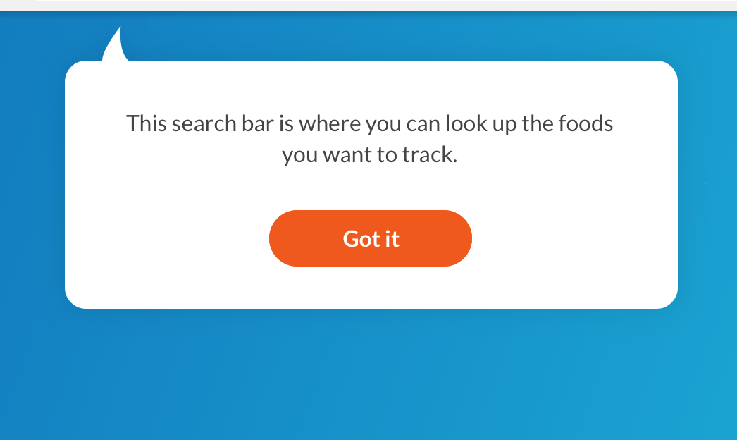
My goal: to have more of a pop up effect like a real javascript modal. I basically need to create a modal like you see in the following picture. I'm not sure what the best approach is or the best plugin.
 471
471
You could define a CSS animation for that and call this animation when you are clicking on the button. You can achieve this with adding the following CSS code. This is only an example to give you a rough idea of how your effect could look like. From this point you can even optimize and finetune the animation.
CSS
.overlay:target .popup{
  animation: popup 0.7s;
}

@keyframes popup {
  0%{
    transform: scale(1);
  }
  50%{
    transform: scale(1.4);
  }
  60%{
    transform: scale(1.1);
  }
  70%{
    transform: scale(1.2);
  }
  80%{
    transform: scale(1);
  }
  90%{
    transform: scale(1.1);
  }
  100%{
    transform: scale(1);
  }
}
body {
  font-family: Arial, sans-serif;
  background: url(http://www.shukatsu-note.com/wp-content/uploads/2014/12/computer-564136_1280.jpg) no-repeat;
  background-size: cover;
  height: 100vh;
}
h1 {
  text-align: center;
  font-family: Tahoma, Arial, sans-serif;
  color: #06D85F;
  margin: 80px 0;
}
.box {
  width: 40%;
  margin: 0 auto;
  background: rgba(255, 255, 255, 0.2);
  padding: 35px;
  border: 2px solid #fff;
  border-radius: 20px/50px;
  background-clip: padding-box;
  text-align: center;
}
.button {
  font-size: 1em;
  padding: 10px;
  color: #fff;
  border: 2px solid #06D85F;
  border-radius: 20px/50px;
  text-decoration: none;
  cursor: pointer;
  /* transition: all 0.3s ease-out; */
}
.button:hover {
  background: #06D85F;
}
.overlay {
  position: fixed;
  top: 0;
  bottom: 0;
  left: 0;
  right: 0;
  background: rgba(0, 0, 0, 0.7);
  transition: opacity 500ms;
  visibility: hidden;
  opacity: 0;
}
.overlay:target {
  visibility: visible;
  opacity: 1;
}
.popup {
  margin: 70px auto;
  padding: 20px;
  background: #fff;
  border-radius: 5px;
  width: 30%;
  position: relative;
  transition: all 5s ease-in-out;
}
.popup:after {
  content: '';
  position: absolute;
  bottom: 100%;
  width: 0;
  height: 0;
  border-style: solid;
  border-width: 0 20px 20px 20px;
  border-color: transparent transparent white transparent;
}
.overlay:target .popup {
  animation: popup 0.7s;
}
.popup h2 {
  margin-top: 0;
  color: #333;
  font-family: Tahoma, Arial, sans-serif;
}
.popup .close {
  position: absolute;
  top: 20px;
  right: 30px;
  transition: all 200ms;
  font-size: 30px;
  font-weight: bold;
  text-decoration: none;
  color: #333;
}
.popup .close:hover {
  color: #06D85F;
}
.popup .content {
  max-height: 30%;
  overflow: auto;
}
@media screen and (max-width: 700px) {
  .box {
    width: 70%;
  }
  .popup {
    width: 70%;
  }
}
@keyframes popup {
  0% {
    transform: scale(1);
  }
  50% {
    transform: scale(1.4);
  }
  60% {
    transform: scale(1.1);
  }
  70% {
    transform: scale(1.2);
  }
  80% {
    transform: scale(1);
  }
  90% {
    transform: scale(1.1);
  }
  100% {
    transform: scale(1);
  }
}
<h1>Popup/Modal Windows without JavaScript</h1>
<div class="box">
<a class="button" href="#popup1">Let me Pop up</a>
</div>
<div id="popup1" class="overlay">
<div class="popup">
<h2>Here i am</h2>
<a class="close" href="#">×</a>
<div class="content">
Thank to pop me out of that button, but now i'm done so you can close this window.
</div>
</div>
</div>In answer to getting the curved arrow, you can use the :after or :before pseudo element. Something like this will achieve the desired effect:
CSS
.popup:after {
  content: "";
  position: absolute;
  border: 0 solid transparent;
  border-left: 24px solid white;
  border-radius: 33px 0;
  top: -18px;
  left: 20px;
  width: 30px;
  height: 34px;
}
If you love us? You can donate to us via Paypal or buy me a coffee so we can maintain and grow! Thank you!
Donate Us With


