 Menu
Menu
To apply a shadow effect only on one side of an element set the blur value to a positive number and set the spread value to the same size but with a negative sign. Depending on which side you want the shadow on, set the offset value as follows: Top shadow: offset-x: 0 and offset-y: -5px.
Simply apply the following CSS to the element in question: box-shadow: 0 0 Xpx Ypx [hex/rgba]; /* note 0 offset values */ clip-path: inset(Apx Bpx Cpx Dpx);
1) Set your shadow's horizontal alignment to the left (negative values). box-shadow: -30px 0px 10px 10px #888888; Although this way you won't have the same shadow size in the top and bottom. 2) Use a div inside a div and apply shadow to each one.
This is what you are looking for. It has examples for each side you want with a shadow.
.top-box
{
    box-shadow: inset 0 7px 9px -7px rgba(0,0,0,0.4);
}
.left-box
{
    box-shadow: inset 7px 0 9px -7px rgba(0,0,0,0.4);
}
.right-box
{
    box-shadow: inset -7px 0 9px -7px rgba(0,0,0,0.4);
}
.bottom-box
{
    box-shadow: inset 0 -7px 9px -7px rgba(0,0,0,0.4);
}
See the snippet for more examples:
body {
    background-color:#0074D9;
}
div {
    background-color:#ffffff;
    padding:20px;
    margin-top:10px;
}
.top-box {
    box-shadow: inset 0 7px 9px -7px rgba(0,0,0,0.7);
}
.left-box {
    box-shadow: inset 7px 0 9px -7px rgba(0,0,0,0.7);
}
.right-box {
    box-shadow: inset -7px 0 9px -7px rgba(0,0,0,0.7);
}
.bottom-box {
    box-shadow: inset 0 -7px 9px -7px rgba(0,0,0,0.7);
}
.top-gradient-box {
    background: linear-gradient(to bottom, #999 0, #ffffff 7px, #ffffff 100%);
}
.left-gradient-box {
    background: linear-gradient(to right, #999 0, #ffffff 7px, #ffffff 100%);
}
.right-gradient-box {
    background: linear-gradient(to left, #999 0, #ffffff 7px, #ffffff 100%);
}
.bottom-gradient-box {
    background: linear-gradient(to top, #999 0, #ffffff 7px, #ffffff 100%);
}
<div class="top-box">
This area has a top shadow using box-shadow
</div>
<div class="left-box">
This area has a left shadow using box-shadow
</div>
<div class="right-box">
This area has a right shadow using box-shadow
</div>
<div class="bottom-box">
This area has a bottom shadow using box-shadow
</div>
<div class="top-gradient-box">
This area has a top shadow using gradients
</div>
<div class="left-gradient-box">
This area has a left shadow using gradients
</div>
<div class="right-gradient-box">
This area has a right shadow using gradients
</div>
<div class="bottom-gradient-box">
This area has a bottom shadow using gradients
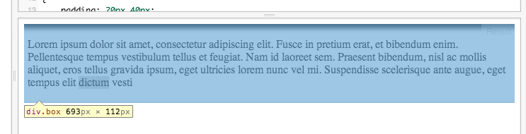
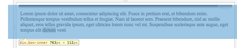
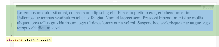
</div>The trick is a second .box-inner inside, which is larger in width than the original .box, and the box-shadow is applied to that.
Then, added more padding to the .text to make up for the added width.
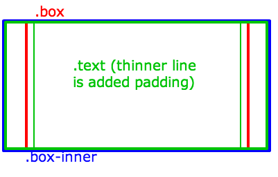
Use max width for .inner-box to not cause .box to get wider, and overflow to make sure the remaining is clipped:
.box {
    max-width: 100% !important;
    overflow: hidden;
}
110% is wider than the parent which is 100% in a child's context (should be the same when the parent .box has a fixed width, for example).
Negative margins make up for the width and cause the element to be centered (instead of only the right part hiding):
.box-inner {
    width: 110%;
    margin-left:-5%;
    margin-right: -5%;
    -webkit-box-shadow: inset 0px 5px 10px 1px #000000;
    box-shadow: inset 0px 5px 10px 1px #000000;
}
And add some padding on the X axis to make up for the wider .inner-box:
.text {
    padding: 20px 40px;
}
If you inspect the Fiddle, you'll see:
Quite a bit late, but a duplicate answer that doesn't require altering the padding or adding extra divs can be found here: Have an issue with box-shadow Inset bottom only. It says, "Use a negative value for the fourth length which defines the spread distance. This is often overlooked, but supported by all major browsers"
From the answerer's fiddle:
box-shadow: inset 0 -10px 10px -10px #000000;
This comes a little close.
.box
{
    -webkit-box-shadow: inset -1px 10px 5px -3px #000000;
    box-shadow: inset -1px 10px 5px -3px #000000;
}
try it, maybe useful...
box-shadow: 0 0 0 3px rgb(255,255,255), 0 7px 3px #cbc9c9;
                    -webkit-box-shadow: 0 0 0 3px rgb(255,255,255), 0 7px 5px #cbc9c9;
                    -o-box-shadow: 0 0 0 3px rgb(255,255,255), 0 7px 5px #cbc9c9;
                    -moz-box-shadow: 0 0 0 3px rgb(255,255,255), 0 7px 5px #cbc9c9;
above CSS cause you have a box shadow in bottom.
you can red more Here
This might not be the exact thing you are looking for, but you can create a very similar effect by using rgba in combination with linear-gradient:
background: linear-gradient(rgba(0,0,0,.5) 0%, rgba(0,0,0,0) 30%);
This creates a linear-gradient from black with 50% opacity (rgba(0,0,0,.5)) to transparent (rgba(0,0,0,0)) which starts being competently transparent 30% from the top. You can play with those values to create your desired effect. You can have it on a different side by adding a deg-value (linear-gradient(90deg, rgba(0,0,0,.5) 0%, rgba(0,0,0,0) 30%)) or switching the colors around. If you want really complex shadows like different angles on different sides you could even start layering linear-gradient.
Here is a snippet to see it in action:
.box {
  background: linear-gradient(rgba(0,0,0,.5) 0%, rgba(0,0,0,0) 30%);
}

.text {
  padding: 20px;
}
<div class="box">
<div class="text">
Lorem ipsum ....
</div>
</div>If you love us? You can donate to us via Paypal or buy me a coffee so we can maintain and grow! Thank you!
Donate Us With