 Menu
Menu
I'm creating a speech bubble with CSS and I have reached this far.
.says{
width: 200px;
padding: 20px;
margin-right: 20px;
background: #BF7EF2;
color: #fff;
box-shadow: -3px 3px 5px #C1B9C8;
position: relative;
border-radius: 5px;
}
.says:before{
content: "";
position: absolute;
z-index: -1;
top: 14px;
right: -18px;
height: 20px;
border-right: 20px solid #BF7EF2;
border-bottom-right-radius: 25px 20px;
transform: translate(0, -4px);
box-shadow: -3px 3px 5px #C1B9C8;
}
.says:after{
content: "";
position: absolute;
z-index: -1;
top: 7px;
right: -18px;
width: 30px;
height: 30px;
background: #fff;
border-bottom-left-radius: 40px 35px;
transform: translate(0px, -20px);
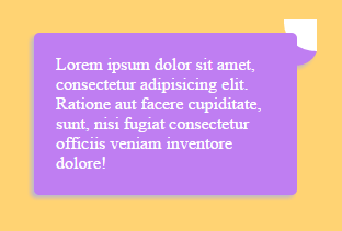
}<div class="says">Lorem ipsum dolor sit amet, consectetur adipisicing elit. Ratione aut facere cupiditate, sunt, nisi fugiat consectetur officiis veniam!</div>Basically I have used :before and :after pseudo class and applied border-radius. Then overlapped each other to reach the desire effect. Right now as you can see, I'm using background: #fff on :after because the current parent's background is white. This will go over many different divs with different bg colors throughout my app. And this is the issue I'm having right now.
Example-
Can I achieve the same "speech-bubble" tail without using the background property on :after?
^ This line explains it's not a duplicate of linked question.
Or by any other completely different ways?
 861
861
As webtiki says, you can get this result adapting my previous answer (Even though may be it is a little bit difficult)
.container {
  width:300px;
  margin:5px;
}
.test
{
position: relative;
width: 300px;
height: 150px;
padding: 0px;
background: pink;
border-radius: 6px;
}

.test:after {
    content: '';
    top: 1px;
    right: -29px;
    position: absolute;
    border: 0px solid;
    display: block;
    width: 38px;
     height: 26px;
    background-color: transparent;
    border-bottom-left-radius: 50%;
    border-bottom-right-radius: 50%;
    box-shadow: -21px 9px 0px 8px pink;
}
<div class="container">
<div class="test"></div>
</div>
<img src="http://i.stack.imgur.com/MYlKY.png" alt="enter image description here">If you love us? You can donate to us via Paypal or buy me a coffee so we can maintain and grow! Thank you!
Donate Us With

