 Menu
Menu
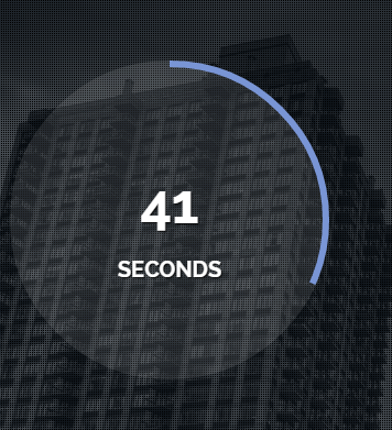
Currently, I am working on a quiz game and in that, for each question, I wish to place a countdown timer. I got some plugins, but I wish if I could create it myself. What I am trying to create looks like the one in the image below.Can you please tell me how I can do it?
Is there a way to assign a border to only up to a specified percentage of the perimeter, so that I could give a border, first in full, and then as each second advances, I can keep decreasing/increasing it so that I would get it in the perfect way.
The timer I wish to create should look somewhat like this (hope you understand how its blue border will increase every second):
 803
803
Here is something i was playing around with a while ago. It uses a combination of SVG, css transitions and javascript. You should be able to rip it apart and use as a starting point...
/** * The setTimeout({},0) is a workaround for what appears to be a bug in StackSnippets. * It should not be required. See JSFiddle version. */ setTimeout(function() { var time = 10; /* how long the timer will run (seconds) */ var initialOffset = '440'; var i = 1 /* Need initial run as interval hasn't yet occured... */ $('.circle_animation').css('stroke-dashoffset', initialOffset-(1*(initialOffset/time))); var interval = setInterval(function() { $('h2').text(i); if (i == time) { clearInterval(interval); return; } $('.circle_animation').css('stroke-dashoffset', initialOffset-((i+1)*(initialOffset/time))); i++; }, 1000); }, 0).item { position: relative; float: left; } .item h2 { text-align:center; position: absolute; line-height: 125px; width: 100%; } svg { -webkit-transform: rotate(-90deg); transform: rotate(-90deg); } .circle_animation { stroke-dasharray: 440; /* this value is the pixel circumference of the circle */ stroke-dashoffset: 440; transition: all 1s linear; }<script src="https://ajax.googleapis.com/ajax/libs/jquery/1.11.1/jquery.min.js"></script> <div class="item html"> <h2>0</h2> <svg width="160" height="160" xmlns="http://www.w3.org/2000/svg"> <g> <title>Layer 1</title> <circle id="circle" class="circle_animation" r="70" cy="81" cx="81" stroke-width="8" stroke="#6fdb6f" fill="none"/> </g> </svg> </div>JSFiddle version
93
If you love us? You can donate to us via Paypal or buy me a coffee so we can maintain and grow! Thank you!
Donate Us With