 Menu
Menu
RawMaterialButton is better suited I think.
RawMaterialButton(
  onPressed: () {},
  elevation: 2.0,
  fillColor: Colors.white,
  child: Icon(
    Icons.pause,
    size: 35.0,
  ),
  padding: EdgeInsets.all(15.0),
  shape: CircleBorder(),
)
ElevatedButton)ElevatedButton (with less customizations)
ElevatedButton(
  onPressed: () {},
  child: Icon(Icons.menu, color: Colors.white),
  style: ElevatedButton.styleFrom(
    shape: CircleBorder(),
    padding: EdgeInsets.all(20),
    primary: Colors.blue, // <-- Button color
    onPrimary: Colors.red, // <-- Splash color
  ),
)
ElevatedButton (with more customizations)
ElevatedButton(
  onPressed: () {},
  child: Icon(Icons.menu),
  style: ButtonStyle(
    shape: MaterialStateProperty.all(CircleBorder()),
    padding: MaterialStateProperty.all(EdgeInsets.all(20)),
    backgroundColor: MaterialStateProperty.all(Colors.blue), // <-- Button color
    overlayColor: MaterialStateProperty.resolveWith<Color?>((states) {
      if (states.contains(MaterialState.pressed)) return Colors.red; // <-- Splash color
    }),
  ),
)
Using InkWell
ClipOval(
  child: Material(
    color: Colors.blue, // Button color
    child: InkWell(
      splashColor: Colors.red, // Splash color
      onTap: () {},
      child: SizedBox(width: 56, height: 56, child: Icon(Icons.menu)),
    ),
  ),
)
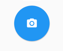
Output (same for the last two):
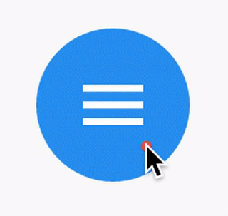
You just need to use the shape: CircleBorder()
MaterialButton(
  onPressed: () {},
  color: Colors.blue,
  textColor: Colors.white,
  child: Icon(
    Icons.camera_alt,
    size: 24,
  ),
  padding: EdgeInsets.all(16),
  shape: CircleBorder(),
)
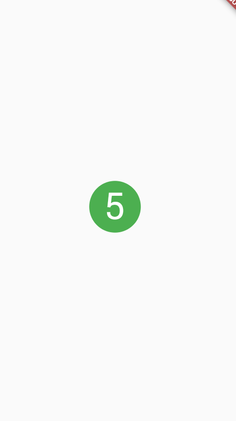
You can use InkWell to do that:
A rectangular area of a Material that responds to touch.
Below example demonstrate how to use InkWell. Notice: you don't need StatefulWidget to do that. I used it to change the state of the count.
Example:
import 'package:flutter/material.dart';

class SettingPage extends StatefulWidget {
  @override
  _SettingPageState createState() => new _SettingPageState();
}

class _SettingPageState extends State<SettingPage> {
  int _count = 0;
  @override
  Widget build(BuildContext context) {
    return new Scaffold(
      body: new Center(
        child: new InkWell(// this is the one you are looking for..........
        onTap: () => setState(() => _count++),
        child: new Container(
          //width: 50.0,
          //height: 50.0,
          padding: const EdgeInsets.all(20.0),//I used some padding without fixed width and height
          decoration: new BoxDecoration(
            shape: BoxShape.circle,// You can use like this way or like the below line
            //borderRadius: new BorderRadius.circular(30.0),
            color: Colors.green,
          ),
          child: new Text(_count.toString(), style: new TextStyle(color: Colors.white, fontSize: 50.0)),// You can add a Icon instead of text also, like below.
          //child: new Icon(Icons.arrow_forward, size: 50.0, color: Colors.black38)),
        ),//............
      ),
      ),
    );
  }
}
If you want to get benefit of splashColor, highlightColor, wrap InkWell widget using a Material widget with material type circle. And then remove decoration in Container widget.
Outcome:
If you love us? You can donate to us via Paypal or buy me a coffee so we can maintain and grow! Thank you!
Donate Us With