 Menu
Menu
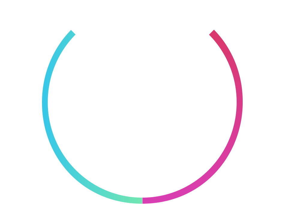
I want to create circle div with a gradient effect on its borders like the image below.
How can I achieve that?
Here is where I'm getting stuck:
.circle {
    background-color: #ffffff;
    text-align: ;
    width: 675px;
    height: 675px;
    border-radius: 50%;

    border-style: solid;
    border-width: 30px;
    border-left-color: #39c8e7;
    border-right-color: #39c8e7;
    border-bottom-color: // here I need linear gradient
    border-top-color:    // this need to be transparent
}
 748
748
Method 1: Using border-image with gradient: The border is created by using the size and color as transparent in the border property. The gradient is used to define the border-image property. The border-image-slice is set to 1 for a border to properly be displayed.
The most straight forward way is to use border-image property. You can use whatever linear-gradient or repeat-gradient you want. The border-image slice property needs to be 1 for linear gradient.
To create a linear gradient you must define at least two color stops. Color stops are the colors you want to render smooth transitions among. You can also set a starting point and a direction (or an angle) along with the gradient effect.
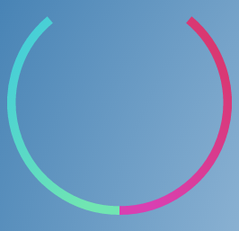
Using SVG:
For such shapes, I would recommend SVG because of two main reasons - (1) Arcs can be created very easily using SVG and this means that the top part will be transparent by default (2) SVG stroke (border) can be assigned a gradient. This means that we need not fill the arc/circle with gradient and then overlay a white circle on top of it and this in turn means that center part can also be transparent.
The path elements that create the two arcs use trigonometric equations to find out the end points of the arc. So, they can easily be modified if the arcs need to longer or shorter.
The gradients used are roughly equivalent to the ones provided in question but a closer resemblance can be achieved by tuning the color-stop points further.
Demo:
div {
  position: relative;
  height: 250px;
  width: 250px;
  border-radius: 50%;
}
svg {
  position: absolute;
  height: 100%;
  width: 100%;
  top: 0px;
  left: 0px;
}
path {
  fill: transparent;
  stroke-width: 4;
}
#left-half {
  stroke: url(#left-border);
}
#right-half {
  stroke: url(#right-border);
}

/* just for demo */

body {
  background: radial-gradient(circle at center, aliceblue, steelblue);
  min-height: 100vh;
}
<div>
<svg viewBox='0 0 104 104'>
<linearGradient id='left-border' gradientUnits='objectBoundingBox' gradientTransform='rotate(50,0.5,0.5)'>
<stop offset="0%" stop-color="rgb(71, 207, 215)" />
<stop offset="100%" stop-color="rgb(113, 230, 178)" />
</linearGradient>
<linearGradient id='right-border' gradientUnits='objectBoundingBox' gradientTransform='rotate(310,0.5,0.5)'>
<stop offset="0%" stop-color="rgb(217, 63, 177)" />
<stop offset="100%" stop-color="rgb(217, 56, 111)" />
</linearGradient>
<path d='M52,102 A50,50 0 0,1 19.86,13.69' id='left-half' />
<path d='M52,102 A50,50 0 0,0 84.14,13.69' id='right-half' />
</svg>
</div>Output Screenshot: (a background is added to show the circle is transparent except the borders)
Using CSS:
With CSS, you could use two separate linear-gradient background images (one for the left half of the border and the other for the right half) which have an angle and then overlay them with two white circles (created using radial-gradient) to create the same effect as provided in question. To make the top part transparent, you could put the entire stuff in a pseudo-element, position it a bit above the parent element and then clip the top part using overflow: hidden on parent.
The drawback is that the center part of the circle needs to be a solid color (white or something else). It can't be transparent. We can use mask images to create a transparent center but browser support for it is very low. It is only supported by WebKit powered browsers so far.
Demo:
div {
  position: relative;
  height: 250px;
  width: 250px;
  overflow: hidden;
}
div:after {
  position: absolute;
  content: '';
  height: 100%;
  width: 100%;
  left: 0px;
  top: -20%;
  background: radial-gradient(circle at center, white 64%, transparent 65%), radial-gradient(circle at 50% -50%, white 50%, transparent 51%), linear-gradient(310deg, rgb(113, 230, 178), rgb(71, 207, 215)), linear-gradient(50deg, rgb(217, 63, 177), rgb(217, 56, 111));
  background-size: 100% 100%, 100% 100%, 50% 100%, 50% 100%;
  background-position: left top, left top, left top, right top;
  background-repeat: no-repeat;
  border-radius: 50%;
}<div></div>Note: One of the radial gradients could be avoided by using the same method that vals has employed in his answer but the other (positioned above the element) cannot be avoided because this approach doesn't use a constant color for the left and right borders. It tries to mimic the image in question which also doesn't have a constant color on the left and right. Achieving such an effect using borders would be tough. (This is not to say the other answers are bad/wrong but just that this answer is different).
168
You can use 2 different backgrounds, one in the base to get the gradient, and another on top to cover it on white.
Changing the clip and origin of both, you can make the base one show only on the border zone
.test {
    width: 150px;
  height: 150px;
  border-radius: 50%;
  border: solid 10px transparent;
  border-left-color: cyan;
  border-right-color: red;
  background-image: linear-gradient(white, white),
    linear-gradient(90deg, cyan 20%, blue 50% , magenta 50%, red 100%);
  background-clip: padding-box, border-box;
  background-origin: padding-box, border-box;
  background-size: 100% 100%, 100% 50%;
  background-position: center center, center bottom;
  background-repeat: no-repeat;
}

body {
  background-color: yellow;
  }
<div class="test"></div>Another option, so that the background can be transparent.
I'm using 2 pseudo elements, clipped so that they only use one half (the right or the left), and with variable shadows to get the effect.
.test {
  width: 430px;
  height: 430px;
  border-radius: 50%;
  position: relative;
  overflow: hidden;
}

.test:before, .test:after {
  content: "";
  position: absolute;
  width: 400px;
  height: 400px;
  border-radius: 50%;
  left: 15px;
  top: 15px;
}

.test:before {
  box-shadow:
   -31px 232px 107px -142px rgb(110, 228, 180),
   -228px -71px 0px -92px #47CFDA,
   -213px 71px 0px -77px rgba(66, 205, 221, 0.948),
   -31px 232px 0px -77px rgb(66, 205, 221);
  clip: rect(0px, 200px, 1000px, -15px);
}

.test:after {
  box-shadow: 42px 256px 107px 108px #D93EB2, 384px 60px 0px 132px #D9386F;
  clip: rect(0px, 450px, 1000px, 200px);
}

body {
  background: radial-gradient(circle at center, aliceblue, steelblue);
  min-height: 100vh;
}
<div class="test"></div>body background copyed from Harry's answer
36
If you love us? You can donate to us via Paypal or buy me a coffee so we can maintain and grow! Thank you!
Donate Us With

