 Menu
Menu
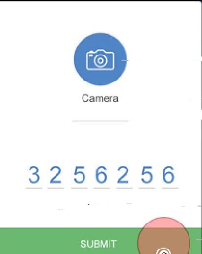
I am creating an UI for a mobile app I am required to create a popover with the UI attached in the screenshot.How to create a 7 character underline input text field in html and css like the below one?
HTML Code
<ion-modal-view class="modal contact-details-modal" id="contactDetailModal">


<ion-content delegate-handle="modalContent">
<center>
<br><br>
<img src="assets/images/camera-small.png">
<br><p>Camera</p>
     <div class="underline_camera" style="border: 0;border-bottom: 1px solid  #b2b2b2;outline: 0;width: 100px;">
    <input type="text" id="camera" name=" camera" value="" />
</div><br>

<div class="meter_reading" style="border: 0;border-bottom: 1px solid     #b2b2b2;outline: 0;width: 20px;">
    <input type="text" id="meter" name=" meter" value="" />
    <!--<input type="text" id="meter" name=" meter" value="" />
    <input type="text" id="meter" name=" meter" value="" />
    <input type="text" id="meter" name=" meter" value="" />
    <input type="text" id="meter" name=" meter" value="" />
    <input type="text" id="meter" name=" meter" value="" />
    <input type="text" id="meter" name=" meter" value="" />-->

 </div>


 <div class="button-bar">

 <a class="button button-balanced">
 SUBMIT</a>
 </div>
 </center>
</ion-content>
</ion-modal-view>
CSS Code
.contact-details-modal {
   top: 15%;
   border-radius: 3px;
   -webkit-border-radius: 3px;
   min-height: 70% !important;
   width: 80%;
   left: 10%;
}
 361
361
Here's a solution that creates a single text field with underlines under each character (try deleting and writing another number in the input field):
input {
  border: none;
  width: 10.5ch;
  background:
    repeating-linear-gradient(90deg,
        dimgrey 0,
        dimgrey 1ch,
        transparent 0,
        transparent 1.5ch)
      0 100%/100% 2px no-repeat;
  color: dimgrey;
  font: 5ch consolas, monospace;
  letter-spacing: .5ch;
}
input:focus {
  outline: none;
  color: dodgerblue;
}
<input maxlength='7' value='0123456'/>This uses the ch unit whose width is the width of the 0 character. It also assumes the font in the input field is a monospace one so that all characters have the same width.
So the width for every character is always 1ch. The gap between the characters is taken to be .5ch. This is the value we set for letter-spacing. The width of the input is the number of characters times the sum between the letter width (1ch) and the gap width (.5ch). So that's 7*(1ch + .5ch) = 7*1.5ch = 10.5ch.
We remove the actual border of the input and we set a fake one using a repeating-linear-gradient. The dash (dimgrey) goes from 0 to 1ch and the gap (transparent) starts immediately after the dash and goes to 1.5ch.
It's attached to the left and the bottom of the input - this is the background-position component (0% horizontally and 100% vertically).
It spreads across the entire input horizontally (100%) and is 2px tall - this is the background-size component of the background.
The Sass code that generates this CSS is:
$char-w: 1ch;
$gap: .5*$char-w;
$n-char: 7;
$in-w: $n-char*($char-w + $gap);

input {
  border: none;
  width: $in-w;
  background: repeating-linear-gradient(90deg,
    dimgrey 0, dimgrey $char-w,
    transparent 0, transparent $char-w + $gap)
    0 100%/100% 2px no-repeat;
  font: 5ch consolas, monospace;
  letter-spacing: $gap;

  &:focus {
    outline: none;
    color: dodgerblue;
  }
}
You can tweak the gap and other things here.
141
Add a max length of character to an input.
<input type="text" class="underline" maxlength="7">
Adding size="7" is an easy way of also setting the width of the input to contain the 7 characters. But it's better to handle this in CSS.
And give it the proper styling.
.underline {
    background-color: #fff;
    border: none;
    border-bottom: thin solid gray;
}
First I set border to 0 to remove all border styling, after which I set styling for border-bottom. This way it takes only two lines of code instead of four when styling all border top, right, bottom and left.
Update
https://jsfiddle.net/1q3h8qeh/
36
If you love us? You can donate to us via Paypal or buy me a coffee so we can maintain and grow! Thank you!
Donate Us With