I often have to make stacked barplots to compare variables, and because I do all my stats in R, I prefer to do all my graphics in R with ggplot2. I would like to learn how to do two things:
First, I would like to be able to add proper percentage tick marks for each variable rather than tick marks by count. Counts would be confusing, which is why I take out the axis labels completely.
Second, there must be a simpler way to reorganize my data to make this happen. It seems like the sort of thing I should be able to do natively in ggplot2 with plyR, but the documentation for plyR is not very clear (and I have read both the ggplot2 book and the online plyR documentation.
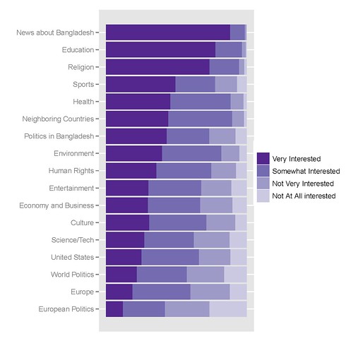
My best graph looks like this, the code to create it follows:
The R code I use to get it is the following:
library(epicalc)

### recode the variables to factors ###
recode(c(int_newcoun, int_newneigh, int_neweur, int_newusa, int_neweco, int_newit, int_newen, int_newsp, int_newhr, int_newlit, int_newent, int_newrel, int_newhth, int_bapo, int_wopo, int_eupo, int_educ), c(1,2,3,4,5,6,7,8,9, NA),
c('Very Interested','Somewhat Interested','Not Very Interested','Not At All interested',NA,NA,NA,NA,NA,NA))

### Combine recoded variables to a common vector
Interest1<-c(int_newcoun, int_newneigh, int_neweur, int_newusa, int_neweco, int_newit, int_newen, int_newsp, int_newhr, int_newlit, int_newent, int_newrel, int_newhth, int_bapo, int_wopo, int_eupo, int_educ)


### Create a second vector to label the first vector by original variable ###
a1<-rep("News about Bangladesh", length(int_newcoun))
a2<-rep("Neighboring Countries", length(int_newneigh))
[...]
a17<-rep("Education", length(int_educ))


Interest2<-c(a1, a2, a3, a4, a5, a6, a7, a8, a9, a10, a11, a12, a13, a14, a15, a16, a17)

### Create a Weighting vector of the proper length ###
Interest.weight<-rep(weight, 17)

### Make and save a new data frame from the three vectors ###
Interest.df<-cbind(Interest1, Interest2, Interest.weight)
Interest.df<-as.data.frame(Interest.df)

write.csv(Interest.df, 'C:\\Documents and Settings\\[name]\\Desktop\\Sweave\\InterestBangladesh.csv')

### Sort the factor levels to display properly ###

Interest.df$Interest1<-relevel(Interest$Interest1, ref='Not Very Interested')
Interest.df$Interest1<-relevel(Interest$Interest1, ref='Somewhat Interested')
Interest.df$Interest1<-relevel(Interest$Interest1, ref='Very Interested')

Interest.df$Interest2<-relevel(Interest$Interest2, ref='News about Bangladesh')
Interest.df$Interest2<-relevel(Interest$Interest2, ref='Education')
[...]
Interest.df$Interest2<-relevel(Interest$Interest2, ref='European Politics')

detach(Interest)
attach(Interest)

### Finally create the graph in ggplot2 ###

library(ggplot2)
p<-ggplot(Interest, aes(Interest2, ..count..))
p<-p+geom_bar((aes(weight=Interest.weight, fill=Interest1)))
p<-p+coord_flip()
p<-p+scale_y_continuous("", breaks=NA)
p<-p+scale_fill_manual(value = rev(brewer.pal(5, "Purples")))
p
update_labels(p, list(fill='', x='', y=''))
I'd very much appreciate any tips, tricks or hints.
Your second problem can be solved with melt and cast from the reshape package
After you've factored the elements in your data.frame called you can use something like:
install.packages("reshape")
library(reshape)

x <- melt(your.df, c()) ## Assume you have some kind of data.frame of all factors
x <- na.omit(x) ## Be careful, sometimes removing NA can mess with your frequency calculations

x <- cast(x, variable + value ~., length)
colnames(x) <- c("variable","value","freq")
## Presto!
ggplot(x, aes(variable, freq, fill = value)) + geom_bar(position = "fill") + coord_flip() + scale_y_continuous("", formatter="percent")
As an aside, I like to use grep to pull in columns from a messy import. For example:
x <- your.df[,grep("int.",df)] ## pulls all columns starting with "int_"
And factoring is easier when you don't have to type c(' ', ...) a million times.
for(x in 1:ncol(x)) {
df[,x] <- factor(df[,x], labels = strsplit('
Very Interested
Somewhat Interested
Not Very Interested
Not At All interested
NA
NA
NA
NA
NA
NA
', '\n')[[1]][-1]
}
You don't need prop.tables or count etc to do the 100% stacked bars. You just need +geom_bar(position="stack")
About percentages insted of ..count.. , try:
ggplot(mtcars, aes(factor(cyl), prop.table(..count..) * 100)) + geom_bar()
but since it's not a good idea to shove a function into the aes(), you can write custom function to create percentages out of ..count.. , round it to n decimals etc.
You labeled this post with plyr, but I don't see any plyr in action here, and I bet that one ddply() can do the job. Online plyr documentation should suffice.
If you love us? You can donate to us via Paypal or buy me a coffee so we can maintain and grow! Thank you!
Donate Us With