 Menu
Menu
Using CSS, how can I apply more than one transform?
Example: In the following, only the translation is applied, not the rotation.
li:nth-child(2) { transform: rotate(15deg); transform: translate(-20px,0px); }  948
948
Multiple transforms can be applied to an element in one property like this: transform: rotate(15deg) translateX(200px); This will rotate the element 15 degrees clockwise and then translate it 200px to the right.
Just start from there that in CSS, if you repeat 2 values or more, always last one gets applied, unless using ! important tag, but at the same time avoid using ! important as much as you can, so in your case that's the problem, so the second transform override the first one in this case...
In the example below, we'll use multiple values of the transform property. It is possible to add multiple values applied one after another. The values must be separated by space. The transform property applies the rightmost value, and then the values on the left.
I'm adding this answer not because it's likely to be helpful but just because it's true.
In addition to using the existing answers explaining how to make more than one translation by chaining them, you can also construct the 4x4 matrix yourself
I grabbed the following image from some random site I found while googling which shows rotational matrices:
Rotation around x axis: 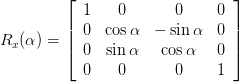
Rotation around y axis: 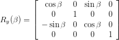
Rotation around z axis: 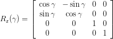
I couldn't find a good example of translation, so assuming I remember/understand it right, translation:
[1 0 0 0] [0 1 0 0] [0 0 1 0] [x y z 1] See more at the Wikipedia article on transformation as well as the Pragamatic CSS3 tutorial which explains it rather well. Another guide I found which explains arbitrary rotation matrices is Egon Rath's notes on matrices
Matrix multiplication works between these 4x4 matrices of course, so to perform a rotation followed by a translation, you make the appropriate rotation matrix and multiply it by the translation matrix.
This can give you a bit more freedom to get it just right, and will also make it pretty much completely impossible for anyone to understand what it's doing, including you in five minutes.
But, you know, it works.
Edit: I just realized that I missed mentioning probably the most important and practical use of this, which is to incrementally create complex 3D transformations via JavaScript, where things will make a bit more sense.
26
You have to put them on one line like this:
li:nth-child(2) { transform: rotate(15deg) translate(-20px,0px); } When you have multiple transform directives, only the last one will be applied. It's like any other CSS rule.
Keep in mind multiple transform one line directives are applied from right to left.
This: transform: scale(1,1.5) rotate(90deg);
and: transform: rotate(90deg) scale(1,1.5);
will not produce the same result:
.orderOne, .orderTwo { font-family: sans-serif; font-size: 22px; color: #000; display: inline-block; } .orderOne { transform: scale(1, 1.5) rotate(90deg); } .orderTwo { transform: rotate(90deg) scale(1, 1.5); }<div class="orderOne"> A </div> <div class="orderTwo"> A </div>If you love us? You can donate to us via Paypal or buy me a coffee so we can maintain and grow! Thank you!
Donate Us With


