 Menu
Menu
I'd like to apply a drop-shadow filter to a specific element/path inside an inline placed SVG via CSS, I don't need the whole graphic to be shadowed, just an element inside it.
.shadow {
fill: red;
-webkit-filter:
drop-shadow( 3px 3px 2px rgba(0,0,0,.7) );
filter:
drop-shadow( 3px 3px 2px rgba(0,0,0,.7) );
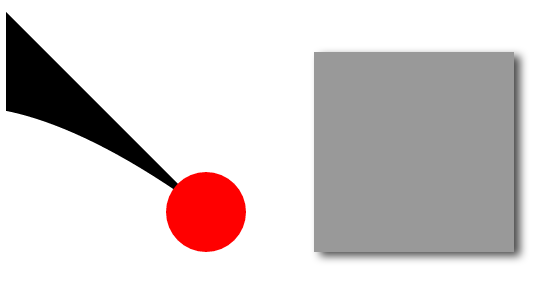
} <svg height="150" width="150">
<g>
<path d="M0,0 C-72,132 -72,-26 100,100"></path>
</g>
<g class="shadow" >
<circle class="shadow" cx="100" cy="100" r="20"></circle>
</g>
</svg>As you can see above, I'm trying to apply a drop-shadow to the red circle element of the SVG, but it's not working.
Searching around I haven't found any specific info on this, only few comments in other SVG related questions simply stating that it doesn't work on single SVG elements, but without much explanations.
UPDATE
As pointed out by @azeós in the comments, it is rendering correctly with Firefox (v. 43.0.2) so it's a Chrome specific issue. Is there anyway to make this crossbrowser without fiddling out with the SVG code as suggested in the comments?
 778
778
Updated 2020-04: I did some experiments on this issue because I too couldn't find any information on this and the results are pretty inconsistent.
The TL;DR: SVG drop-shadows are very inconsistent but HTML drop-shadows reliably work (outside of IE11). If you want SVG drop-shadows, you're going to have use a polyfill or just do the drop-shadow within the SVG itself.
Codepen experiment: http://codepen.io/staypuftman/pen/GoNoMq
Neither Chrome nor edge Canary respect filter or -webkit-filter properly in the context of an SVG object drop-shadow but do work on a simple div.
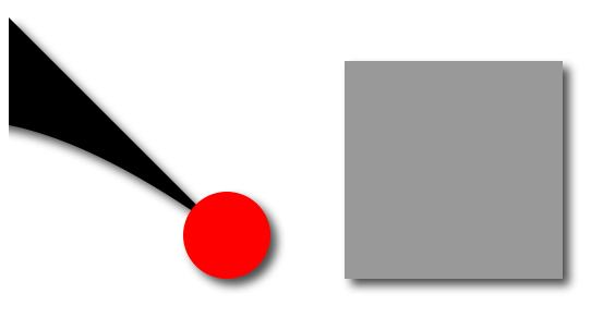
Looks pretty good for both SVG and HTML objects.
Safari briefly had dropshadows on earlier versions but has dropped them again.

Safari has fixed this issue in the 10.1 (and maybe the 10.0) series.
SVG CSS dropshadow does not show and the div dropshadow has less opacity for some reason

No SVG dropshadows but the HTML ones work well.
Nothing.

196
In this CodePen I added different drop-shadows to path and text generated dynamically. Here I found a cross-browser solution that you can apply to a class, for example, instead of #robbie img (in the second link):
#robbie img { filter: "progid:DXImageTransform.Microsoft.Dropshadow(OffX=12, OffY=12, Color='#444')"; filter: url(#drop-shadow); -webkit-filter: drop-shadow(12px 12px 7px rgba(0,0,0,0.5)); filter: drop-shadow(12px 12px 7px rgba(0,0,0,0.5)); }
In the first CodePen I commented another alternative way that does not use the classes, but it uses #numbers_dropshadows_filter and #strokes_dropshadows_filter defined in <defs></defs>.
Cheers
35
You can apply a shadow selectively by doing color selection on the object you want to shadow, creating a shadow and then merging it under the original graphic. But you have to do it via the SVG filter trapdoor in CSS Filters - which doesn't work in IE. (So ... hacky, but possible)
Spec is here: w3.org/TR/SVG11/filters.html#feColorMatrixElement
Demo toy is here:
https://beta.observablehq.com/@gitmullany/filter-effects-using-svg-color-matrices
That matrix doubles the opacity of all red values, zeros out the opacity of everything else and then subtracts 1. The effect is to only leave things at 100% opacity that are rgb(255,0,0)
#mySVG {
   filter: url(#selective-shadow);
}

.shadow {
  fill: red;
}
<svg>
<defs>
<filter id="selective-shadow">
<feColorMatrix type="matrix" values="0 0 0 0 0
0 0 0 0 0
0 0 0 0 0
2 0 0 0 -1"/>
<feGaussianBlur stdDeviation="3"/>
<feOffset dy="2" dx="2"/>
<feMerge>
<feMergeNode/>
<feMergeNode in="SourceGraphic"/>
</feMerge>
</filter>
</defs>
</svg>
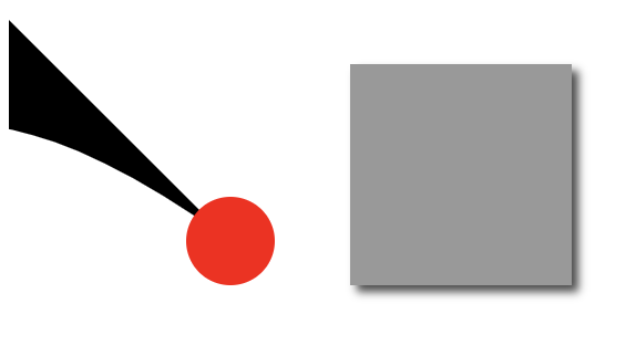
<svg height="150" width="150" id="mySVG">
<g>
<path d="M0,0 C-72,132 -72,-26 100,100"></path>
</g>
<g class="shadow" >
<circle class="shadow" cx="100" cy="100" r="20"></circle>
</g>
</svg>If you love us? You can donate to us via Paypal or buy me a coffee so we can maintain and grow! Thank you!
Donate Us With