 Menu
Menu
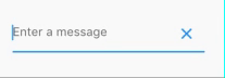
Output:
Create a variable
var _controller = TextEditingController();
And your TextField:
TextField(
  controller: _controller,
  decoration: InputDecoration(
    hintText: 'Enter a message',
    suffixIcon: IconButton(
      onPressed: _controller.clear,
      icon: Icon(Icons.clear),
    ),
  ),
)
        Container(
            margin: EdgeInsets.only(left: 16.0),
            child: TextFormField(
              controller: _username,
              decoration: InputDecoration(
                  hintText: '请输入工号',
                  filled: true,
                  prefixIcon: Icon(
                    Icons.account_box,
                    size: 28.0,
                  ),
                  suffixIcon: IconButton(
                      icon: Icon(Icons.remove),
                      onPressed: () {
                        debugPrint('222');
                      })),
            ),
          ),
use iconButton
Try this -
final TextEditingController _controller = new TextEditingController();
new Stack(
            alignment: const Alignment(1.0, 1.0),
            children: <Widget>[
              new TextField(controller: _controller,),
              new FlatButton(
                  onPressed: () {
                     _controller.clear();
                  },
                  child: new Icon(Icons.clear))
            ]
        )
Here’s another answer expanding a bit on @Vilokan Lab’s answer, which wasn’t really doing it for me since FlatButton has a minimum width of 88.0, and thus the clear button was not appearing right-aligned with the TextField at all.
So I went ahead and made my own button class, and applied that using a Stack, here is my process:
Button class:
class CircleIconButton extends StatelessWidget {
final double size;
final Function onPressed;
final IconData icon;

CircleIconButton({this.size = 30.0, this.icon = Icons.clear, this.onPressed});

@override
Widget build(BuildContext context) {
  return InkWell(
    onTap: this.onPressed,
    child: SizedBox(
        width: size,
        height: size,
        child: Stack(
          alignment: Alignment(0.0, 0.0), // all centered
          children: <Widget>[
            Container(
              width: size,
              height: size,
              decoration: BoxDecoration(
                  shape: BoxShape.circle, color: Colors.grey[300]),
            ),
            Icon(
              icon,
              size: size * 0.6, // 60% width for icon
            )
          ],
        )));
  }
}
Then apply like so as InputDecoration to your TextField:
var myTextField = TextField(
  controller: _textController,
  decoration: InputDecoration(
      hintText: "Caption",
      suffixIcon: CircleIconButton(
        onPressed: () {
          this.setState(() {
            _textController.clear();
          });
        },
      )),
  },
);
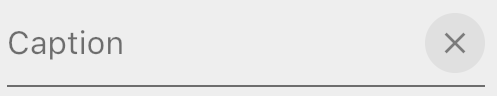
To get this:
Unhighlighted state
Highlighted / selected state.
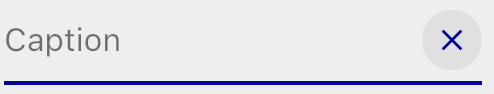
Note this colouring comes free when you use suffixIcon.
Note you can also Stack it in your TextField like this, but you won't get the auto-colouring you get when you use suffixIcon:
var myTextFieldView = Stack(
  alignment: Alignment(1.0,0.0), // right & center
  children: <Widget>[
    TextField(
      controller: _textController,
      decoration: InputDecoration(hintText: "Caption"),
    ),
    Positioned(
      child: CircleIconButton(
        onPressed: () {
          this.setState(() {
            _textController.clear();
          });
        },
      ),
    ),
  ],
);
If you love us? You can donate to us via Paypal or buy me a coffee so we can maintain and grow! Thank you!
Donate Us With