 Menu
Menu
In Flutter, one can apply a theme to the app using ThemeData class. But there two propeties of this class that confuses me: primaryColor and primarySwatch. What's the difference between these two properties and when to use one or the other? Thanks.
 847
847
Color primaryColor. The background color for major parts of the app (toolbars, tab bars, etc)
Clicking on ctrl + primarySwatch, You will be Headed to theme_data page and there you can change your theme color according to your convience.
To share a Theme across an entire app, provide a ThemeData to the MaterialApp constructor. If no theme is provided, Flutter creates a default theme for you. MaterialApp( title: appName, theme: ThemeData( // Define the default brightness and colors. brightness: Brightness.
primarySwatch is not a Color. It's MaterialColor.
Which means it's different shades of a color a material app will use.
primaryColor is one of those shades. To be exact, primaryColor is normally equal to primarySwatch[500].
It is usually better to define a primarySwatch instead of primaryColor. Because some material components may use a different shade of the primaryColor for things such as shadow, border, ...
164
The following is taking from my perusal of theme_data.dart:
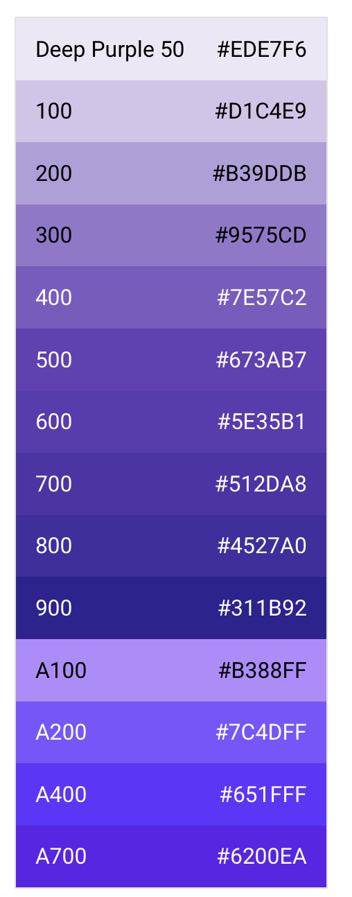
primarySwatch defaults to Colors.blue and sets the following fields (including primaryColor) to various shades of the MaterialColor input depending on whether the theme brightness is light or dark (default is light):
// The default shade for the color is used
primaryColor = primarySwatch; // [500] for normal colors and [200] for accent colors
primaryColorLight = primarySwatch[100];
primaryColorDark = primarySwatch[700];
// This can be overridden by setting accentColor (below) manually
toggleableActiveColor = primarySwatch[600];
accentColor = primarySwatch[500];
secondaryHeaderColor = primarySwatch[50];
textSelectionColor = primarySwatch[200];
textSelectionHandleColor = primarySwatch[300]
backgroundColor = primarySwatch[200];
*buttonColor is set to its default (grey[300])
buttonColor = primarySwatch[600];
*The remaining fields listed above for light themes are set to their dark defaults (various shades of tealAccent, grey or black)
// Brightness.dark/light is estimated based on the default shade for the color
// This also sets the bool primaryIsDark
primaryColorBrightness = estimateBrightnessForColor(primarySwatch);
// This generates the modern simplified set of theme colors flutter recommends
// using when theming Widgets based on the theme. Set it manually if you need
// more control over individual colors
colorScheme = ColorScheme.fromSwatch(
      primarySwatch: primarySwatch, // as above
      primaryColorDark: primaryColorDark, // as above
      accentColor: accentColor, // as above
      cardColor: cardColor, // default based on theme brightness, can be set manually
      backgroundColor: backgroundColor, // as above
      errorColor: errorColor, // default (Colors.red[700]), can be set manually
      brightness: brightness, // default (Brightness.light), can be set manually
    );
As mentioned in the accepted answer, only setting primaryColor could leave Widgets open to selecting some other default color (various shades of blue) based on one of the other fields above if they are not also set individually, so primarySwatch is a convenient shorthand for simple themes.
In general, however, the colorScheme field is most important as per modern conventions you should be using Theme.of(context).colorScheme.<Color> (though it may not work everywhere yet depending on when you read this).
So, if you need more control over individual theme colors, you could either make do with setting the fields used in ColorScheme.fromSwatch, or just set the primarySwatch (for backwards compatibility of Flutter Widgets that have not yet been migrated), and then set the colorScheme manually for extra control. See also this document for more information…
40
Swatch is a category. Color is a range in that category although not limited to it. Based on swatch colour you specify flutter can picks a background and a foreground colour it feels suitable for a component.
tldr;
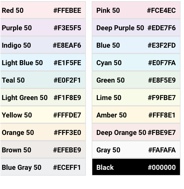
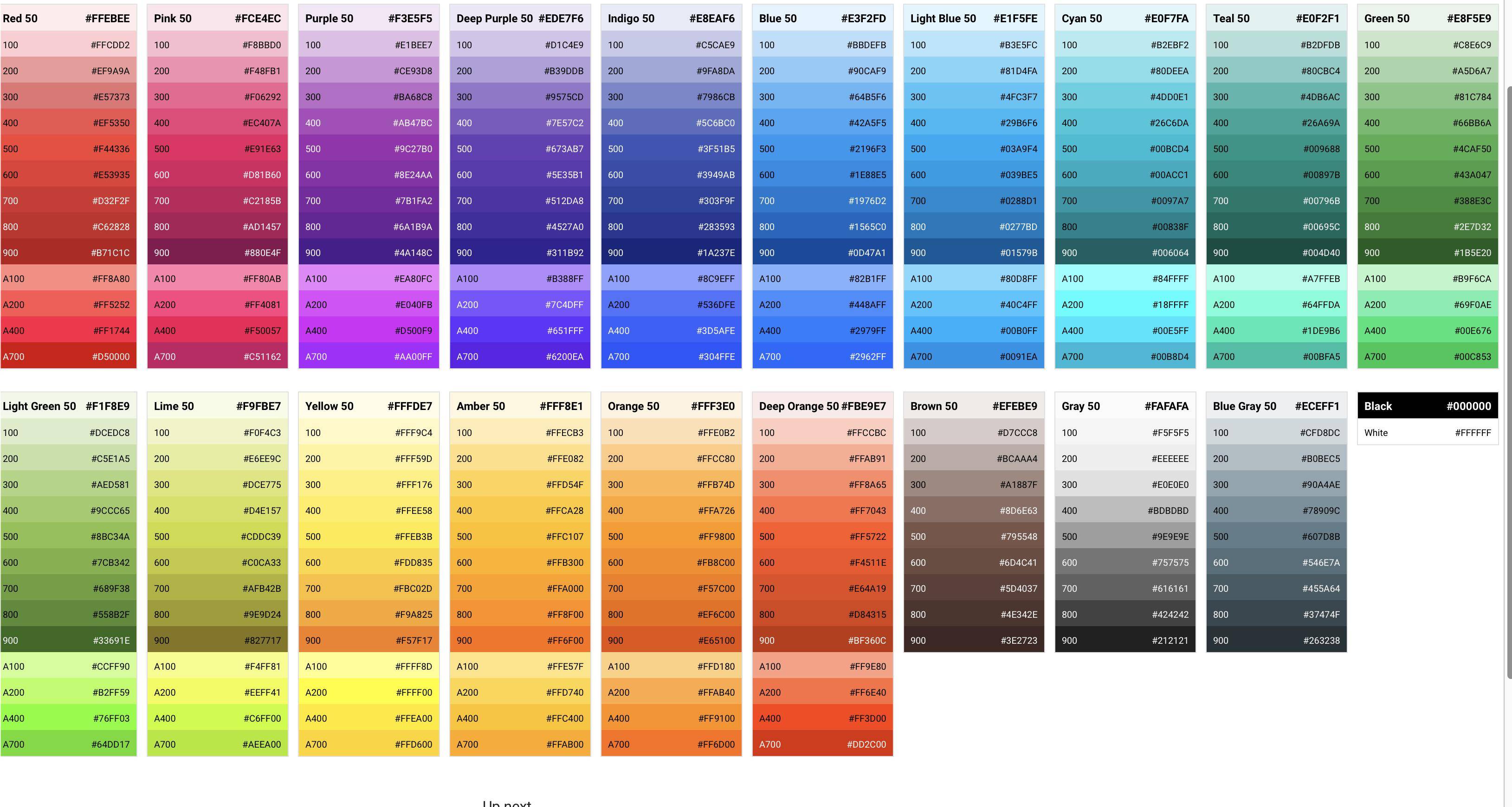
Its important to understand the difference b/w a swatch and a color. A swatch is a category of colour. Its of type MaterialColor Material has below listed swatches plus white. (ignore 50)
.
Each swatch has various ranges. An individual in a swatch/range is a colour although you aren't restricted by it. You can specify any valid colour code even though it's not inside a swatch range.
.
Based on swatch colour you specify flutter can picks a background and a foreground colour it feels suitable for a component.
.
Here is a list of all swatches and their colours. Screenshot taken from https://material.io/design/color/the-color-system.html#tools-for-picking-colors
12
primarySwatch is MaterialColor.
/// Defines a single color as well a color swatch with ten shades of the color.
///
/// The color's shades are referred to by index. The greater the index, the
/// darker the color. There are 10 valid indices: 50, 100, 200, ..., 900.
/// The value of this color should the same the value of index 500 and [shade500].
/// hex_value1 = 0xFFAAD401; hex_value2 = 0xFFAAD403; ...
MaterialColor myGreen = const MaterialColor(0xFFAAD400,
      const {
        50 : const Color(hex_value1),
        100 : const Color(hex_value2),
        200 : const Color(hex_value3),
        300 : const Color(hex_value4),
        400 : const Color(hex_value5),
        500 : const Color(hex_value6),
        600 : const Color(hex_value7),
        700 : const Color(hex_value8),
        800 : const Color(hex_value9),
        900 : const Color(hex_value10)});
// use MaterialColor: myGreen.shade100,myGreen.shade500 ...
myGreen.shade50 // Color === 0xFFAAD401
If you love us? You can donate to us via Paypal or buy me a coffee so we can maintain and grow! Thank you!
Donate Us With