 Menu
Menu
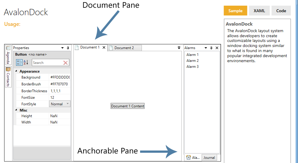
I am using AvalonDock in a project and would like to use the Anchorable Pane, but instead of the tab appearing at the bottom, I would like it to appear at the top like it does on a Document Pane. For my project, a Document Pane is not the appropriate control, so I need to find a way to make the Anchorable Pane appear in the same way.
 684
684
According to Issue Ticket found on CodePlex there is a bug that prevents changing the TabStripPlacement to the top. The way to achieve this is to replace the existing style with one like this:
<Style x:Key="MyCustomAnchorablePaneControlStyle" TargetType="{x:Type xcad:LayoutAnchorablePaneControl}">

    <Setter Property="TabStripPlacement" Value="Top"/>
    <Setter Property="Template">
        <Setter.Value>
            <ControlTemplate TargetType="{x:Type xcad:LayoutAnchorablePaneControl}">
                <Grid ClipToBounds="true" SnapsToDevicePixels="true" KeyboardNavigation.TabNavigation="Local">
                    <Grid.RowDefinitions>
                        <RowDefinition Height="Auto"/>
                        <RowDefinition Height="*"/>
                    </Grid.RowDefinitions>
                    <!--Following border is required to catch mouse events-->
                    <Border Background="Transparent" Grid.RowSpan="2"/>

                    <xcad:AnchorablePaneTabPanel x:Name="HeaderPanel" Margin="2,0,2,2" IsItemsHost="true" Grid.Row="0" KeyboardNavigation.TabIndex="1" Panel.ZIndex="1"/>

                    <Border x:Name="ContentPanel" BorderBrush="{TemplateBinding BorderBrush}" BorderThickness="{TemplateBinding BorderThickness}" Background="{TemplateBinding Background}" Grid.Column="0" KeyboardNavigation.DirectionalNavigation="Contained" Grid.Row="1" KeyboardNavigation.TabIndex="2" KeyboardNavigation.TabNavigation="Cycle">
                        <ContentPresenter x:Name="PART_SelectedContentHost" ContentSource="SelectedContent" Margin="{TemplateBinding Padding}" SnapsToDevicePixels="{TemplateBinding SnapsToDevicePixels}"/>
                    </Border>

                </Grid>
                <ControlTemplate.Triggers>
                    <Trigger Property="IsEnabled" Value="false">
                        <Setter Property="Foreground" Value="{DynamicResource {x:Static SystemColors.GrayTextBrushKey}}"/>
                    </Trigger>
                </ControlTemplate.Triggers>
            </ControlTemplate>
        </Setter.Value>
    </Setter>

    <Setter Property="ItemContainerStyle">
        <Setter.Value>
            <Style TargetType="{x:Type TabItem}">
                <Setter Property="IsSelected" Value="{Binding IsSelected, Mode=TwoWay}"/>
                <Setter Property="ToolTip" Value="{Binding ToolTip}"/>
                <Style.Triggers>
                    <DataTrigger Binding="{Binding RelativeSource={RelativeSource Mode=FindAncestor, AncestorType={x:Type TabControl}}, Path=Items.Count}" Value="1">
                        <Setter Property="Visibility" Value="Collapsed"/>
                    </DataTrigger>
                </Style.Triggers>
            </Style>
        </Setter.Value>
    </Setter>

    <Setter Property="ItemTemplate">
        <Setter.Value>
            <DataTemplate>
                <xcad:LayoutAnchorableTabItem Model="{Binding}"/>
            </DataTemplate>
        </Setter.Value>
    </Setter>

    <Setter Property="ContentTemplate">
        <Setter.Value>
            <DataTemplate>
                <xcad:LayoutAnchorableControl Model="{Binding}"/>
            </DataTemplate>
        </Setter.Value>
    </Setter>

</Style>
If you love us? You can donate to us via Paypal or buy me a coffee so we can maintain and grow! Thank you!
Donate Us With