 Menu
Menu
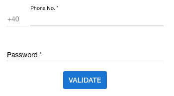
How do I change md-input-container placeholder color using css in Angular Material? As screenshot below I have phone no. and password textfield. Phone no. textfield has Phone No. and password has Password placeholder name.
 611
611
in the last version of angular you can remove the placeholder in the input and add a mat-placeholder in the mat-form-field and custom the css with a class
html :
<mat-form-field>
    <input matInput type="text">
    <mat-placeholder class="placeholder">Search</mat-placeholder>
</mat-form-field>
css:
.mat-focused .placeholder {
    color: #00D318;
}
Placeholder is depicted as a <label> in Angular Material. So you actually need to style the label not the placeholder.
As soon as you click (focus) on the input this <label> which is looking as a placeholder slides up and converted into a form <label>.
So you just need to apply this CSS:
/* When the input is not focused */
md-input-container label {
  color: red;
}

/* When the input is focused */
md-input-container.md-input-focused label {
  color: blue;
}
Have a look at this Plunkr Demo.
36
In Angular 4+
First you will need to turn ViewEncapsulation off to style Material Elements. Be warned this is subverting the Angular emulated-shadow DOM default and you should proceed with caution (https://blog.thoughtram.io/angular/2015/06/29/shadow-dom-strategies-in-angular2.html).
In dummy.component.ts:
@Component({
 ...,
 encapsulation: ViewEncapsulation.None,
})
Then give your < mat-form-field > element a unique class in dummy.component.html:
<mat-form-field class="dummy-input-field" floatPlaceholder="always">
  <input placeholder="Dummy"/>
</mat-form-field>
Finally in dummy.component.css apply the styling:
.dummy-input-field .mat-input-placeholder {
  color: red;
}
Similarly, if you'd like to dynamically change color if the field is focused:
.dummy-input-field.mat-focused .mat-input-placeholder {
  color: red;
}
If you love us? You can donate to us via Paypal or buy me a coffee so we can maintain and grow! Thank you!
Donate Us With