 Menu
Menu
In Mozilla Firefox, open the site for which you want to use a mobile browser simulator. Then, either press CTRL + Shift + M on your keyboard or click the burger button on the top-right corner to open Firefox's menu, and choose Web Developer. You see a menu filled with tools that are useful to web developers.
Connecting the Developer ToolsConnect the developer tools to an instance of Firefox running on an Android device. Connect the developer tools to a specific iframe in the current page.
All you need to do is right-click on a webpage and you will get an 'Inspect' or 'Inspect Element' option.
You can use tools own browser (Firefox, IE, Chrome...) to debug your JavaScript.
As for resizing, Firefox/Chrome has own resources accessible via Ctrl + Shift + I OR F12. Going tab "style editor" and clicking "adaptive/responsive design" icon.
Old Firefox versions

New Firefox/Firebug

Chrome

*Another way is to install an addon like "Web Developer"
Use the Responsive Design Tool using Ctrl + Shift + M.
Most web applications detects mobile devices based on the HTTP Headers.
If your web site also uses HTTP Headers to identify mobile device, you can do the following:
User-Agent and value: Mozilla/5.0 (iPhone; U; CPU like Mac OS X; en) AppleWebKit/420+ (KHTML, like Gecko) Version/3.0 Mobile/1A543 Safari/419.3
Hope it helps!
You could use the Firefox add-on User Agent Overrider. With this add-on you can use whatever user agent you want, for examlpe:
Firefox 28/Android: Mozilla/5.0 (Android; Mobile; rv:28.0) Gecko/24.0 Firefox/28.0
If your website detects mobile devices through the user agent then you can test your layout this way.
Update Nov '17:
Due to the release of Firefox 57 and the introduction of web extension this add-on sadly is no longer available. Alternatively you can edit the Firefox preference general.useragent.override in your configuration:
about:config
general.useragent.override
I would use the "Responsive Design View" available under Tools -> Web Developer -> Responsive Design View. It will let you test your CSS against different screen sizes.
You can use the already mentioned built in Responsive Design Mode (via dev tools) for setting customised screen sizes together with the Random Agent Spoofer Plugin to modify your headers to simulate you are using Mobile, Tablet etc. Many websites specify their content according to these identified headers.
As dev tools you can use the built in Developer Tools (Ctrl + Shift + I or Cmd + Shift + I for Mac) which have become quite similar to Chrome dev tools by now.
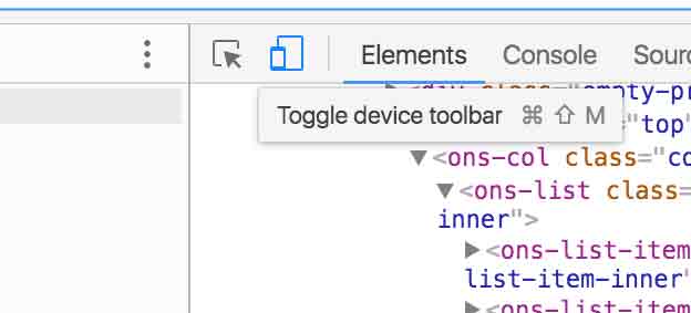
I think it's better to use the chrome toggle device toolbar with the chrome inspector. It provides you a user agent switch along with responsive mode.
If you love us? You can donate to us via Paypal or buy me a coffee so we can maintain and grow! Thank you!
Donate Us With