 Menu
Menu
Here is my code snippet:
.container {
  display: flex;
  flex-direction: column;
}
.container > div {
  padding: 20px;
  color: #fff;
  margin: 5px;
  text-align: center;
  font-size: 30px;
}
.fruits {
  order: 2;
  background: #ff5423;
}
.container :not(.fruits) {
  order: 1;
}
.flowers {
  background: #f970bd;
}
.trees {
  background: #049500;
}
<div class="container">
<div class="fruits">The fruits</div>
<div class="flowers">The flowers</div>
<div class="fruits">The fruits</div>
<div class="trees">The trees</div>
<div class="fruits">The fruits</div>
</div>I am putting all .fruits div in the bottom using flex-direction: column;. There are two other divs .flowers and .trees which can be placed randomly anywhere inside .conatiner and I can't handle that. I want them to take half of its parent width so they take only one row.
What I want to achieve:
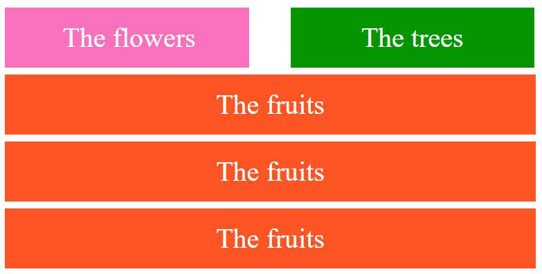
Giving 50% width will not work here. I know the rule says the direction is column-wise, however, I still hope if there is any available method/trick to do so! Any other workaround using different technique rather than using flex will also help.
 460
460
You can do this with flex-direction: row you just need to set flex-wrap: wrap on parent and flex: 0 0 50% on elements you want to take half width.
You also need to use * {box-sizing: border-box} for paddings and calc() for margins.
* {
  box-sizing: border-box;
}
.container {
  display: flex;
  flex-wrap: wrap;
}
.container > div {
  padding: 20px;
  color: #fff;
  margin: 5px;
  flex: 0 0 calc(100% - 10px);
  text-align: center;
  font-size: 30px;
}
.fruits {
  order: 2;
  background: #ff5423;
}
.container div:not(.fruits) {
  order: 1;
  flex: 0 0 calc(50% - 10px);
}
.flowers {
  background: #f970bd;
}
.trees {
  background: #049500;
}
<div class="container">
<div class="fruits">The fruits</div>
<div class="flowers">The flowers</div>
<div class="fruits">The fruits</div>
<div class="trees">The trees</div>
<div class="fruits">The fruits</div>
</div>If you love us? You can donate to us via Paypal or buy me a coffee so we can maintain and grow! Thank you!
Donate Us With

