 Menu
Menu
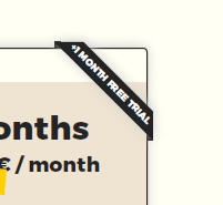
Is it possible to create css ribbon in corner shaped?
 .
.
I've tried with an png image, but is there any option to create using css ? should work with responsive views also.
.container {
  width: 200px;
  height: 200px;
  position: relative;
  margin: 20px;
  overflow: hidden;
}

.box {
  width: 100%;
  height: 100%;
  position: absolute;
  top: 0;
  left: 0;
  opacity: 0.8; /* for demo purpose  */
}

.stack-top {
  height: 30px;
  z-index: 9;
  margin: 40px; /* for demo purpose  */
  transform: rotateY(0deg) rotate(45deg); /* needs Y at 0 deg to behave properly*/
  transition: transform 2s;
  color: #fff;
}
<div class="container">
<div class="box" style="background: #fffff3;"></div>
<div class="box stack-top" style="background: #242424;"> 1Month</div>
</div> 959
959
You can try like below:
.container {
  width: 200px;
  height: 150px;
  position: relative;
  display:inline-block;
  margin: 10px;
  background: lightblue;
}

.stack-top {
  /* adjust the below to control the shape */
  --d:5px;
  --g:16px;
  --c:#333;
  /**/

  position: absolute;
  top: 0;
  right: 0;
  transform: translate(29.29%, -100%) rotate(45deg); /* 29.29% = 100%*(1 - cos(45deg)) */
  color: #fff;
  text-align: center;
  width: 100px;
  transform-origin: bottom left;
  padding:5px 0 calc(var(--d) + 5px);
  background:
    linear-gradient(135deg, transparent var(--g), var(--c) calc(var(--g) - 0.3px)) left,
    linear-gradient(-135deg,transparent var(--g), var(--c) calc(var(--g) - 0.3px)) right;
  background-size:51% 100%;
  background-repeat:no-repeat;
  clip-path:polygon(0 0,100% 0,100% 100%, calc(100% - var(--d)) calc(100% - var(--d)), var(--d) calc(100% - var(--d)),0 100%)
}
<div class="container">
<div class="stack-top">1Month</div>
</div>
<div class="container">
<div class="stack-top" style="--d:0px;--g:19px;width:120px;--c:blue">1Month</div>
</div>
<div class="container">
<div class="stack-top" style="--d:8px;--g:17px;width:80px;--c:red">XX</div>
</div>
<div class="container">
<div class="stack-top" style="--d:10px;--g:20px;width:200px;--c:green">1Month</div>
</div>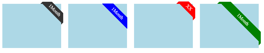
Another adjustment to add a shadow effect to the folded part:
.container {
  width: 200px;
  height: 150px;
  position: relative;
  display:inline-block;
  margin: 10px;
  background: lightblue;
}

.stack-top {
  /* adjust the below to control the shape */
  --d:5px;
  --w:100px;
  --c:#333;
  /**/

  position: absolute;
  top: 0;
  right: 0;
  transform: translate(29.29%, -100%) rotate(45deg); /* 29.29% = 100%*(1 - cos(45deg)) */
  color: #fff;
  text-align: center;
  width: var(--w);
  transform-origin: bottom left;
  padding:5px 0 calc(var(--d) + 5px);
  background:
    linear-gradient(rgba(0,0,0,0.6) 0 0) bottom/100% var(--d) no-repeat
    var(--c);
  clip-path:polygon(0 100%,0 calc(100% - var(--d)),50% calc(100% - var(--d) - var(--w)/2),100% calc(100% - var(--d)),100% 100%,calc(100% - var(--d)) calc(100% - var(--d)), var(--d) calc(100% - var(--d)))
}
<div class="container">
<div class="stack-top">1Month</div>
</div>
<div class="container">
<div class="stack-top" style="--d:0px;--w:120px;--c:pink">1Month</div>
</div>
<div class="container">
<div class="stack-top" style="--d:8px;--w:80px;--c:red">XX</div>
</div>
<div class="container">
<div class="stack-top" style="--d:12px;--w:200px;--c:green">1Month</div>
</div>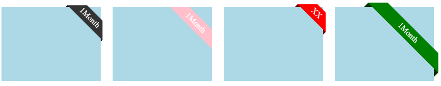
You can add position option:
.container {
  width: 200px;
  height: 150px;
  position: relative;
  display:inline-block;
  margin: 10px;
  background: lightblue;
}

.stack-top {
  /* adjust the below to control the shape */
  --d:5px;
  --w:100px;
  --c:#333;
  /**/

  position: absolute;
  top: 0;
  right: 0;
  transform: translate(29.29%, -100%) rotate(45deg); /* 29.29% = 100%*(1 - cos(45deg)) */
  color: #fff;
  text-align: center;
  width: var(--w);
  transform-origin: bottom left;
  padding:5px 0 calc(var(--d) + 5px);
  background:
    linear-gradient(rgba(0,0,0,0.6) 0 0) bottom/100% var(--d) no-repeat
    var(--c);
  clip-path:polygon(0 100%,0 calc(100% - var(--d)),50% calc(100% - var(--d) - var(--w)/2),100% calc(100% - var(--d)),100% 100%,calc(100% - var(--d)) calc(100% - var(--d)), var(--d) calc(100% - var(--d)))
}

.stack-top.left {
  left:0;
  right:auto;
  transform: translate(-29.29%, -100%) rotate(-45deg);
  transform-origin: bottom right;
}
<div class="container">
<div class="stack-top">1Month</div>
</div>
<div class="container">
<div class="stack-top" style="--d:0px;--w:120px;--c:pink">1Month</div>
</div>
<div class="container">
<div class="stack-top left" style="--d:8px;--w:80px;--c:red">XX</div>
</div>
<div class="container">
<div class="stack-top left" style="--d:12px;--w:200px;--c:green">1Month</div>
</div>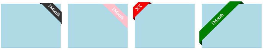
105
In respond to Create a CSS tag over a score card in div (tagged as a duplicate) but can give here hints to anyone else too
You are trying to evaluate a rotation and a translation together to position your ribbon, absolute coordonate + rotate + transform-origin can make it much easier to manage.
You can also use transform-origin to decide where it should rotate around and oversize it (to overflow enough to make it also grow a few lines if needed) and set a padding where areas will can be cut off , overflow:hidden can used to hide both sides.
below your CSS revisited and an example wrapping a few lines .
body {
  display: flex;
}

.project-card {
  margin: 1em;
  height: 350px;
  width: 300px;
  background-color: blue;
  position: relative;
  overflow: hidden;
}

.achievement-label {
  position: absolute;
  width: 300px;
  padding: 0.3rem 90px;
  box-sizing: border-box;
  background-color: red;
  transform: rotateZ(-45deg);
  top: 0;
  left: 0;
  transform-origin: 150px 150px;
  text-align: center;
}
<div class="project-card">
<div class="achievement-label">Winner <br> Is The Big <br>Best.</div>
</div>
<div class="project-card">
<div class="achievement-label">Winner</div>
</div>For the clip-path, you are trying also to keep a 45deg angle, you may decide to draw that path over a square and cut it in half to get that 45deg angle. meanwhile let's take a look at shape-outside which has a similar syntax and lets content flow around a shape.
With some extra markup, you can use float shape-outside (same syntax than clip-path) in place off the padding area to cut off, to let the text follow the shape if it goes under a few lines.
To clip on a 45deg direction, you need to start from a square, offset coordonates of clip-path can be standing outside, here the oversize on each size of the ribbon is about 90px, so let's use a 90px square to draw that path within.
previous example revisited with extra tags below:
body {
  display: flex;
}

.project-card {
  margin: 1em;
  height: 350px;
  width: 300px;
  background-color: blue;
  position: relative;
}

.achievement-label {
  display: grid;/* (or flex) will make height:100% meaning full for the direct children of the grid cells element (<p><i>)*/
  position: absolute;
  width: 300px;
  padding: 0.3rem 0;
  box-sizing: border-box;
  background-color: red;
  transform: rotateZ(-45deg);
  top: 0;
  left: 0;
  transform-origin: 150px 150px;
  text-align: justify;
  text-align-last: justify;
  color: white;
  clip-path: polygon(90px 0, calc(100% - 90px) 0, 100% 90px, 0 90px);
}

p {
  margin: 0;
}

div.achievement-label i {
  float: left;
  height: 100%;
  width: 80px;
  shape-outside: polygon(0 0, 90px 0%, 0 90px, 0% 90px);/* NOTE works as long as height is not taller than 90px */
  background: tomato;
}

div.achievement-label i+i {
  float: right;
  shape-outside: polygon(0 0, 90px 0, 90px 90px, 90px 90px);
}
<div class="project-card">
<div class="achievement-label">
<p><i></i><i></i> Winner Is The Best <br>Is Really The Best <br> ... -/- ....</p>
</div>
</div>
<div class="project-card">
<div class="achievement-label">
<p><i></i><i></i> Winner Is The Best </p>
</div>
</div>for a -45deg you can eventually use css var() and calc() to have to set only the width of your ribbon.
possible examples
body {
  display: flex;
  flex-wrap:wrap;
}

.project-card {
  margin: 1em;
  height: 350px;
  width: 300px;
  background-color: blue;
  position: relative;
  overflow: hidden;
}

.achievement-label {
  text-align: center;
  position: absolute;
  box-sizing: content-box;
  top: 0;
  left: 0;
  transform: rotate(-45deg);
/* init ribbon position for a -45deg rotation at top right corner */
  --width: 150px;
  --edgeOffset: calc( var(--width) / 2);
  --topOffset: calc( (var(--width) *.9));
  width: var(--width);
  transform-origin: 0 var(--edgeOffset);
  margin-top: var(--topOffset);
  padding: 0.3rem var(--edgeOffset);

  /* see padding areas */
  background: linear-gradient(to right, red var(--edgeOffset), tomato var(--edgeOffset), tomato calc(100% - var(--edgeOffset)), red calc(100% - var(--edgeOffset)));
}

.bis {
  width: 200px;
  height: 200px;
}

.ter {
  width: 350px;
  height: 100px;
}
.last {
  width:100%;
  height:80vh;
  min-width:200px;
  min-height:200px;
}
<div class="project-card">
<div class="achievement-label">defaut set </div>
</div>
<div class="project-card bis">
<div class="achievement-label" style="--width:125px;">125px</div>
</div>
<div class="project-card ter">
<div class="achievement-label" style="--width:100px;">100px</div>
</div>
<div class="project-card last">
<div class="achievement-label" style="--width:250px;">250px</div>
</div>If you love us? You can donate to us via Paypal or buy me a coffee so we can maintain and grow! Thank you!
Donate Us With


