 Menu
Menu
I didn't know this trick before, but I think I understand it. The bottom border isn't square, it's beveled on the sides. A left border would be beveled on the top and bottom. This is so borders of different colors meet cleanly. Because the arrow element has 0 height and width, the border segment is as wide on the bottom as you specify in the border rule, but narrows to a width of 0px (the size of the container).
You can play with the effect by setting different border thicknesses or changing the "side" of the border rule. The "arrow" always points opposite of the direction set in the rule. The bottom border "points" up; a right border "points" left.
Here's a quick diagram:
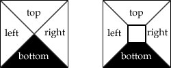
Left is the arrow trick. Right is a more typical border where the container has some dimensions.
Take a box. Say it's 5 pixels high and 5 pixels wide. Now say it has a 4px border. Here's what you should envision: http://jsfiddle.net/FrsGR/190.
.arrow { // box
   height: 5px;
   width: 5px;
   border: 4px solid blue;
}
Now imagine that the box doesn't have a width or height, so you are just left with the borders: http://jsfiddle.net/FrsGR/885/.
.arrow { // box with no width/height
   height: 0;
   width: 0;
   border: 4px solid blue;
}
They now overlap one another, and this is where the magic happens with creating arrows. The overlap line is drawn diagonally from each corner to the center. So, the end result is transparent triangles on the top, left, and right, with a black triangle on the bottom. Hope that helped!
Great reference: How do CSS triangles work?
If you love us? You can donate to us via Paypal or buy me a coffee so we can maintain and grow! Thank you!
Donate Us With